
Preview Chase Travel +
Overview
Increasing Utility With Chase Travel Plus
01
Project Briefing
Project Duration
3 Weeks
Project Goal
Adding A Feature
Tools Used
Figma
Adobe Illustrator
Adobe Photoshop
Contributions
Prototyping
User Research
UI Design
Wireframing
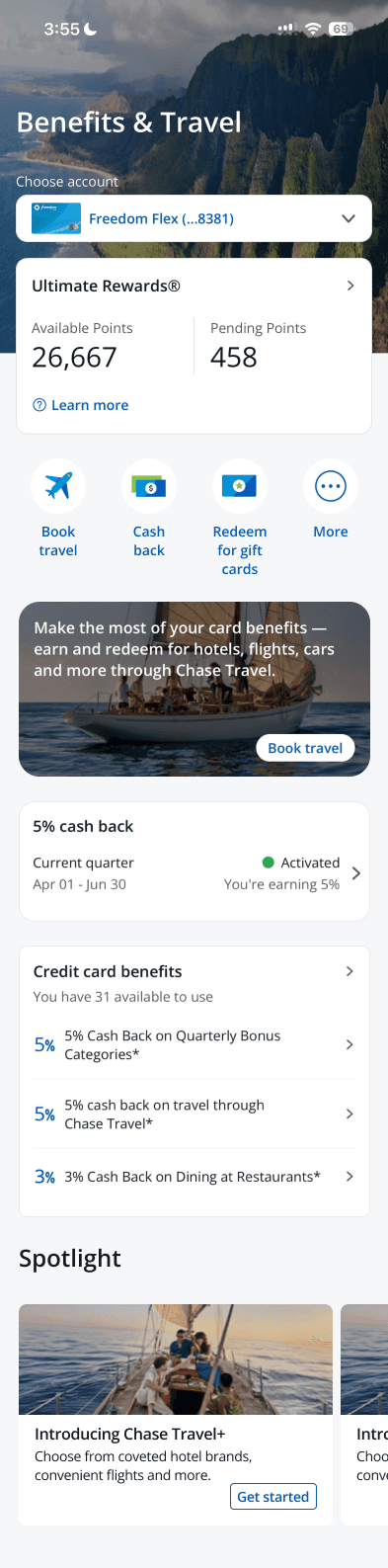
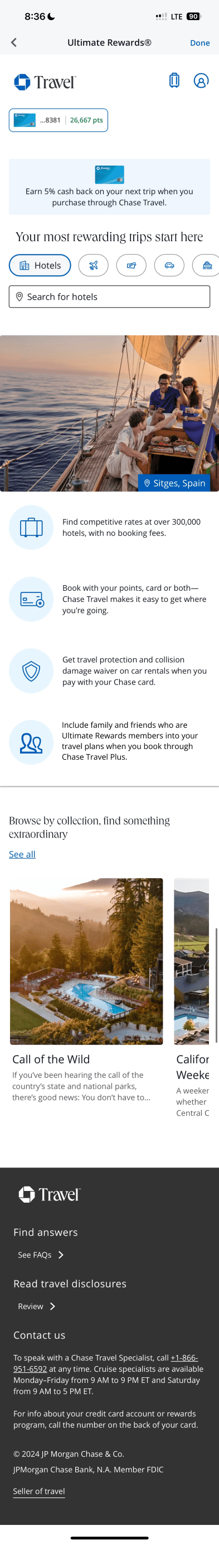
What is "Chase Travel"?
"Chase Travel" is a service offered by Chase Bank for its "Ultimate Rewards Members," who are users of (Compatible) Chase credit cards. It allows members to book travel using their reward points or redeem cashback through the Chase app or website.
01-02
The Problem At Hand
So what's up with the plus?
Chase Travel Plus was conceived to address increased competition among banks by focusing on retaining users through enhanced features, beyond just offering generous sign-up bonuses and referral incentives.
How did I solve the discovered problem?
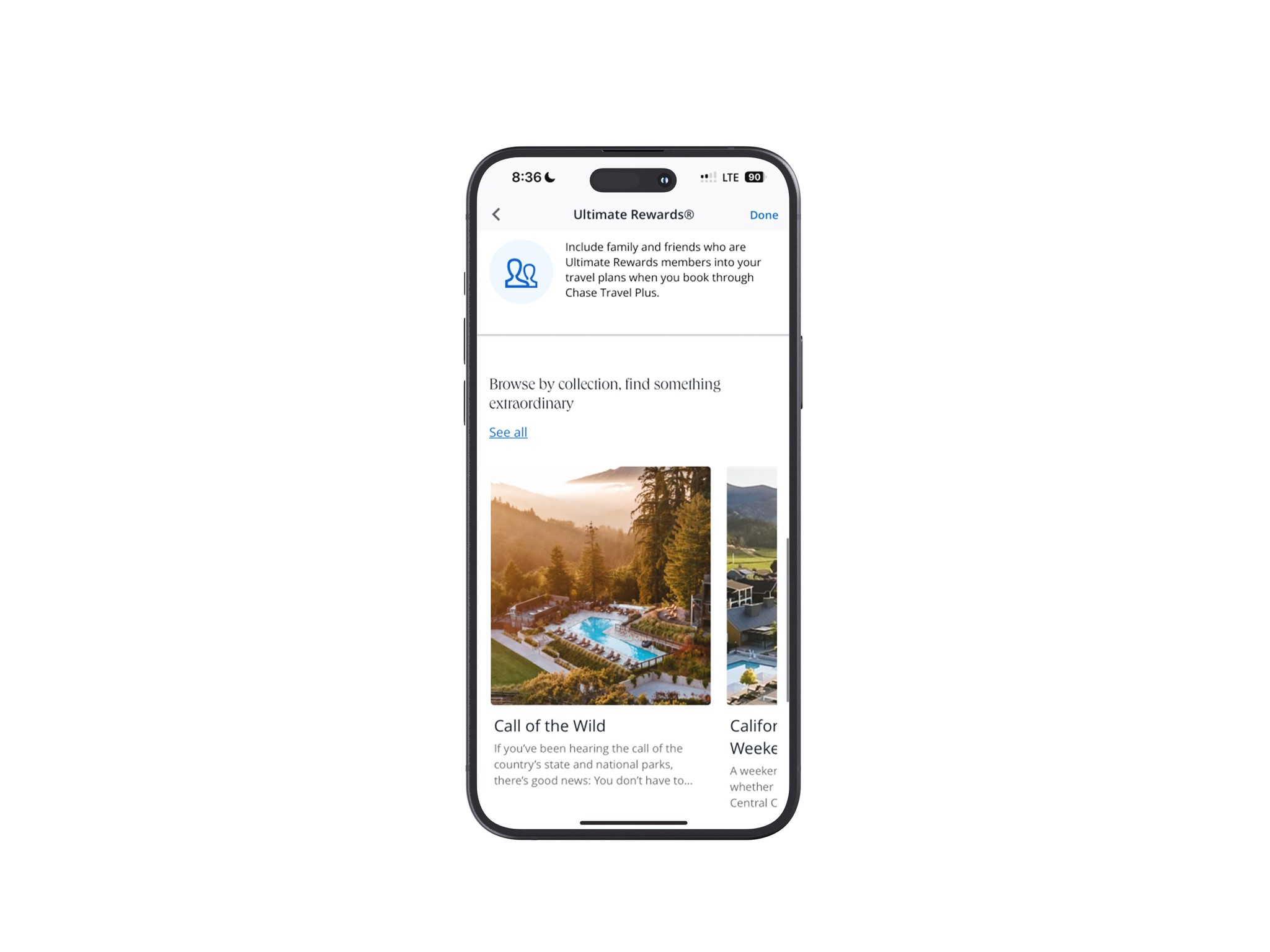
Expanding the Chase Travel portal’s capabilities enhanced the utility for Ultimate Rewards members, giving Chase a competitive edge by allowing seamless travel planning and bookings in one place.
Innovating Chase Travel
What was my approach towards expanding what Chase Travel offers?
1.
Find out how credit card holders like to use their perks, what they'd like to see offered from banks, and research what banks and travel companies do well.
2.
Use research findings to develop wireframes which implement new features to test for feedback.
3.
Refine and iterate for final product.
02 - 01
Unveiling banks' tactics and discovering the consumer experience.
Research Summary
Secondary Research
Before I could solve the issue, I needed to identify the vulnerability first.
Faced with the challenge of integrating new functionality into the established finance and banking industry, I tackled the issue by analyzing and comparing credit card offerings from three leading banks—American Express, Citi, and Capital One—against Chase's offerings. This comparison enabled me to identify an opportunity for innovation and improvement.
Here were my takeaways…
They all incentivize consumers who travel a lot or plan to travel regularly.
Rewards users for using their travel portals.
They all have different methods in how users are able to redeem their acquired points.
Incentives are the main way that makes consumers want to use credit cards. Whether it’s cash back or other reward systems.
Given that card benefits are plain and simple, we could expand on the experience given to users; making it more engaging.
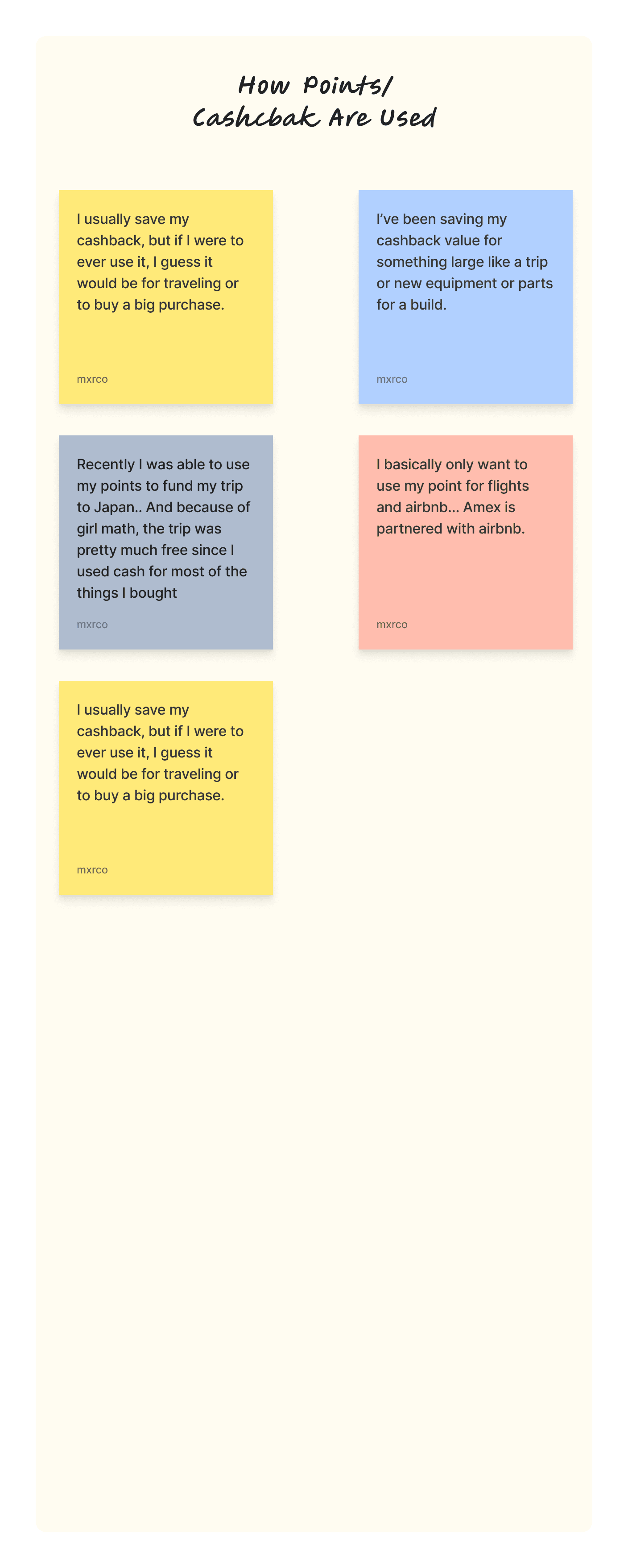
User Research
Discovering a demographic.
Now that I have a goal in mind, I had to see who would benefit from something like this. If no one benefits, it would be time to pivot.
59%
of travelers plan to use a travel card to book trips and pay for expenses during the trip.
-Forbes Advisor
52%
of Millennials use travel credit cards.
-Nerd Wallet
44%
of Gen Z use travel credit cards.
-Nerd Wallet
80%
of cardholders in 2024 with planned trips intend to pay for those trips with their travel credit cards.
-Forbes Advisor
Competitive Analysis
To solve for these questions, I had to see what’s out there to get a feel for what works.
Starting off, I decided to map out a competitive analysis to see what were the most commonly included functionalities and practices found in both recipe apps and learning apps (The 3 I referenced were Tasty, SortedFood's "Sidekick", and Duolingo).
Here were my takeaways…
Contextualize
Offer Modularity
Provide Simplicity
Practice Repetition
Give Positive Reinforcement
User Interviews
Seeking input from real people.
After narrowing my user pool to the two primary groups that use travel cards, I identified a specific demographic for interviews.
My goals were to gain insights into which credit cards were most popular, understand which features offered the most utility, and identify common pain points.
5 Interviewees
Ages 21-28
Travel Card Holders
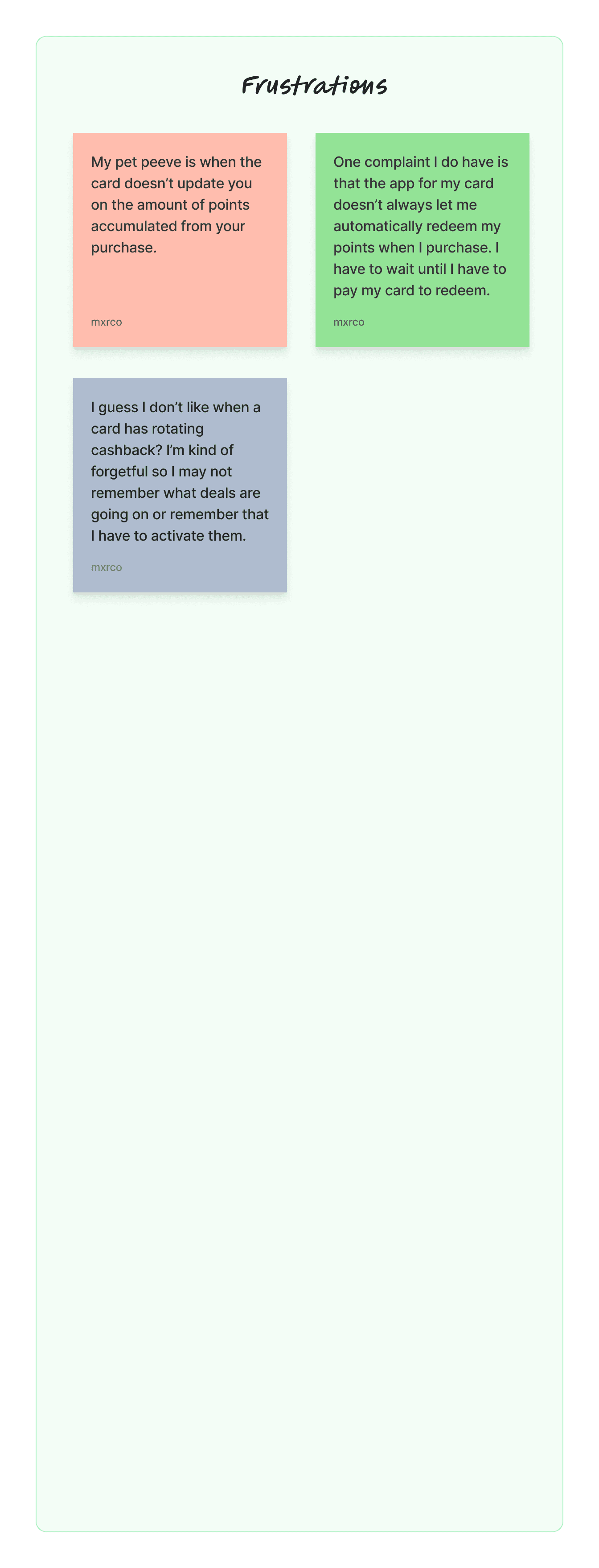
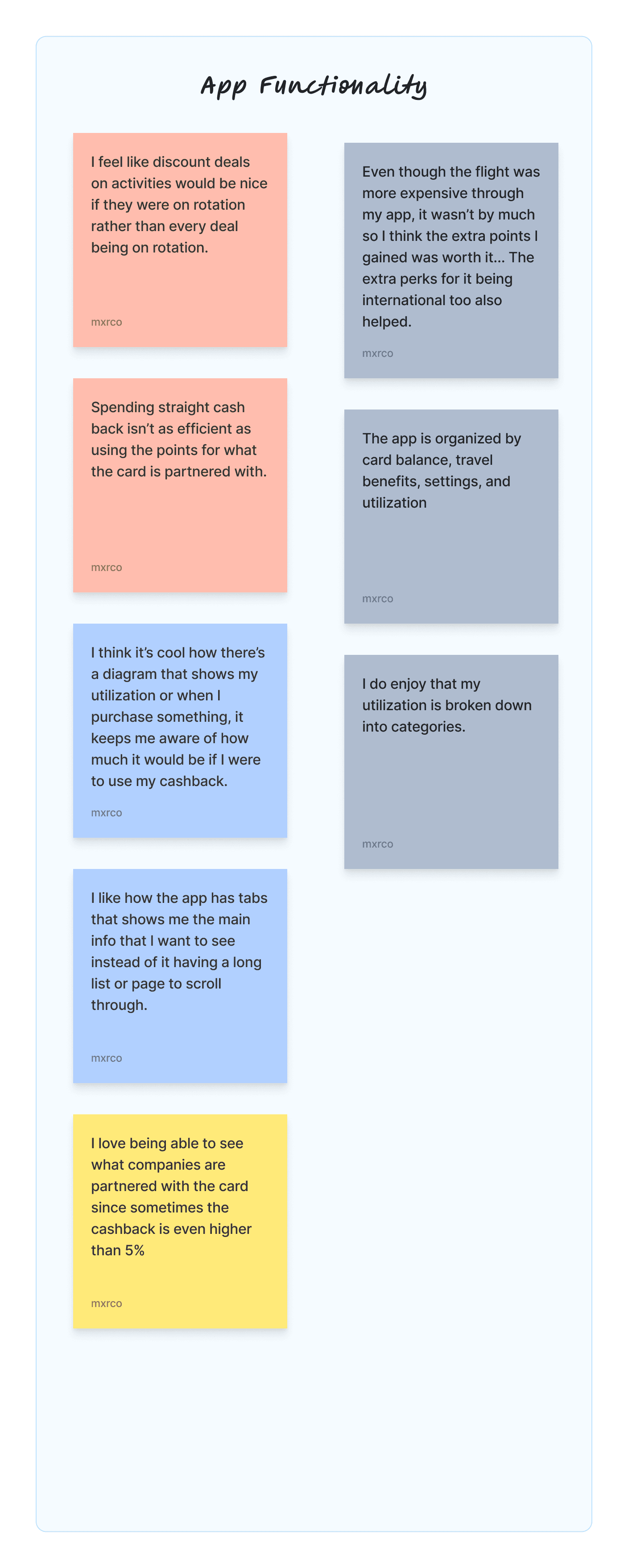
Affinity Mapping
Finding where the data overlaps.
Post-interviews, I compiled notable points into an affinity map to organize the data for analysis.
Research Key Findings
Users appreciate efficiency when using their cashback or other rewards.
Users prioritize versatility and benefits of signing up for new credit cards.
Users appreciate clarity and accessibility when it comes to specific information such as utilization.
Users vary in thought when it comes to functionalities that overlap.
02 - 02
Developing functional features.
Feature Development
Defining Perspective
Refining my interpretation of the users' perspectives.
Collecting user data enabled me to refine the user perspective that I use to address the problem at hand. After analyzing the affinity map, I realized another underlying problem that supports the goal of developing the Chase Travel Portal.
Here is what I noticed…
New Problem:
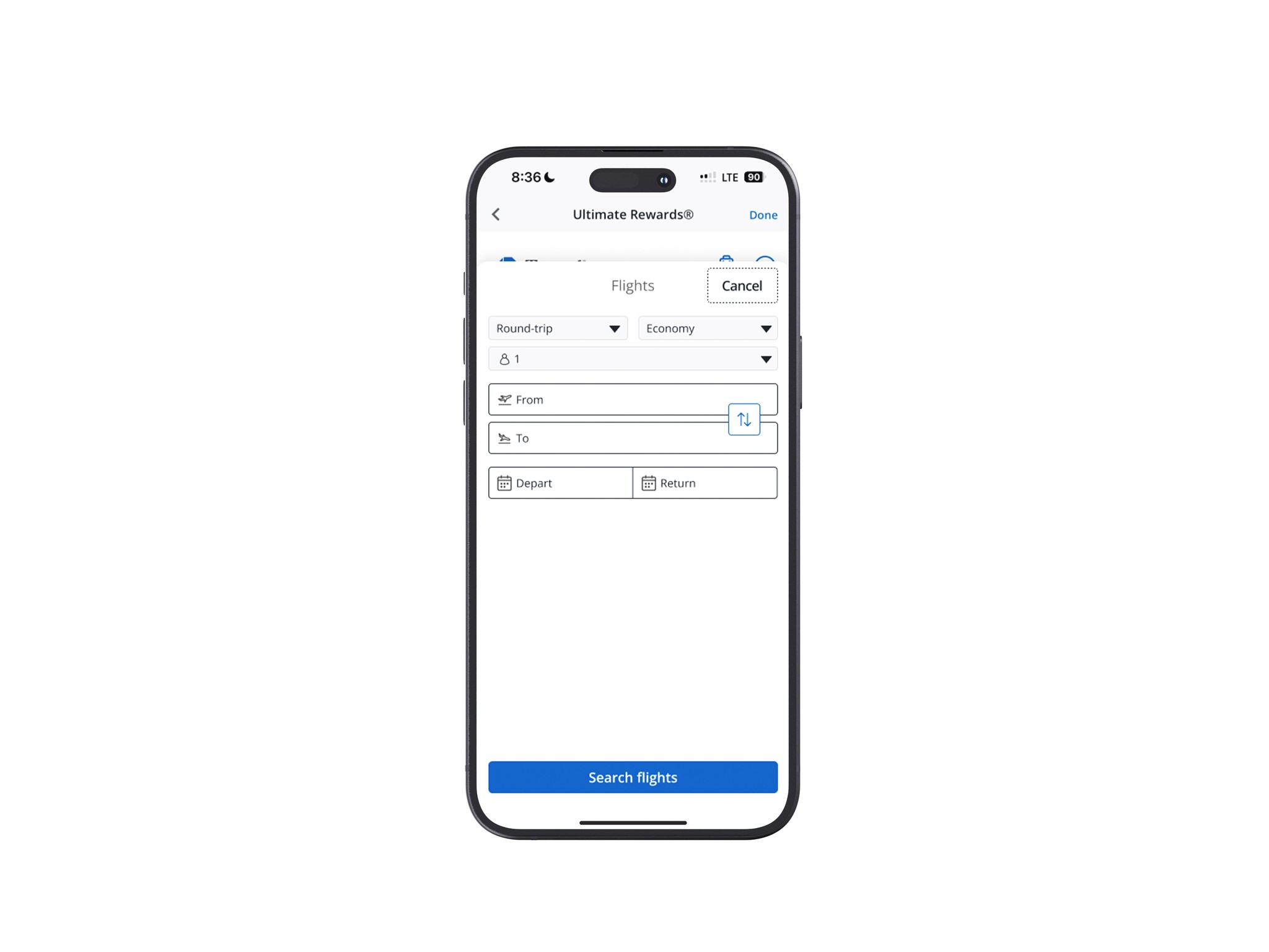
Despite using travel cards for travel purchases, cardholders are becoming less incentivized to book through travel portals despite the extra bonus points; aiding in the increase of competition between banks offering credit cards.
Reason 1:
Booking flights directly is typically cheaper than booking through the travel portal and the points gained from booking through the portal don’t outweigh the immediate savings made by booking direct (which still gives bonus points, although less).
HMW 1:
HMW 2:
Reason 2:
Booking through travel portals may not be as convenient as booking through travel sites.
HMW 3:
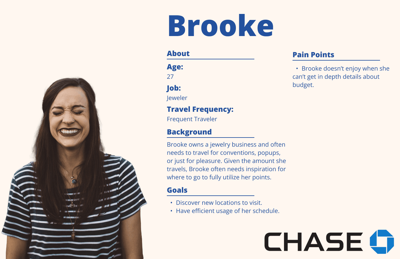
User Personas
Giving a face to our demographic.
Using a combination of my user research and freshly defined perspectives, I was able to develop 2 personas that will keep me on track during development.
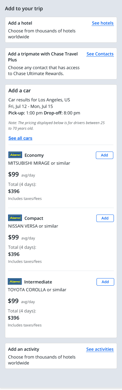
Feature Roadmap & Flows
Determining which features to roll out.
Feature roadmap
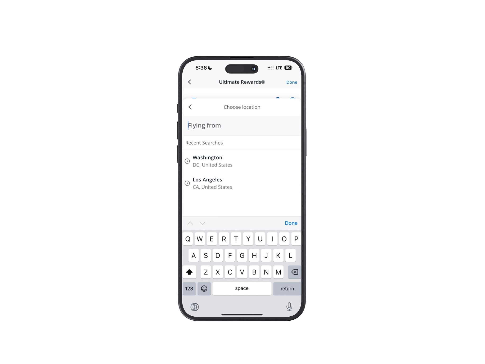
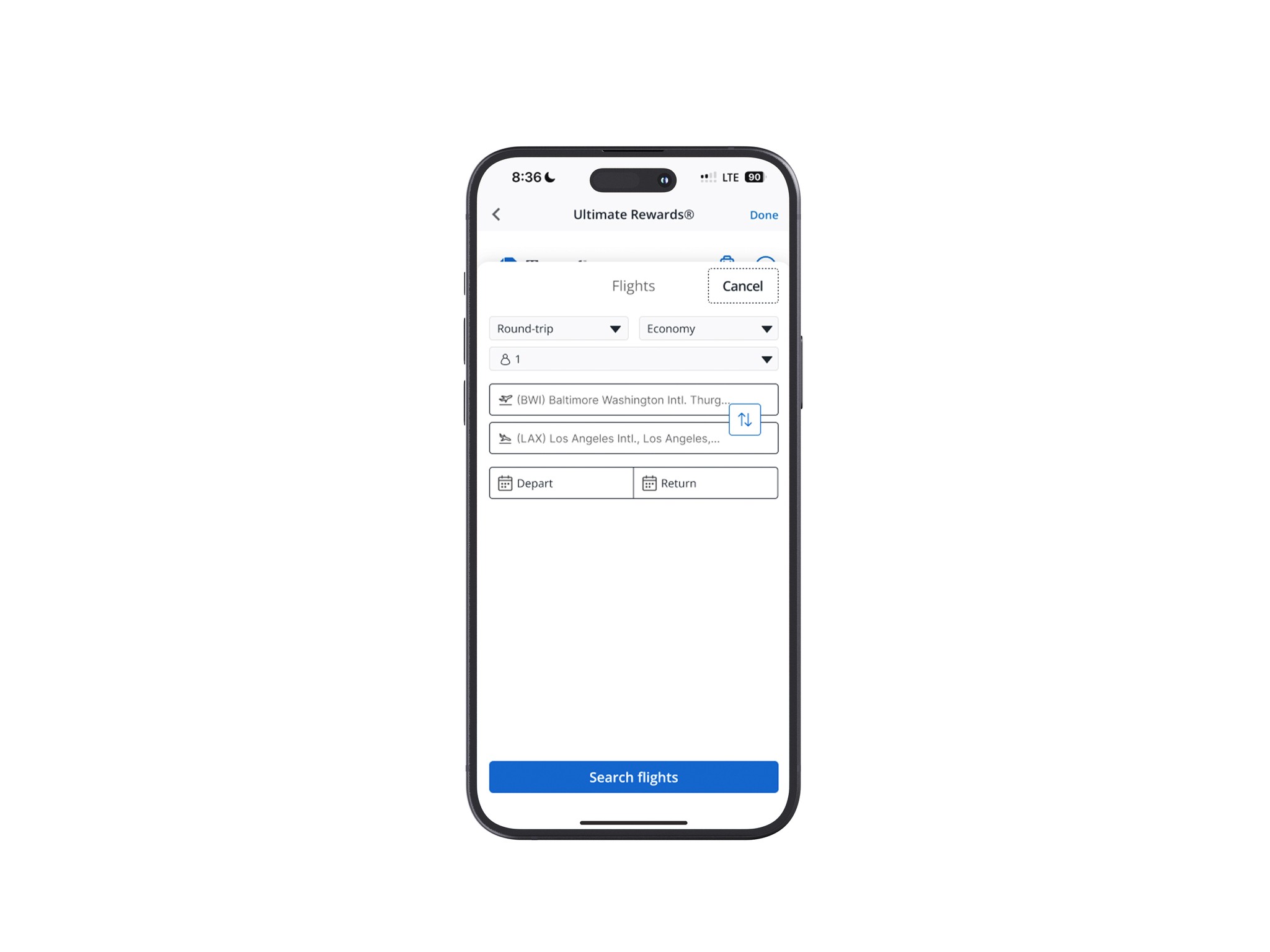
Deciding which features to prioritize was challenging due to time constraints, which limited how much I could develop. So, taking a bit of time to create a road map allowed me to look over my user data in order to determine which functionalities would be most beneficial to the end-user right away.
User flow
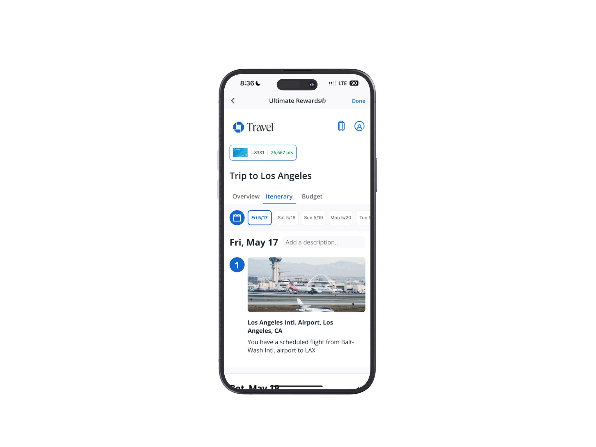
Creating the user flow was straightforward since the main pages and tasks were already set up. To find inspiration for adding a planner, I did a second round of competitor analysis, focusing on indirect competitors like Wanderlog.
02 - 03
A polished product is soon to come.
App Development
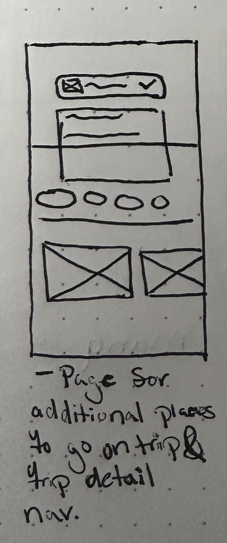
Lo-Fi Wireframes
First round of wireframes.
With a clear plan, I created my first set of wireframes.
Since I was adding features to an existing service, I was able to save time by integrating my additions with the existing setup instead of starting from scratch.
Lo-Fi Feedback
After developing Lo-Fi wireframes, I like to get feedback relating to the general flow of my designs. I find that doing so allows me to catch details worth considering that I'd otherwise overlook.
Some concerns that were brought up were..

Key Takeaway 1
"Mmm… I think inviting a friend before you finish finding a flight kind of seems a bit odd. Like, how would I have a plus one at concert without them knowing where the venue is.. it's possible, but maybe not the best thing to do."
-Anya S.
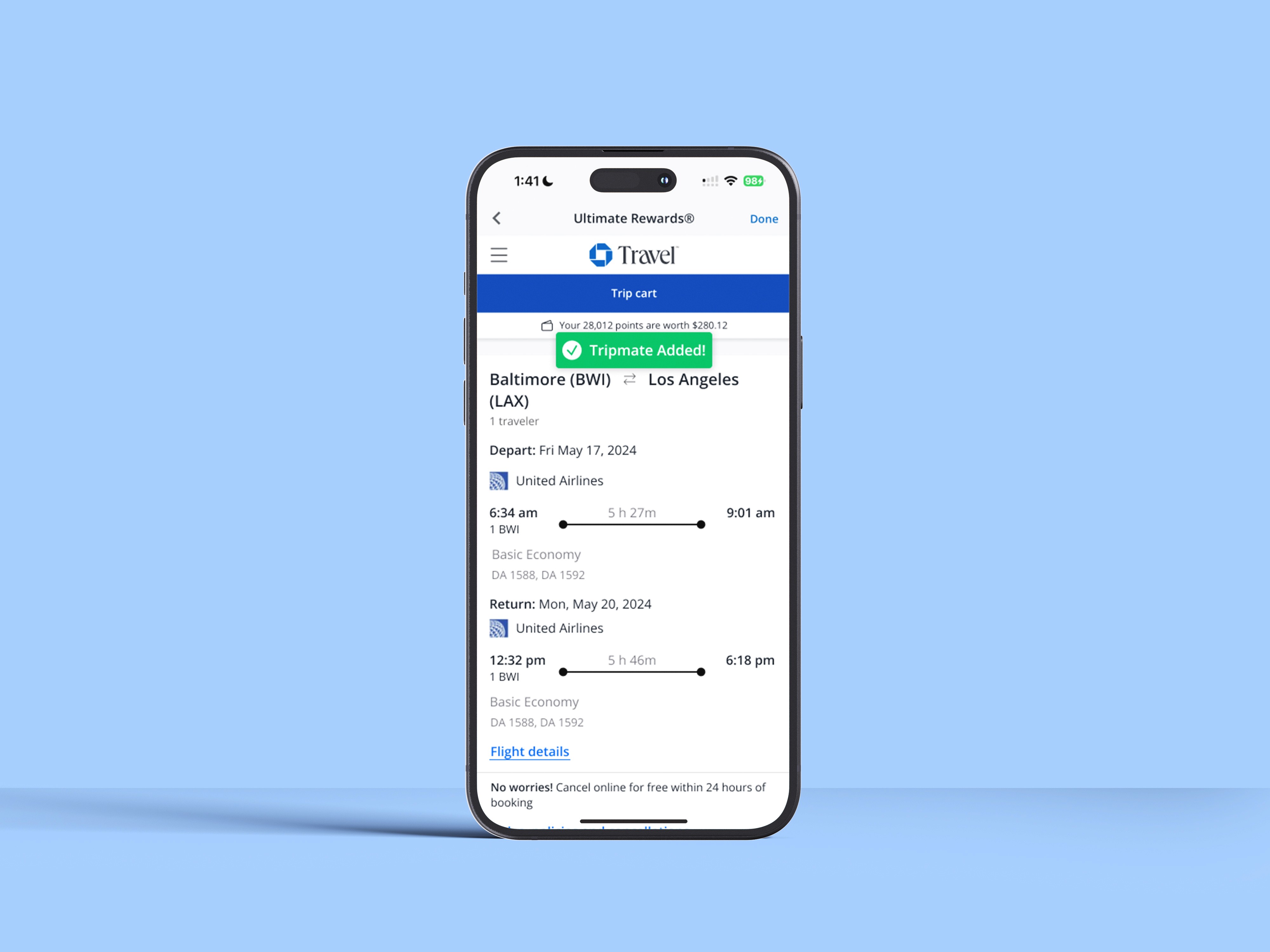
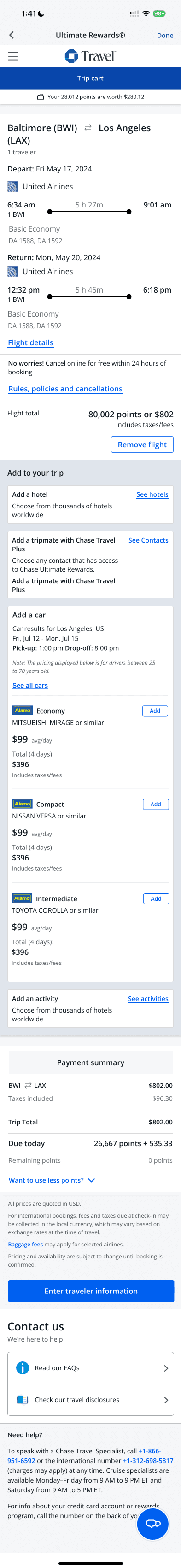
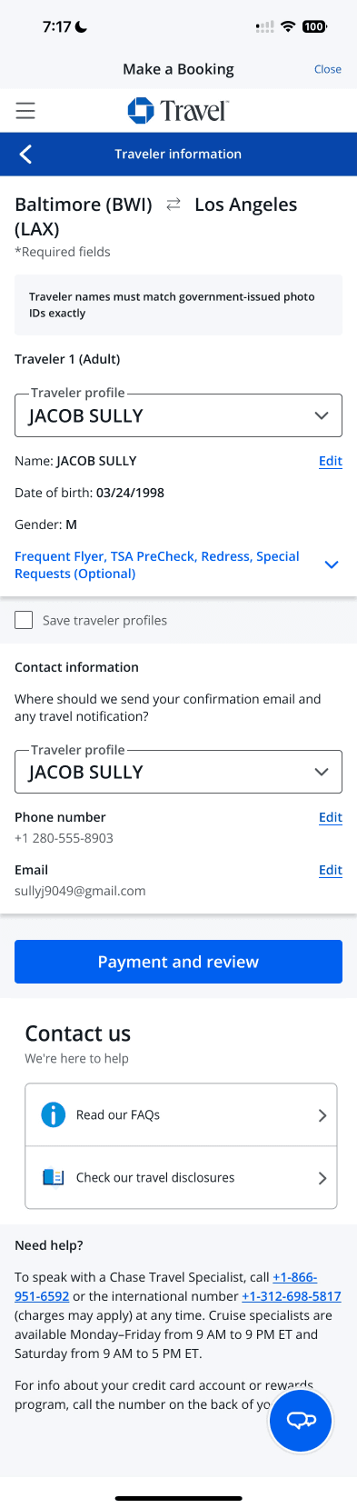
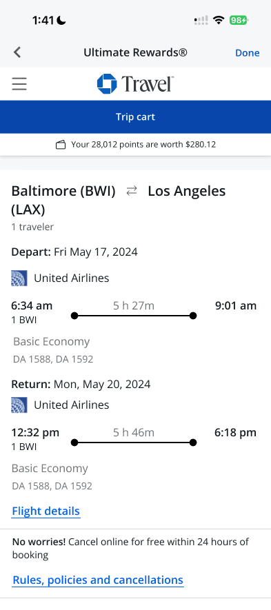
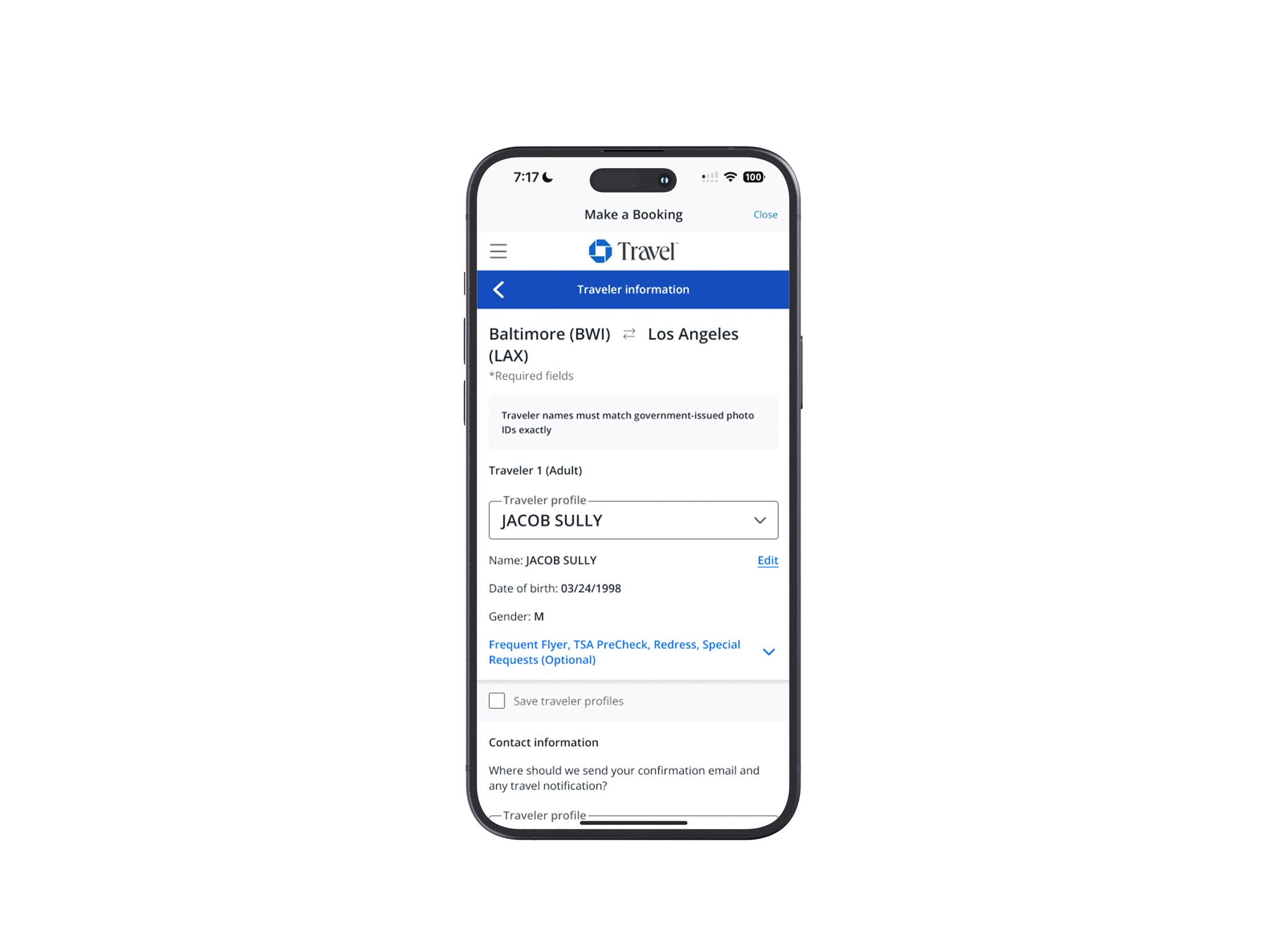
Based on this feedback, I made the adjustment to instead, have the add the invitation option become available after a user selects a fight are in the "Trip Cart" section.
Key Takeaway 2
"I think a cool thing to try to add would be way for everyone to leave a comment on locations added. Like sometimes when I'm out with friends, I want to try a new spot, but they may tell me what their experience was like there and I may change my mind."
-Chaz J.
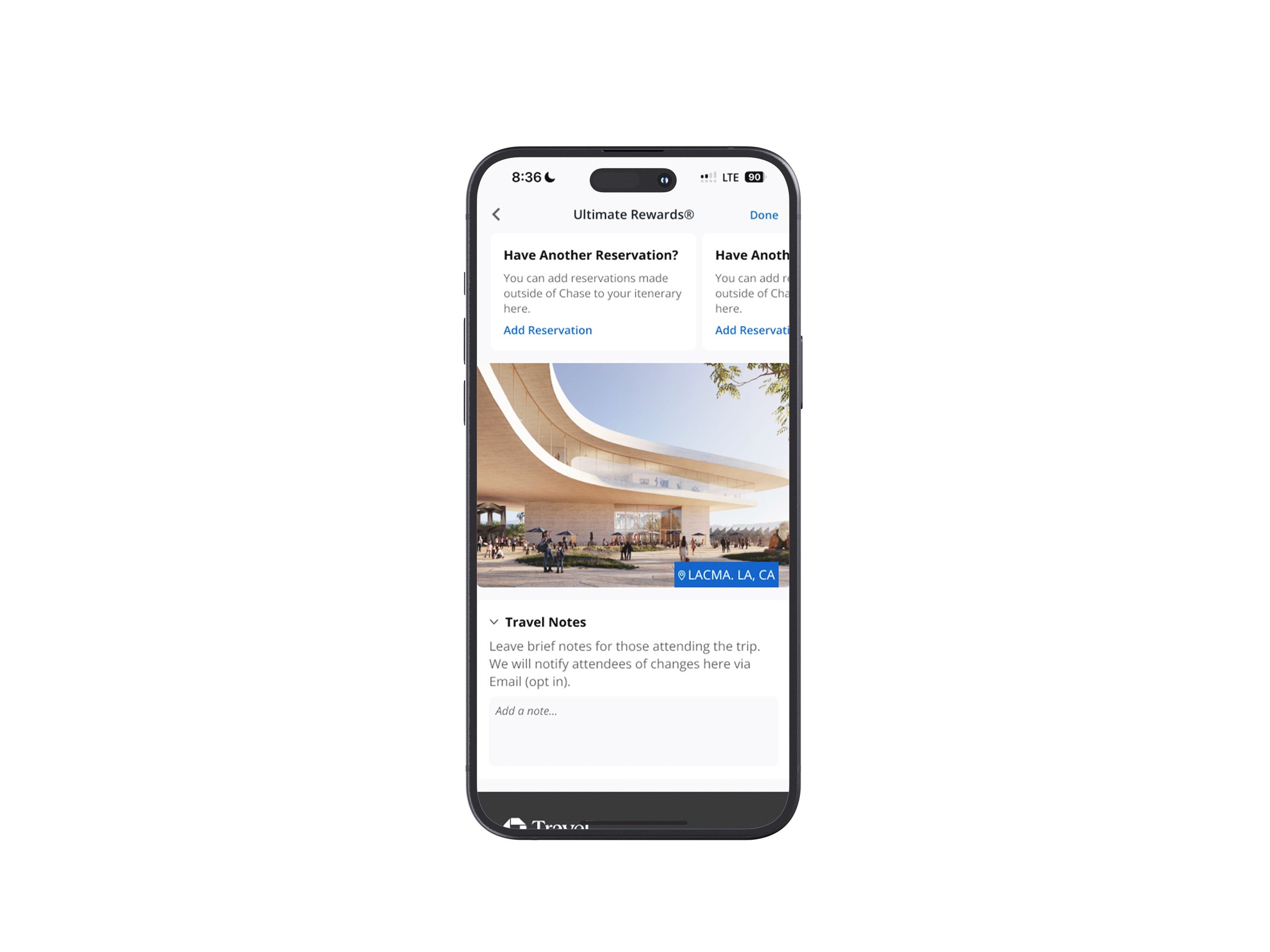
Using this as a guide, I created a notes card to serve as a more versatile and simple feature. I made this decision due to time constraint as well as a thought of seeing both reviews and notes under the location would feel a bit cluttered.


Hi-Fi Screens
Close to a final product.
After implementing suggestions, I was able to fully flesh out my vision for another round of user testing.
Hi-Fi iterations
Presenting my Hi-Fi screens to testers was a bit nerve-racking, but still exciting. As there was a lot more added between the lo-fi and now I was a bit worried about needing to make drastic changes but that wasn't the case in the end.
Users were pleased with how well the changes I made meshed with the existing Chases aesthetic, but did note some things worth considering for some added polish.
Here are the updates made…
Iteration #1
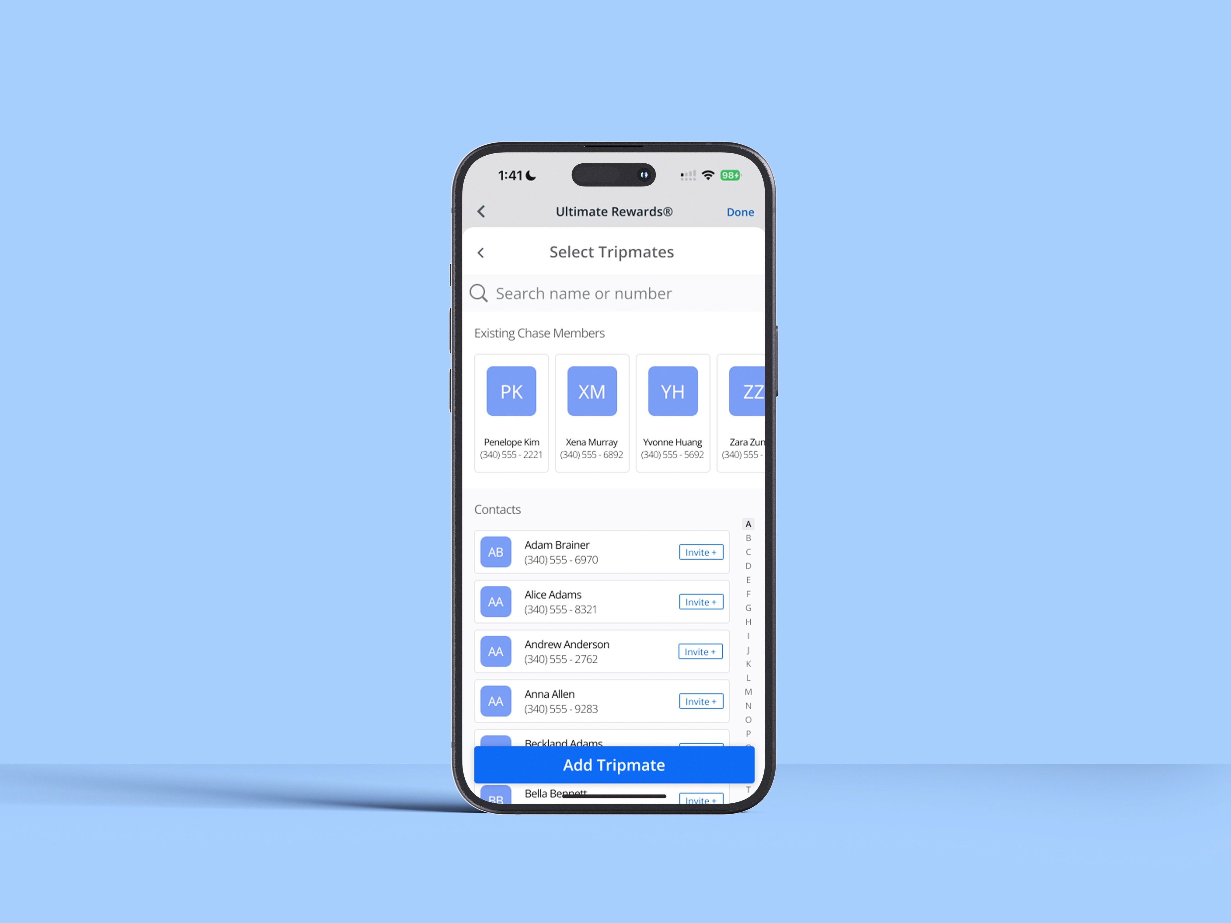
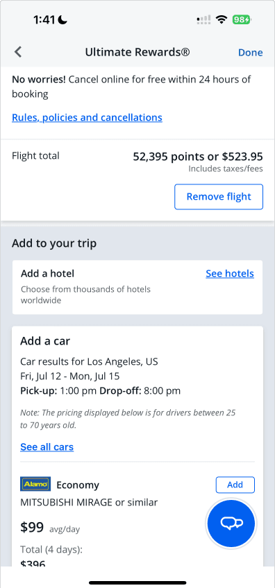
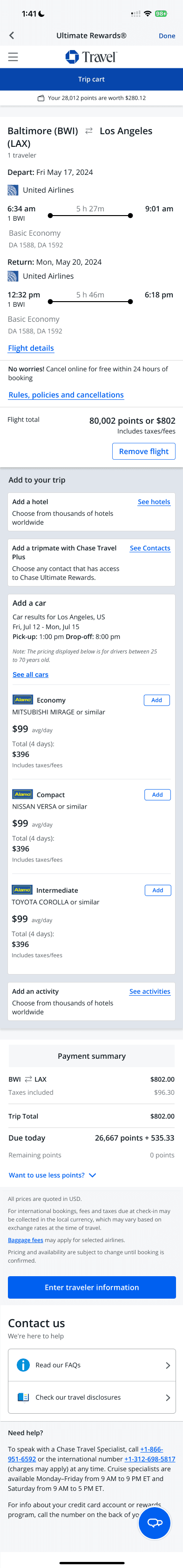
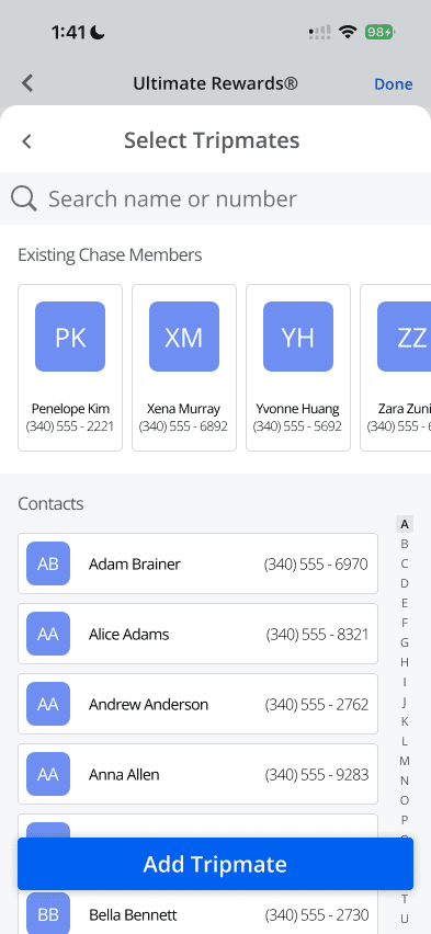
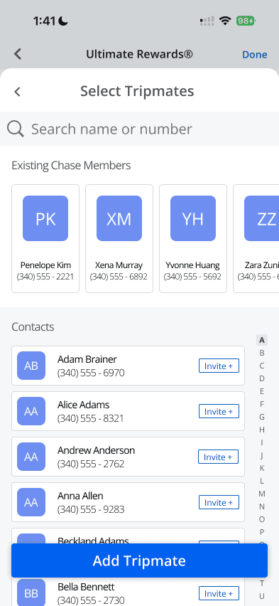
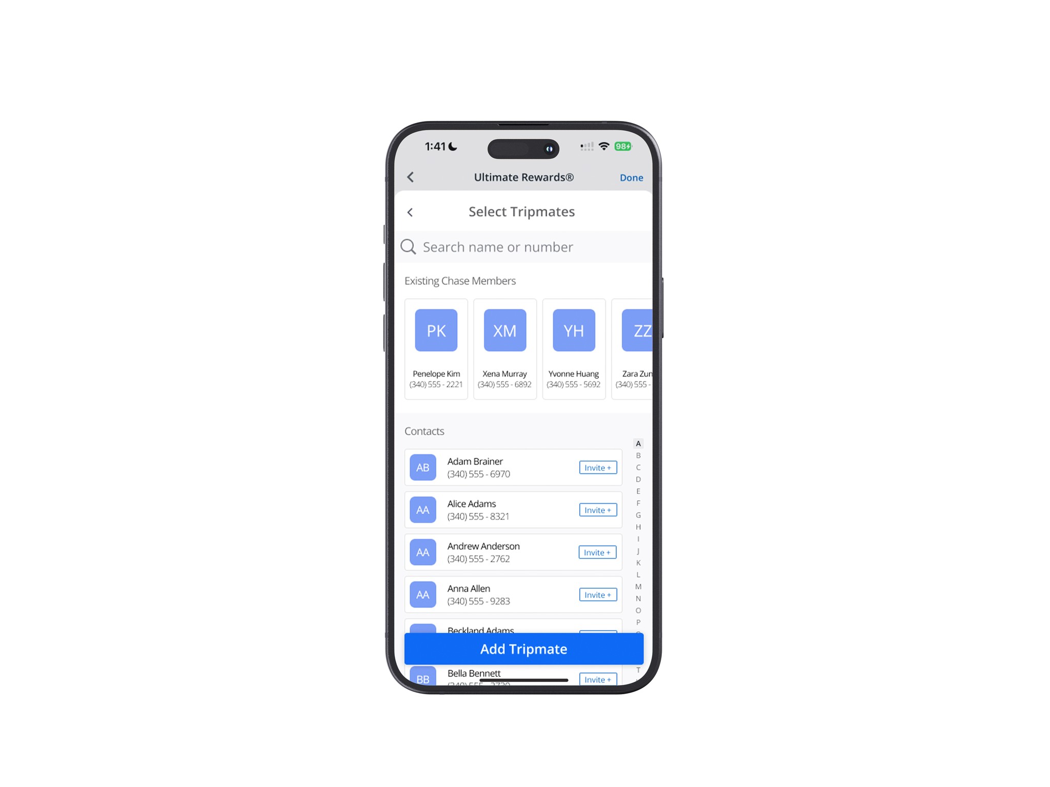
When adding contacts, I made the adjustment to provide and "Invite" toggle as it may get confusing when selecting multiple people.
Iteration #2
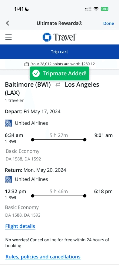
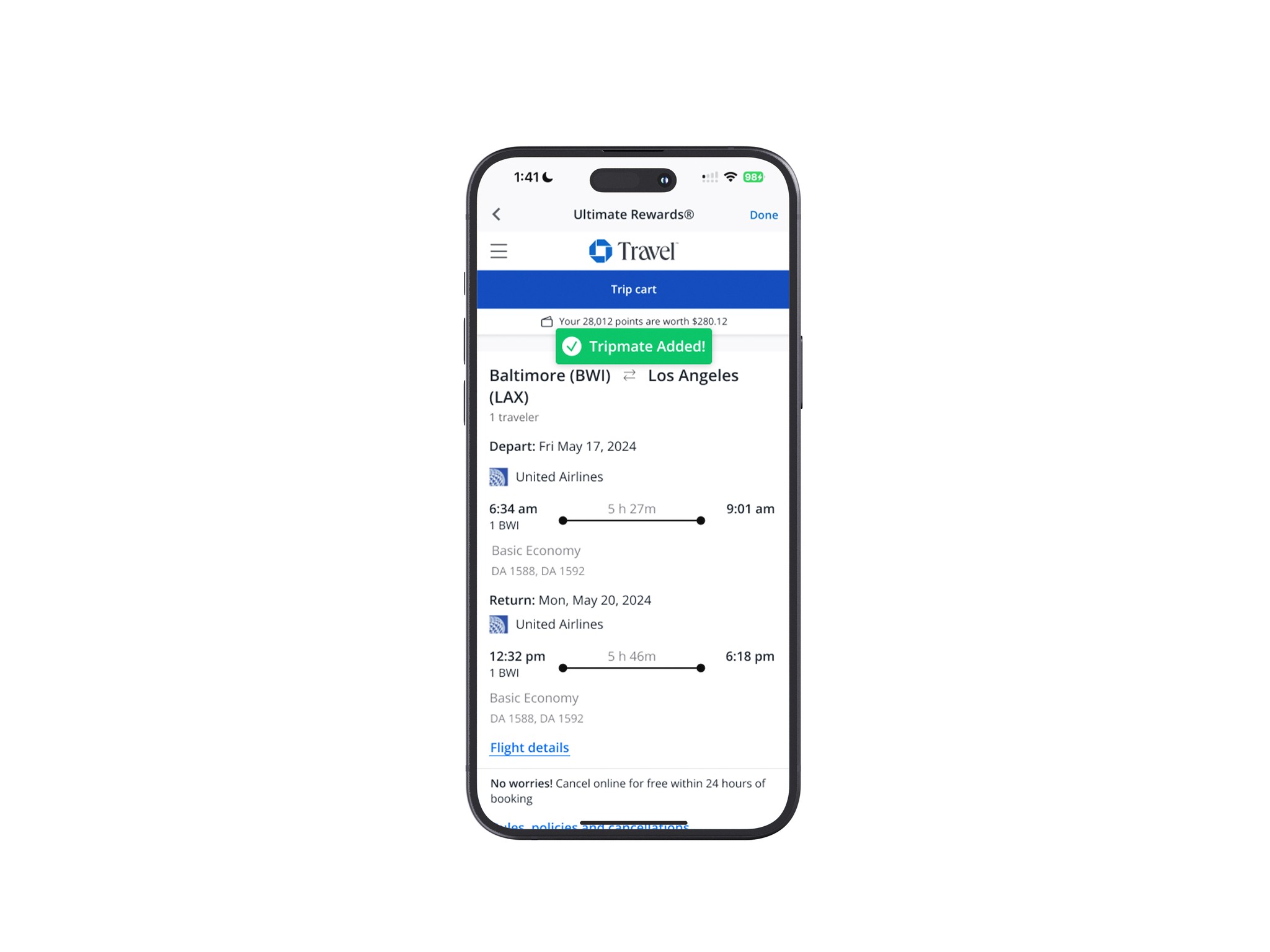
Being made aware of the abrupt jump between screens after booking a flight or inviting friends, I implemented a "toast" to provide confidence to the user that the action done was a success.
Iteration #3
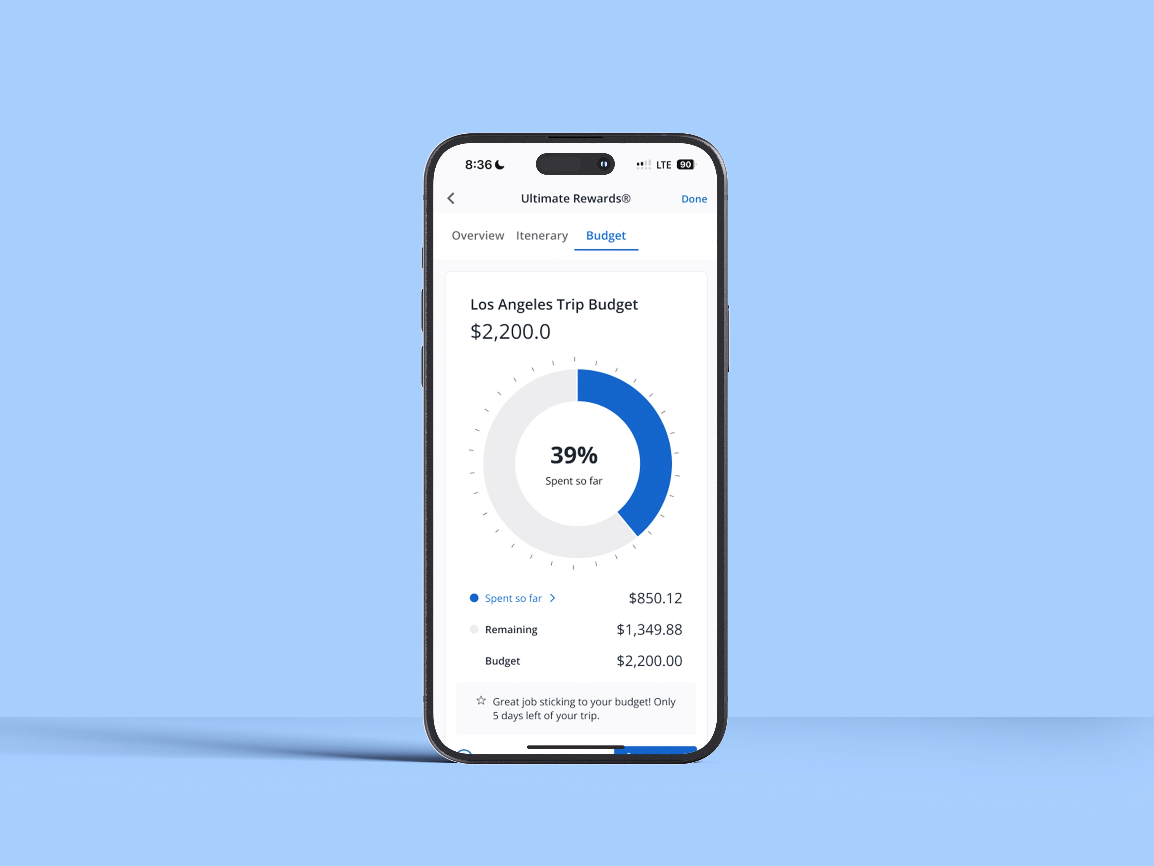
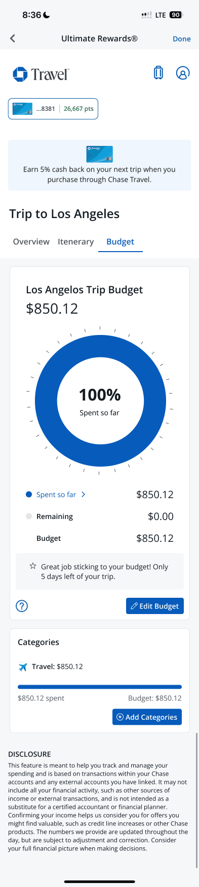
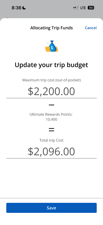
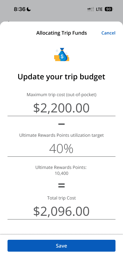
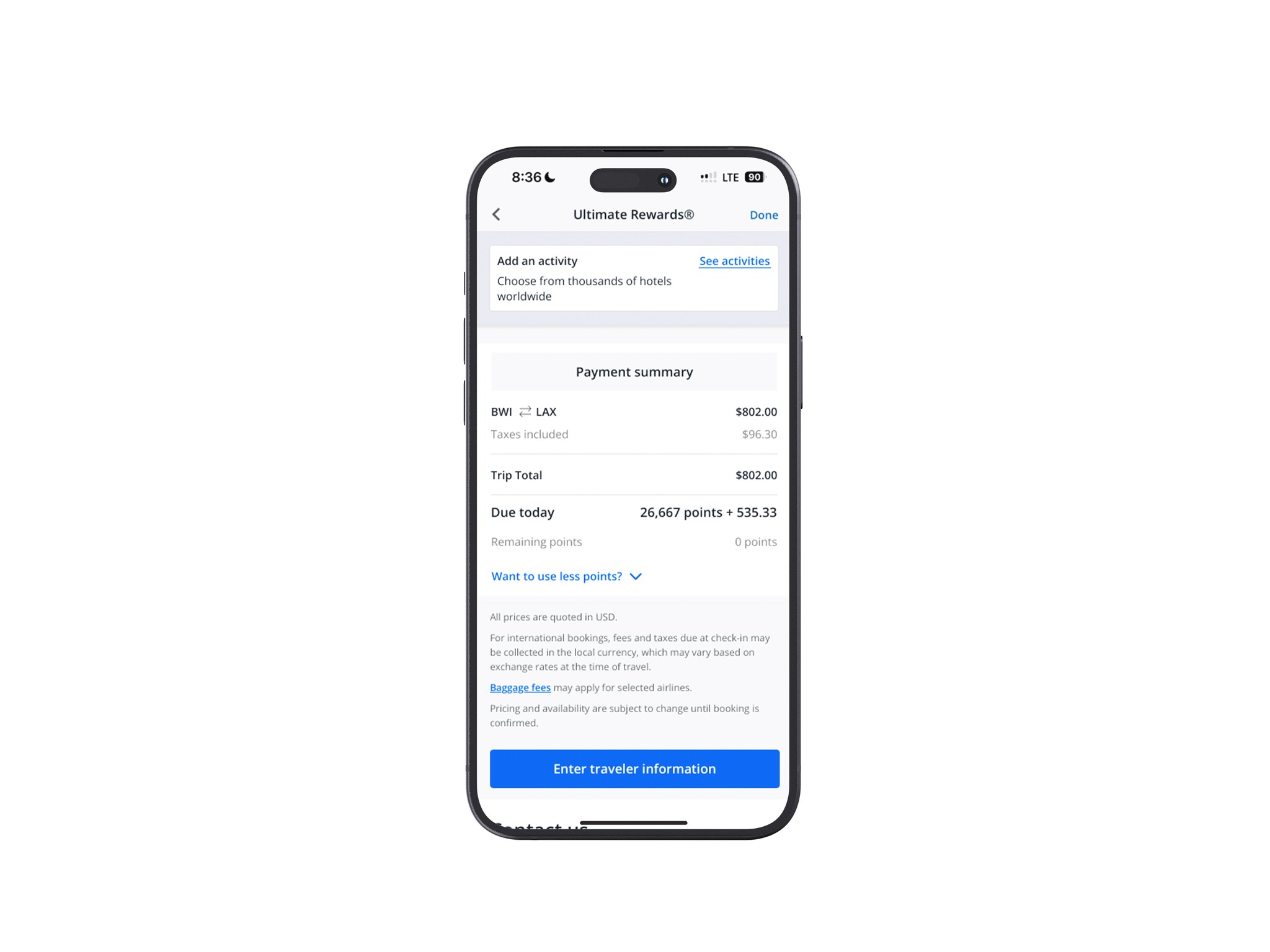
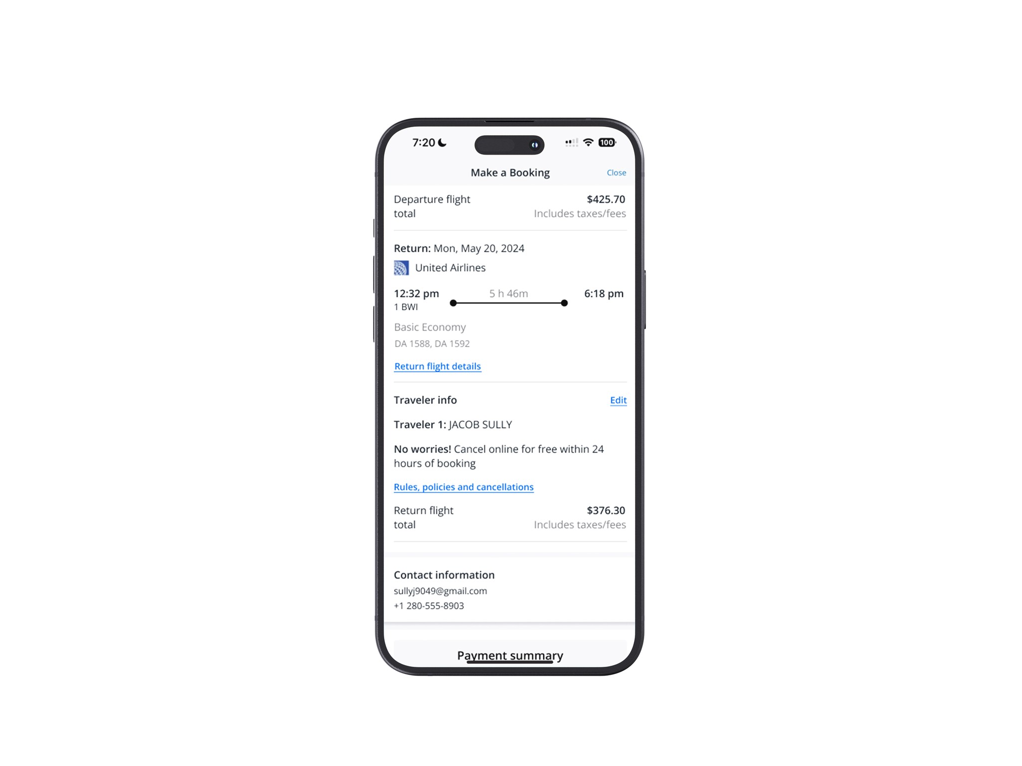
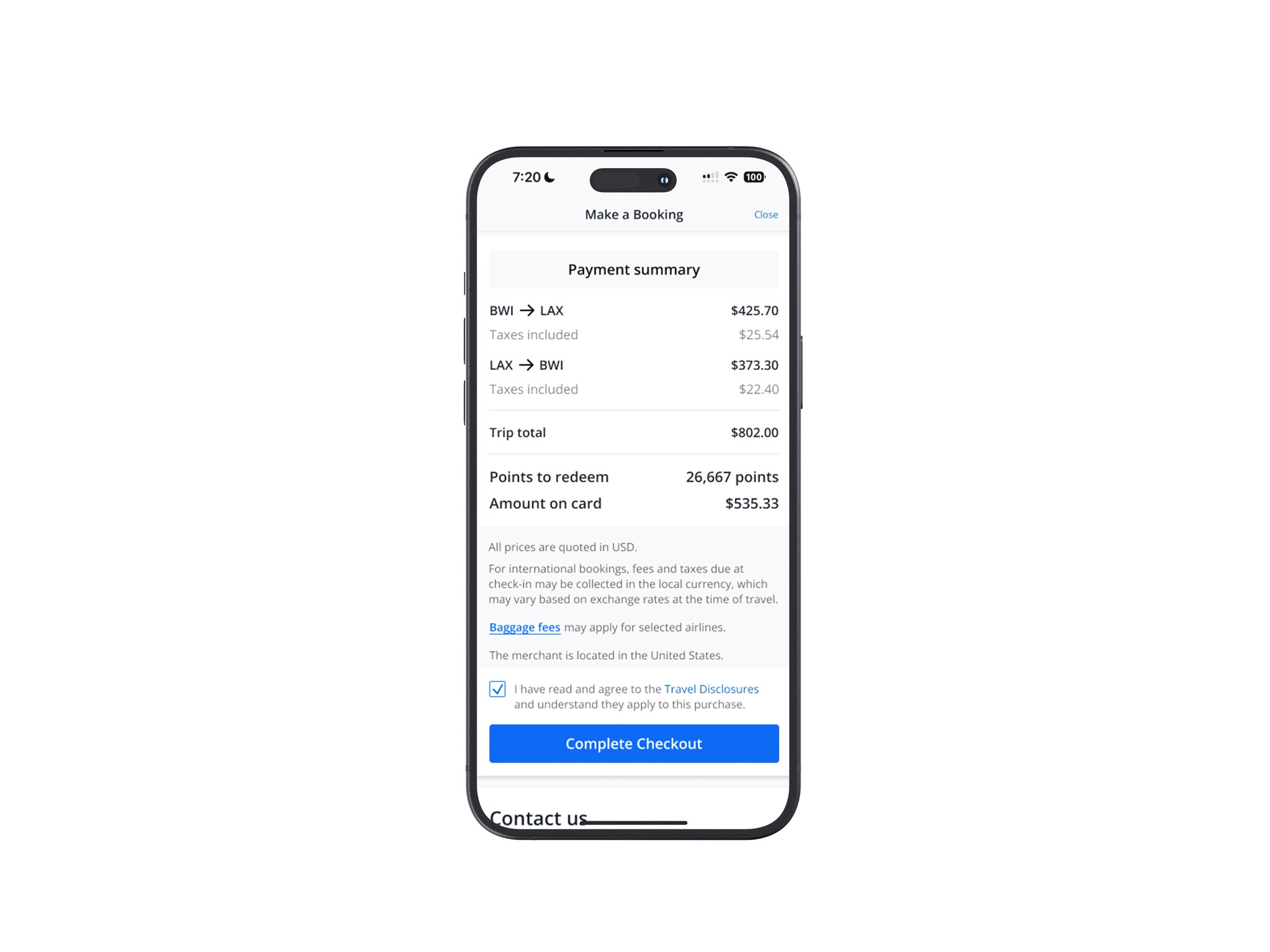
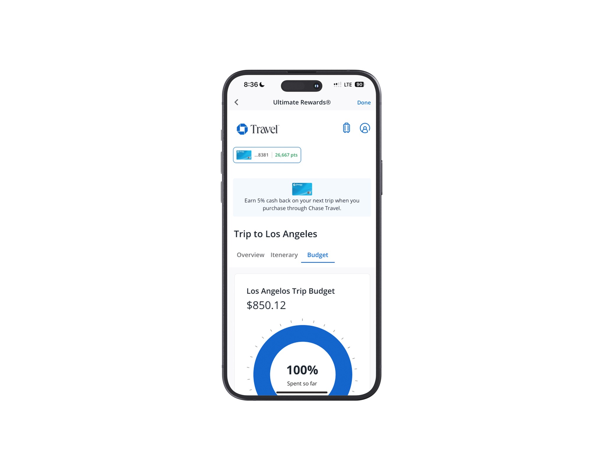
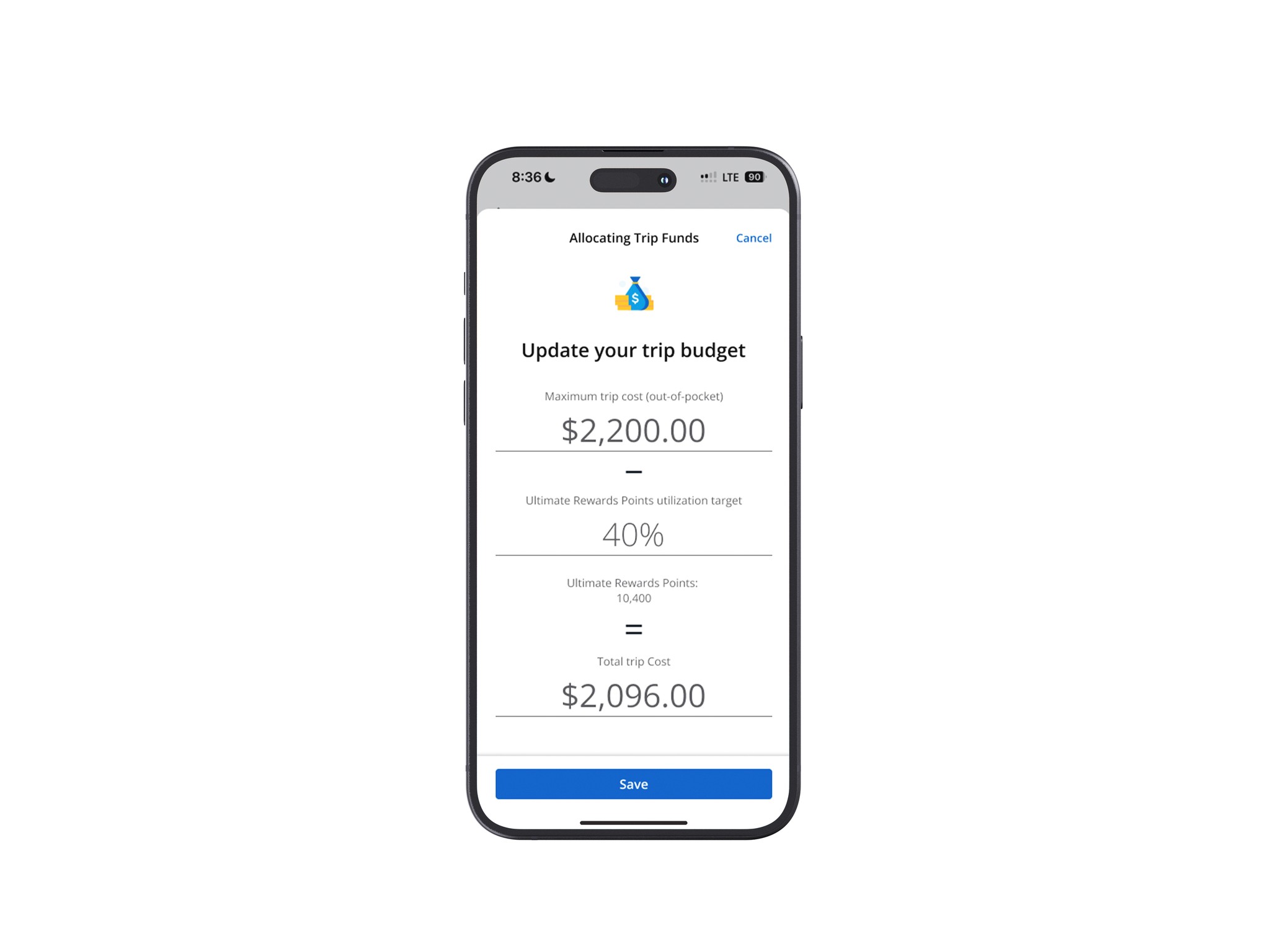
When adjusting the trip budget to account for reward points, I provided a percentage-based option.
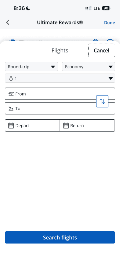
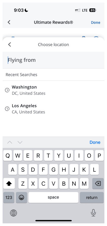
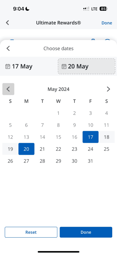
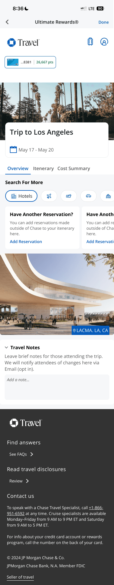
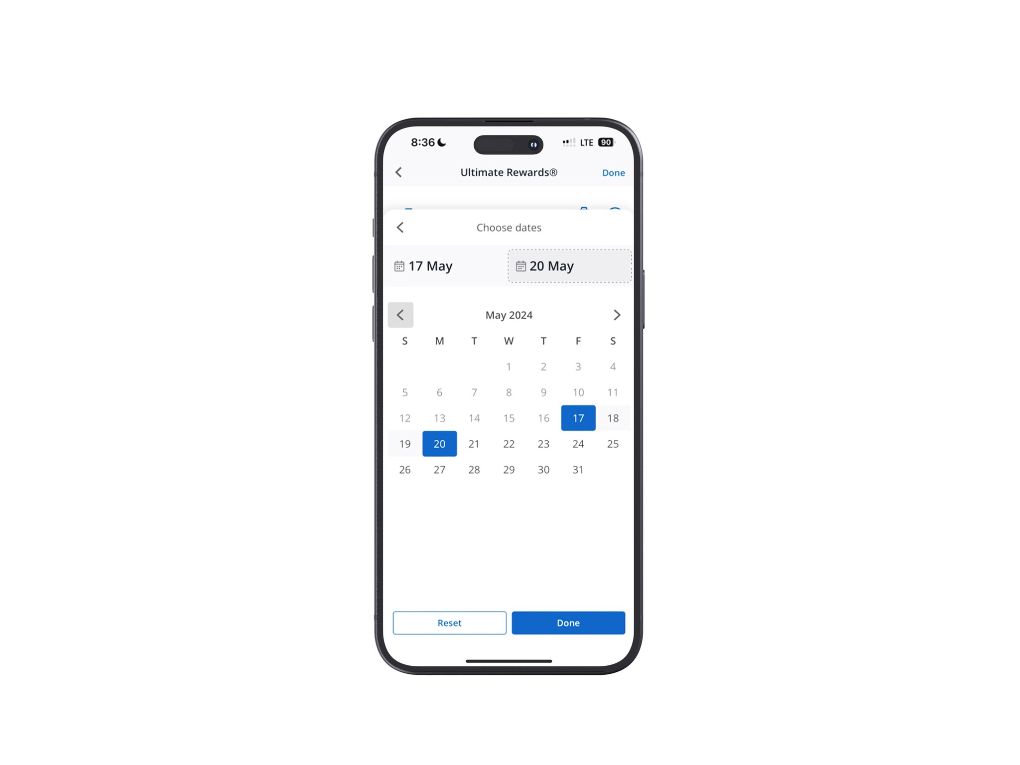
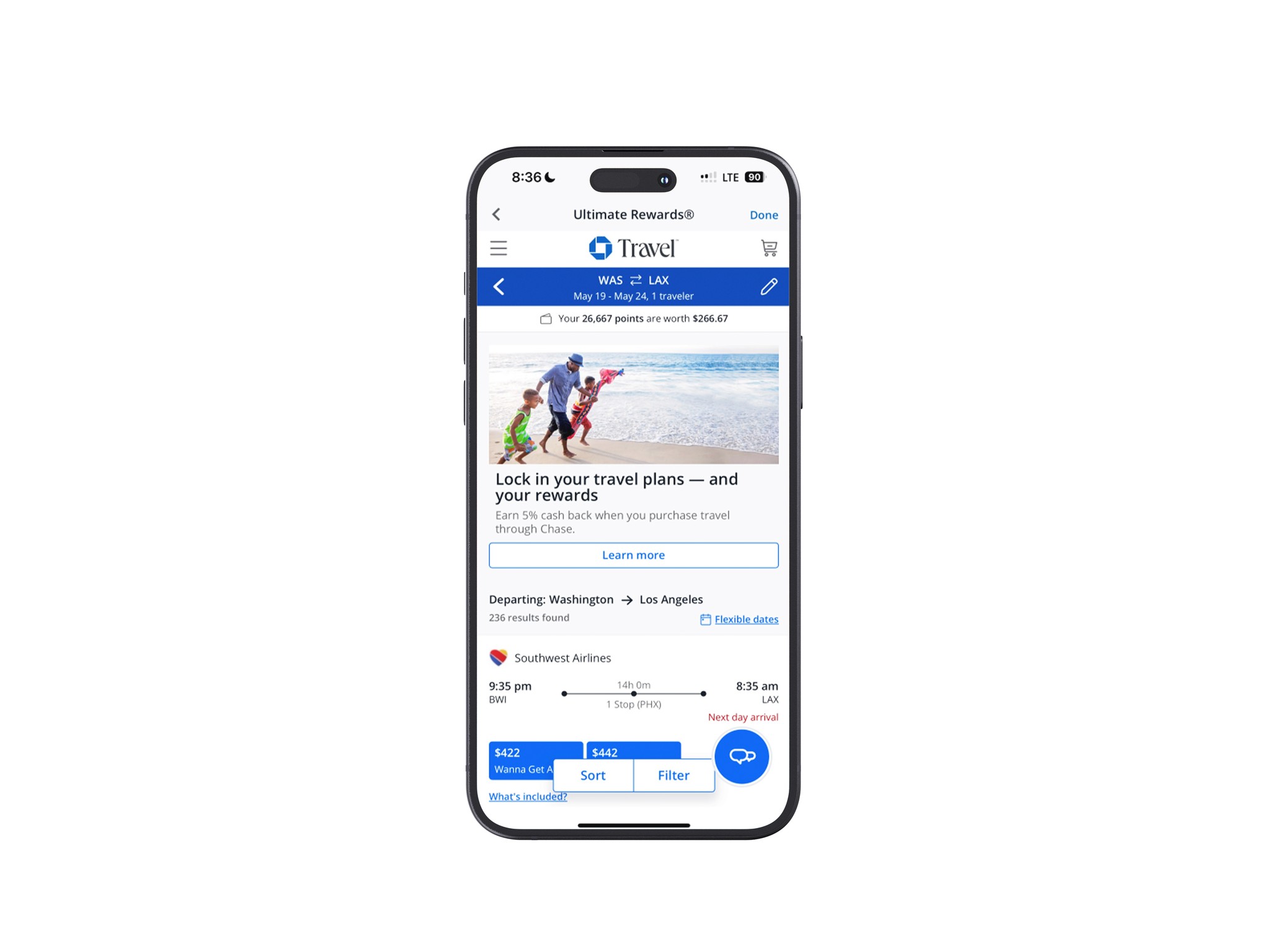
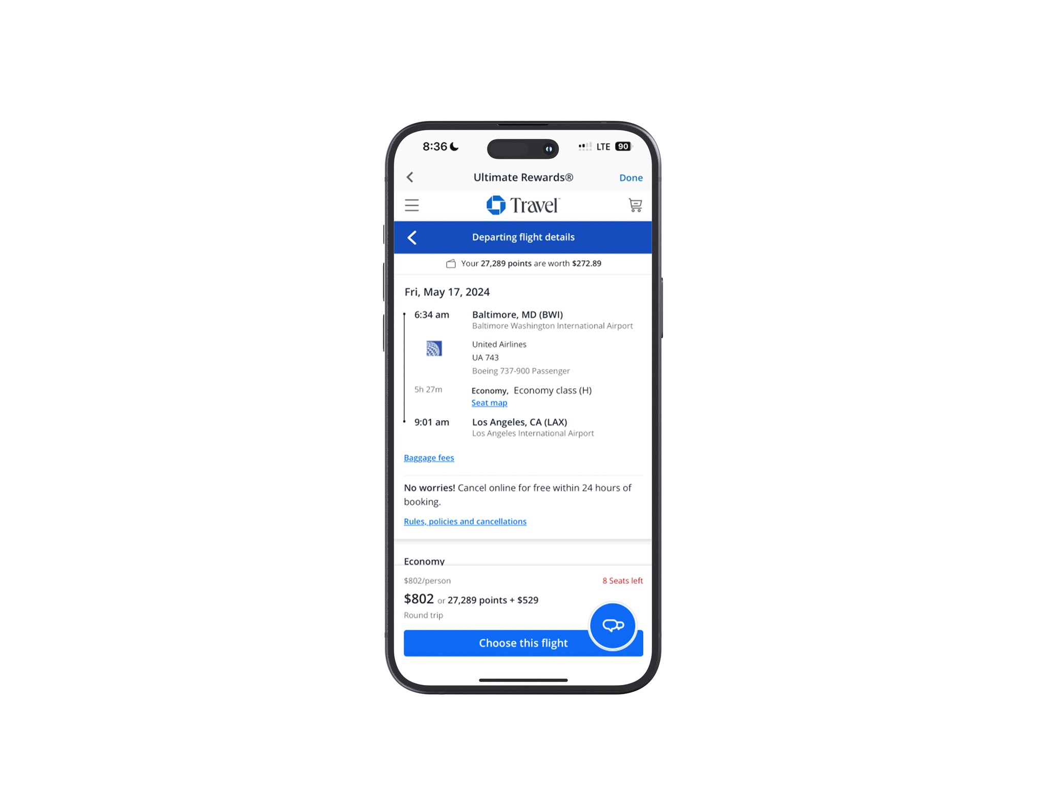
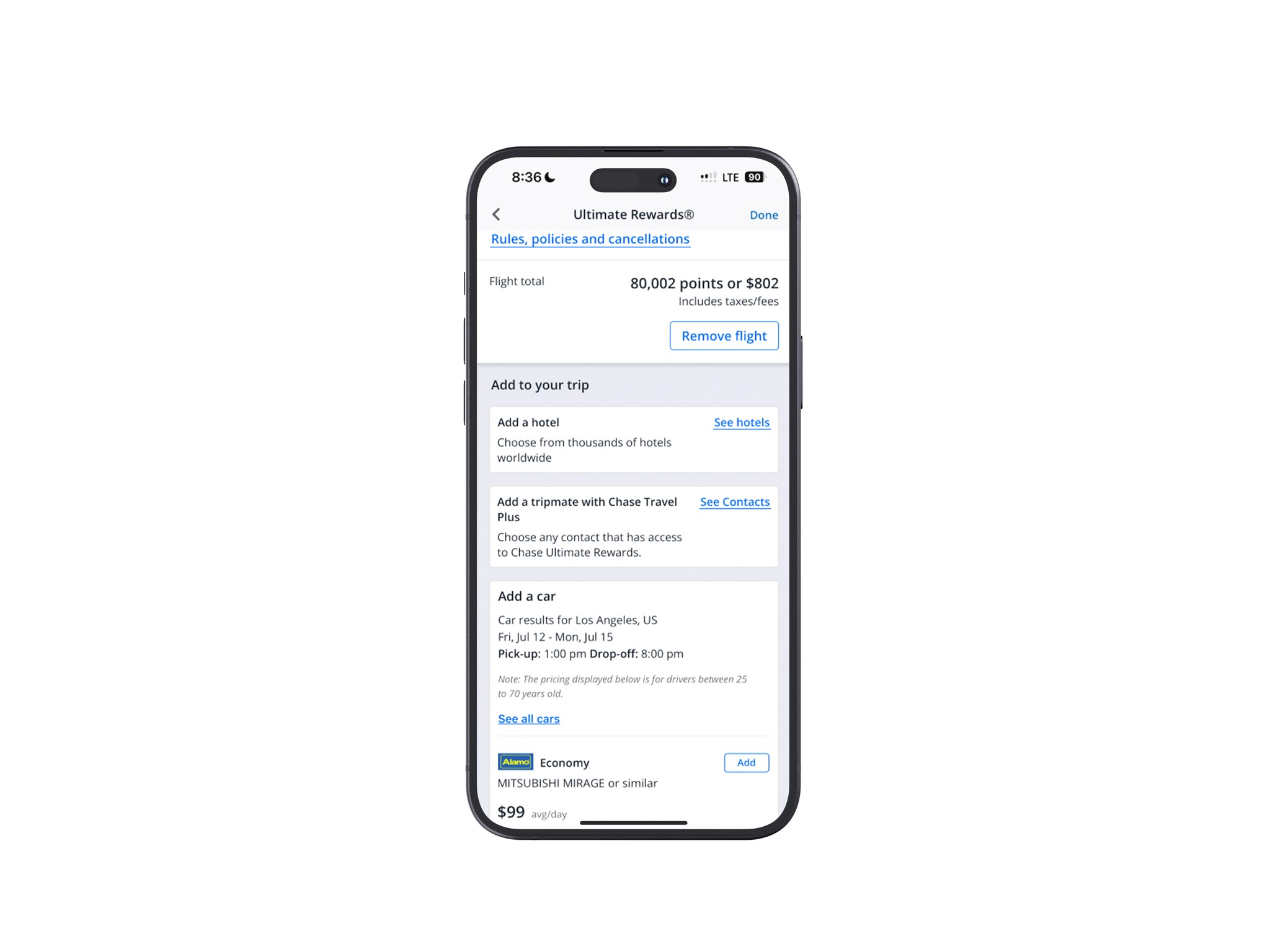
Hi-Fi Prototype
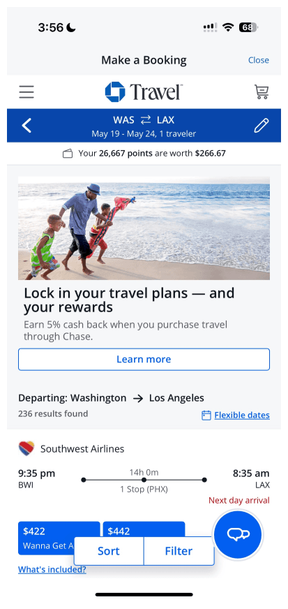
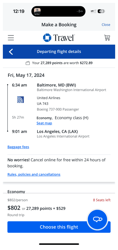
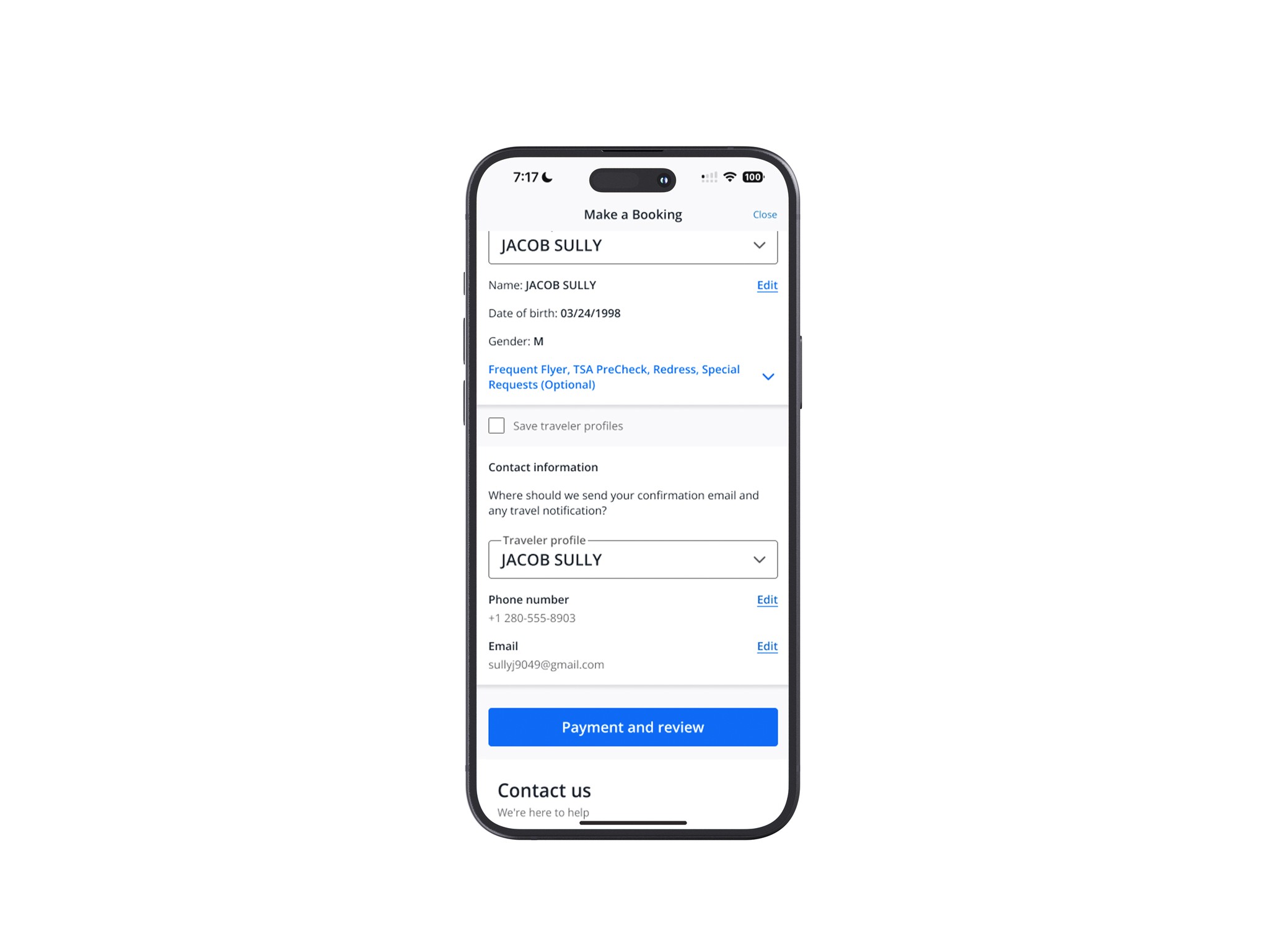
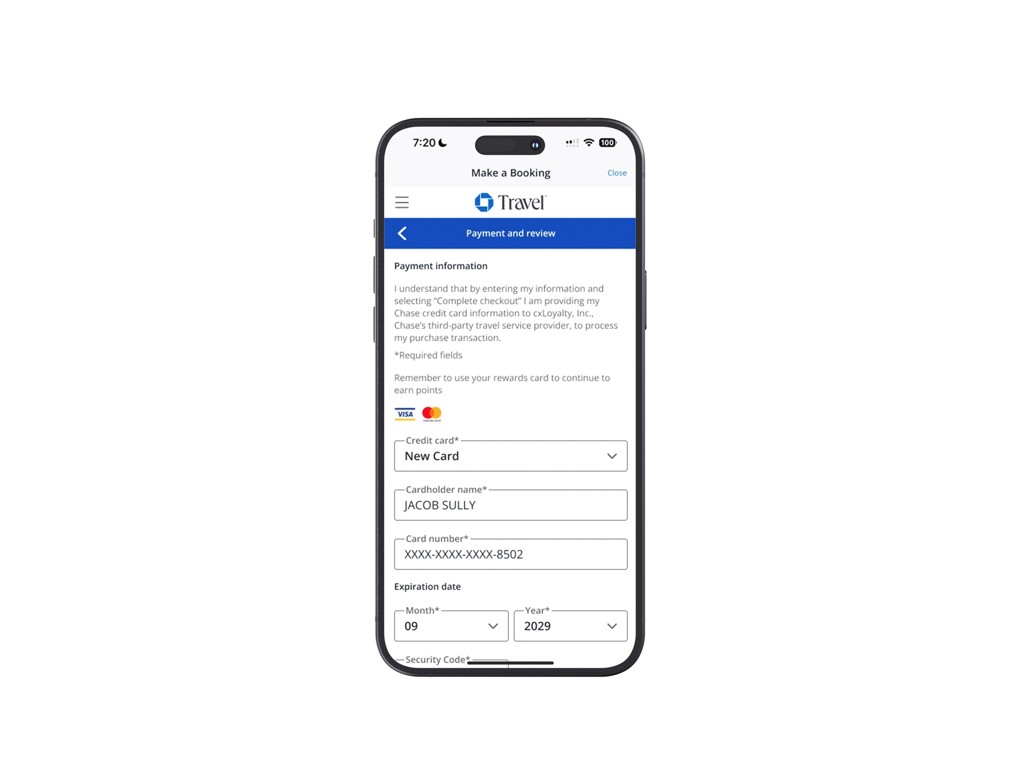
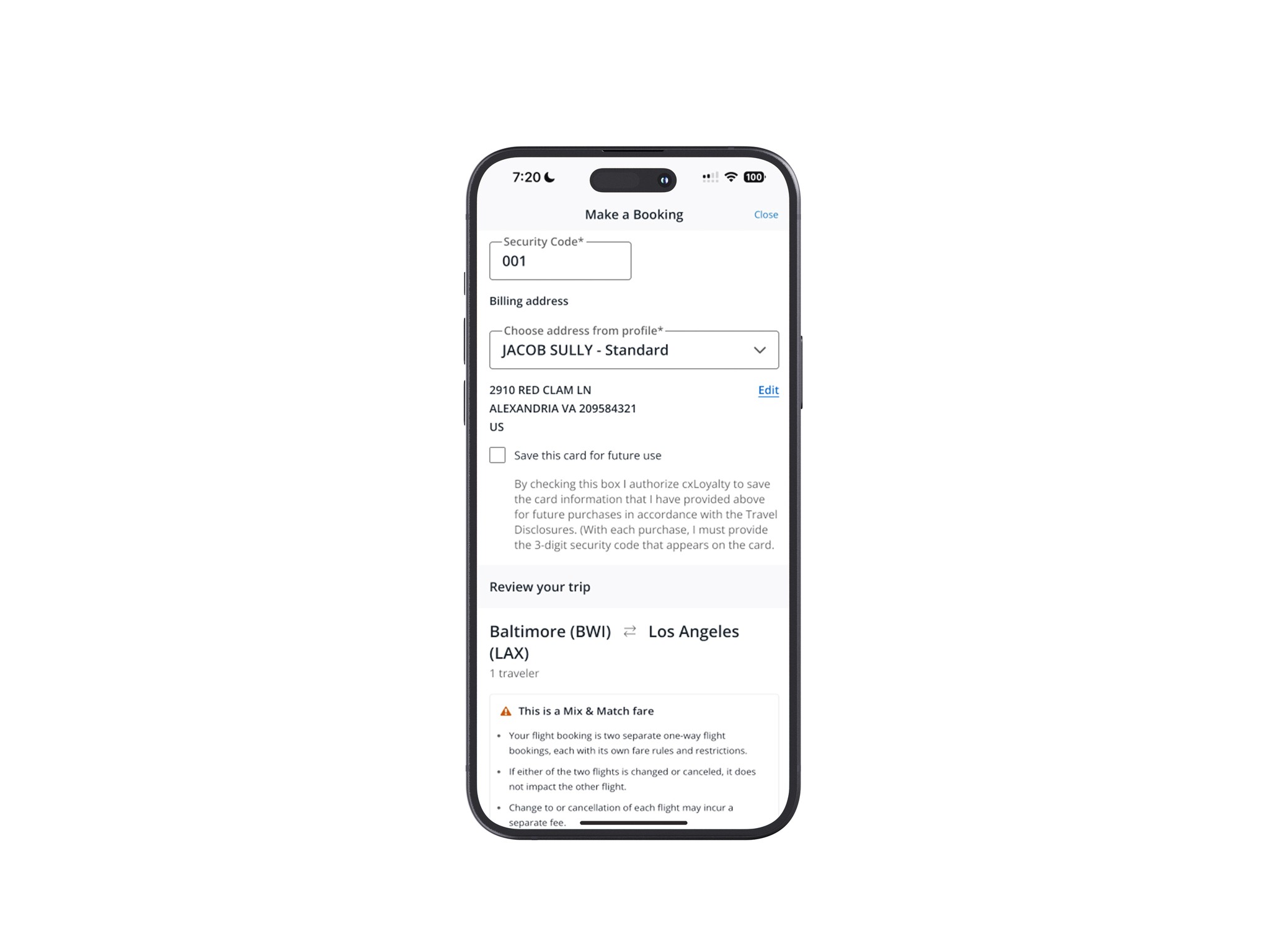
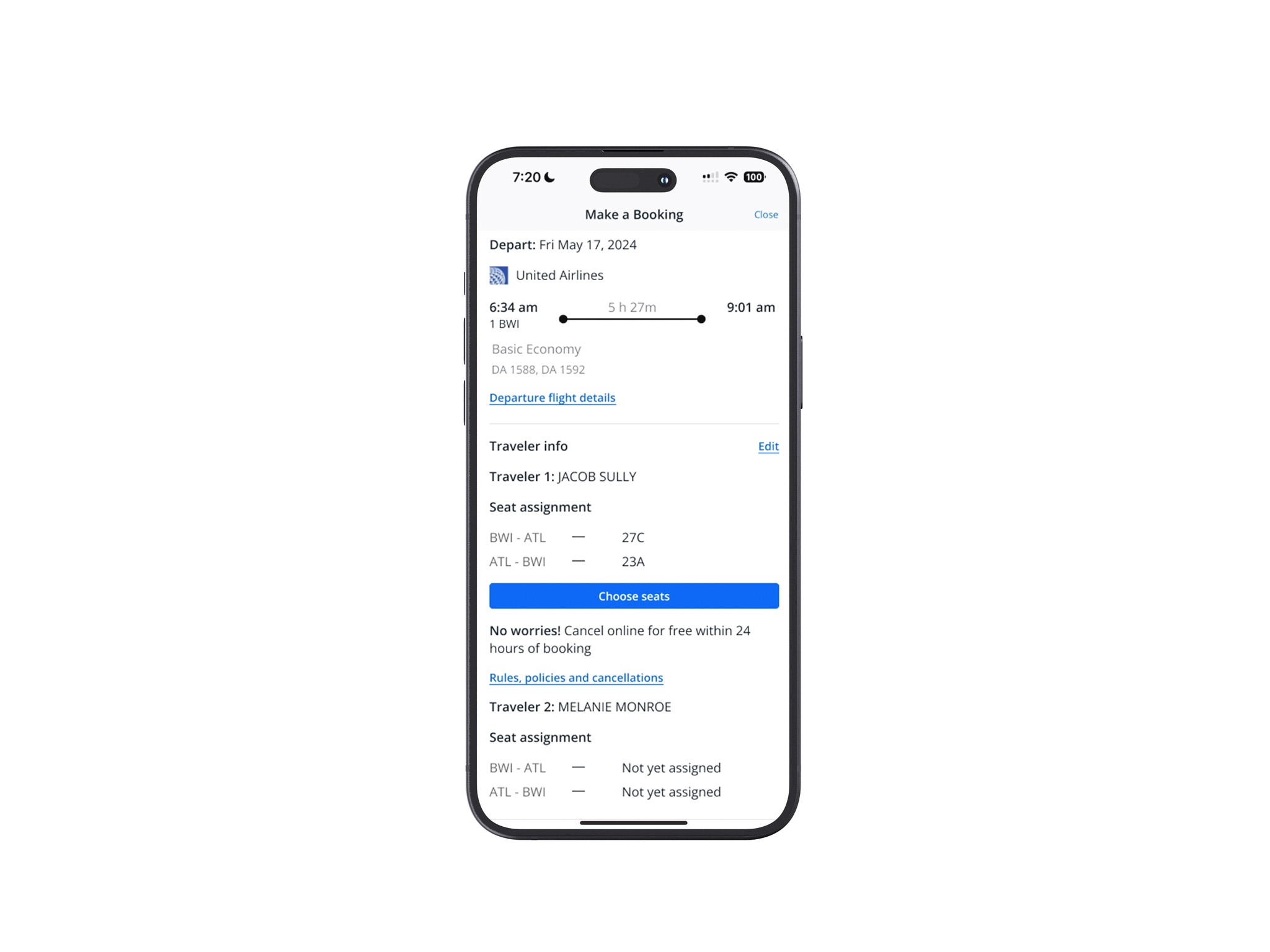
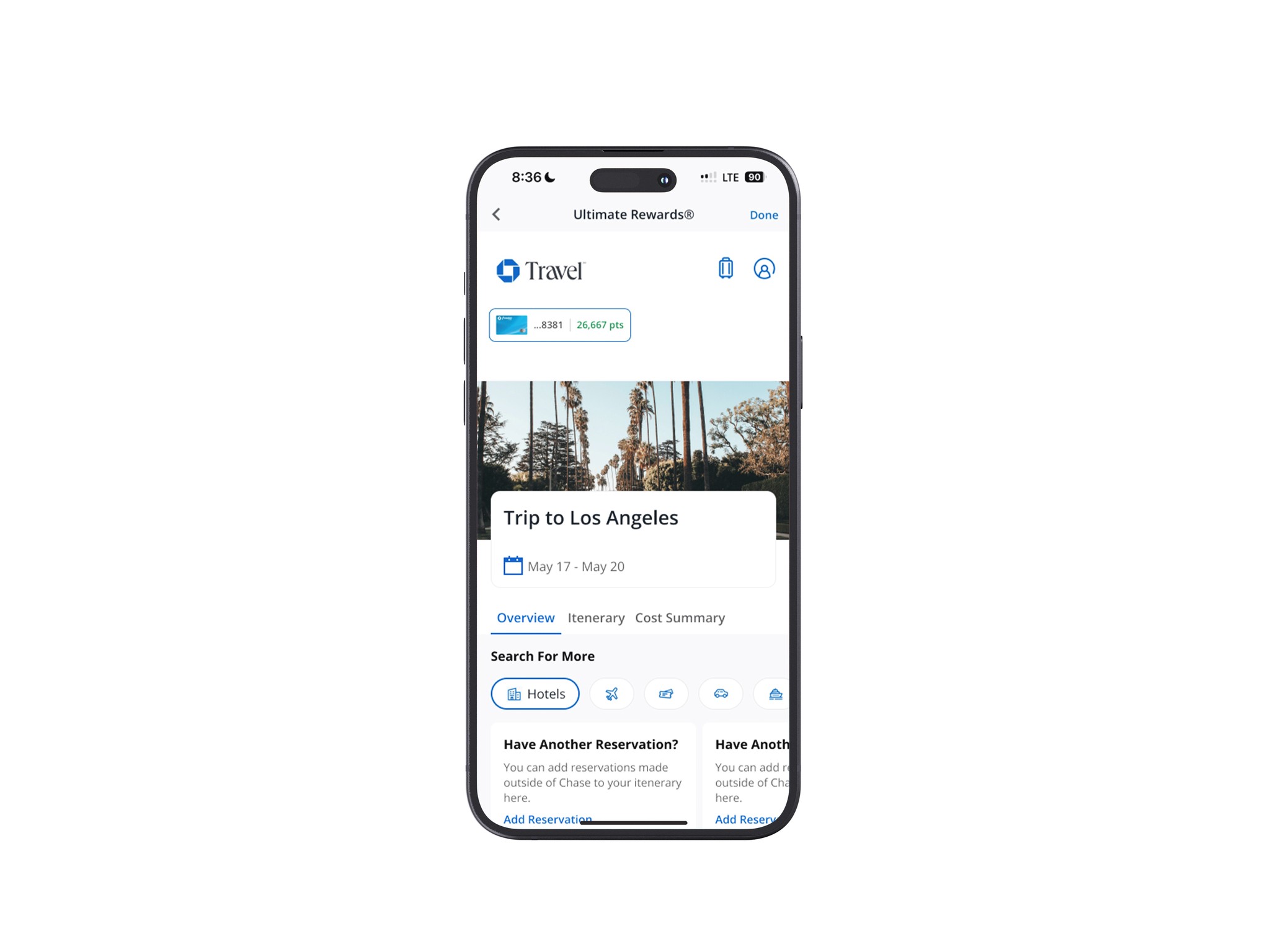
Using Chase Travel+.
All Finalized Screens
Compiling all screens here.

Project Takeaways
Wrapping up the experience.
Overall, I found this project to be incredibly rewarding. It provided valuable insights about myself and serves as a reference for my future prospects. During the development stage, I noticed a dip in my motivation compared to the initial excitement when the golden idea struck. I realized that I derive a lot of joy from building things from scratch (probably due to my background in brand identity), yet I also appreciated the satisfaction of refining and enhancing something that many people use daily in a meaningful way. Interestingly, having the opportunity to build on an existing product allowed me to focus more effectively on what truly matters, preventing my design thinking resource from being stretched too thin.