Preview VirtualxKitchen's Redesign


Overview
Revamping The VirtualxKitchen Experience
01
Project Briefing
Project Duration
3 Weeks
Project Goal
Redesign Existing Site
Tools Used
Figma
Adobe Illustrator
Adobe Photoshop
Contributions
Prototyping
User Research
UI Design
Wireframing
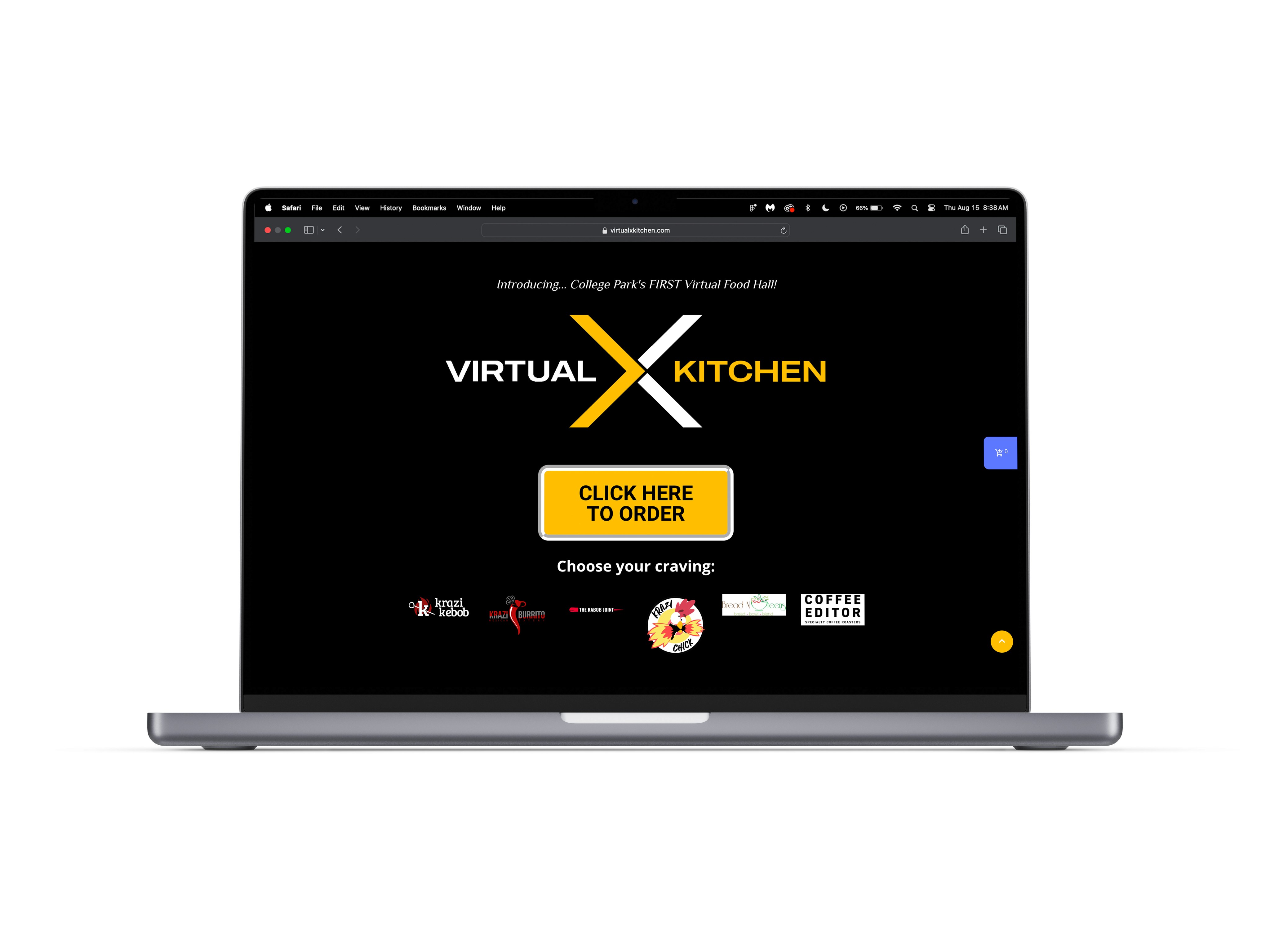
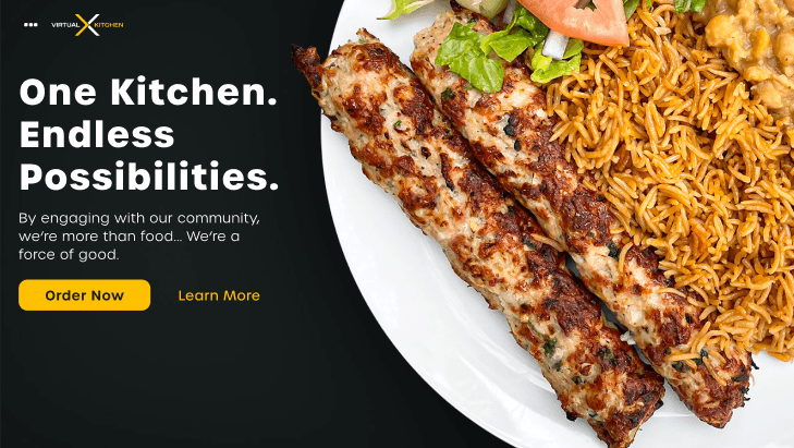
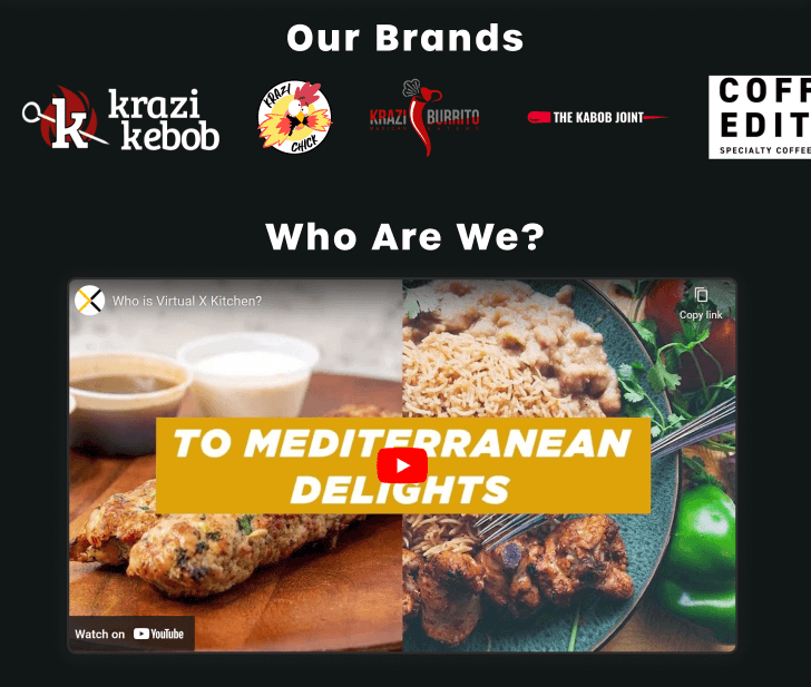
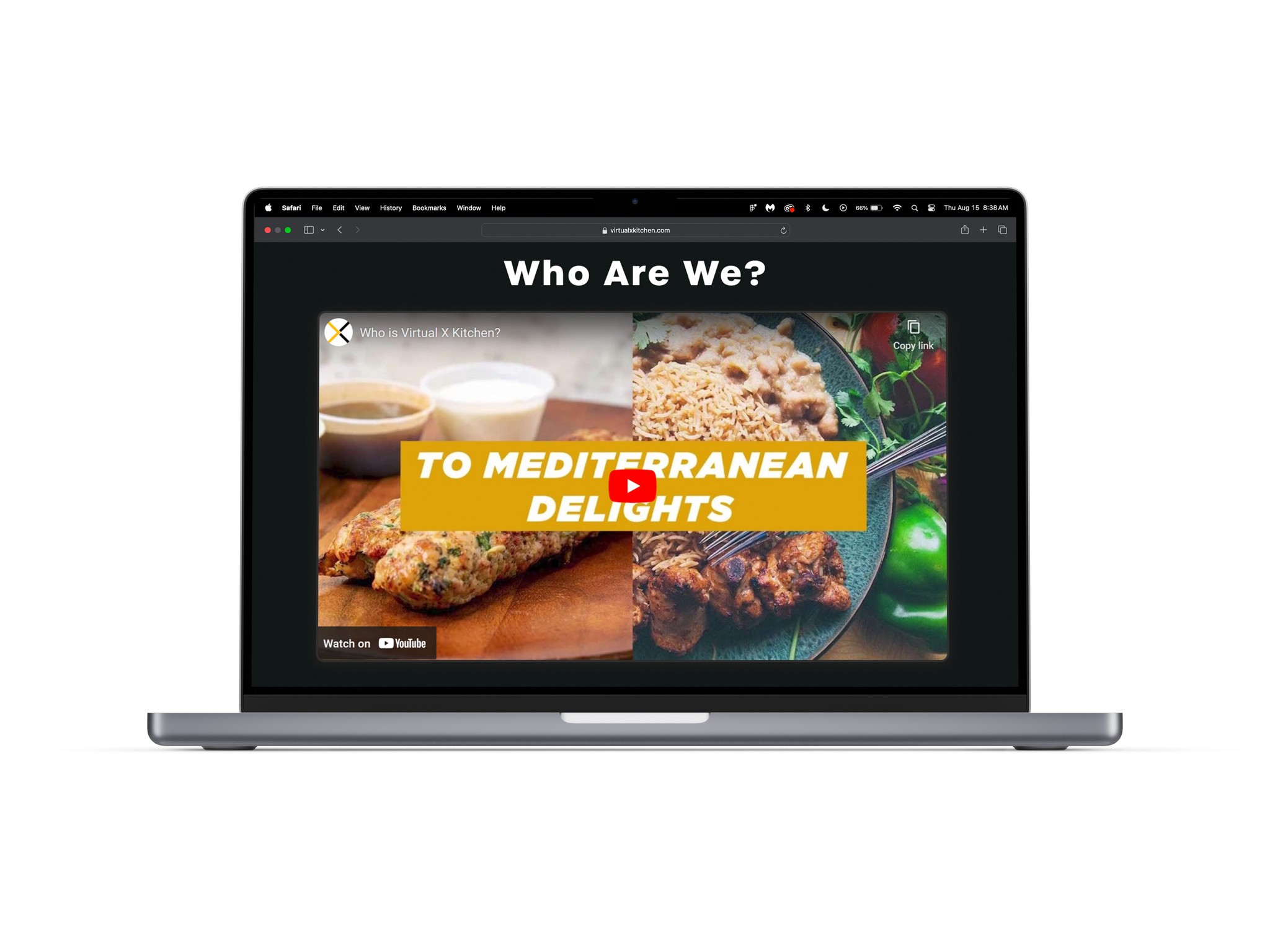
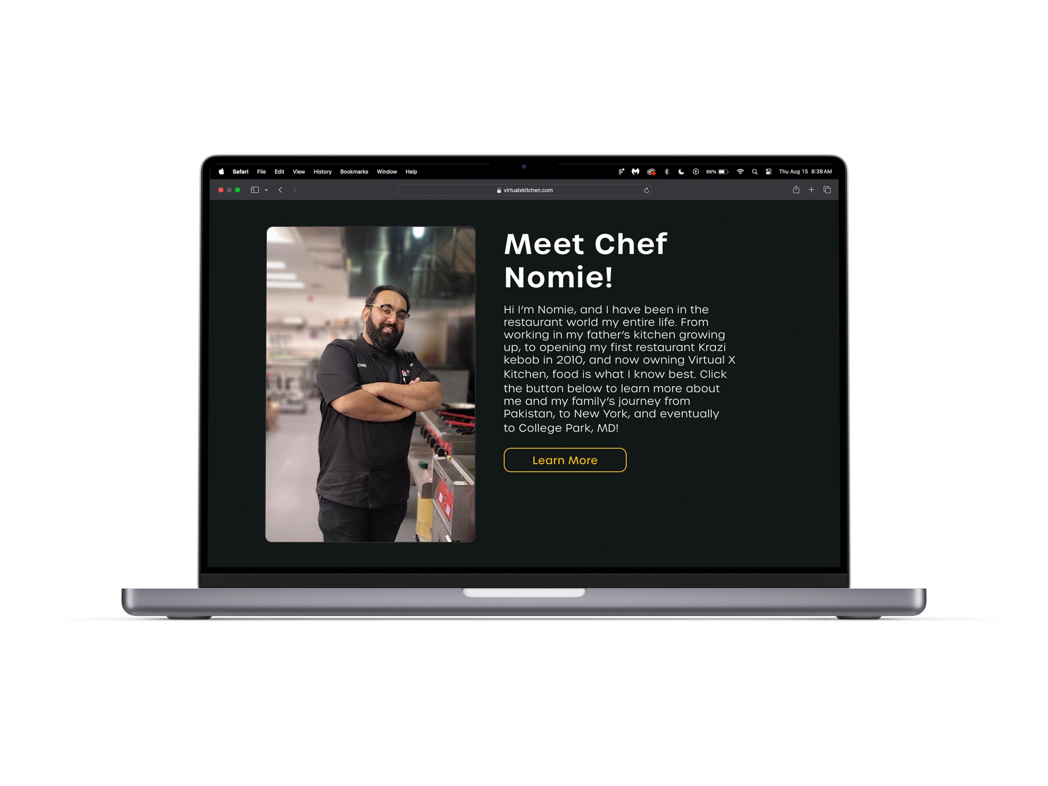
What is "VirtualxKitchen"?
VirtualXKitchen is a virtual food hall in College Park, MD. Their services include 4 restaurants, coffee bean roasting, and catering. Many of the restaurants that VxK host have been around for many years and hold significance to the local university’s students as well as the communities in the area. Given that the food hall is virtual, orders are primarily done online rather in-store by their customers.
01-02
The Problem At Hand
What was the state of VxK's website?
VirtualxKitchen's site suffered from poor UX practices and outdated UI.
How did I solve the issues?
By adopting and incorporating modern UI patterns I was able to create a more familiar site for users to navigate through as well as preserve VxK's branding.
02
Improving VirtualxKitchen's Website
What were the steps that I took for a successful redesign?
1.
Discover common practices by competition and gain insight from consumers experiences.
2.
Develop wireframes for user testing.
3.
Make needed iterations to optimize and polish final designs.
02 - 01
Analyzing the competition & learning user expectations.
Research Summary
Competative Analysis
Finding where to start.
Given the many aspects of VirtualxKitchen that could be enhanced, I aimed to implement minimal changes. This approach ensures we preserve the site's core goals and maintain a familiar experience for returning users.
With this in mind, I decided to look at companies like uber eats, doordash, and local foodhalls to see which UX practices were effective.
Here were my takeaways…
Branding is still very important as it aids in users gaining familiarity and makes the lack of contact still have some personability.
The most important things are accessibility and efficiency throughout the purchase path.
They all have different methods in how users are able to redeem their acquired points.
User Interviews
Hearing what consumers have to say.
With my goal being a redesign/refresh, I wanted to see how users felt about the existing site as well as the their experience ordering food online or with food halls. Doing so would allow me to gauge which things would be best to improve.
Interviewee Details
5 Interviewees
Having 5 interviewees allowed for good perspective variation.
Foodhall Goers
To have the most relevant insights, I decided to apply this constraint to interviewees.
Ages 22-26
Based on the age range of VxK's customers, the largest population that the site refresh would benefit would include those of Gen Z.
Notable Quotes
Quote 1
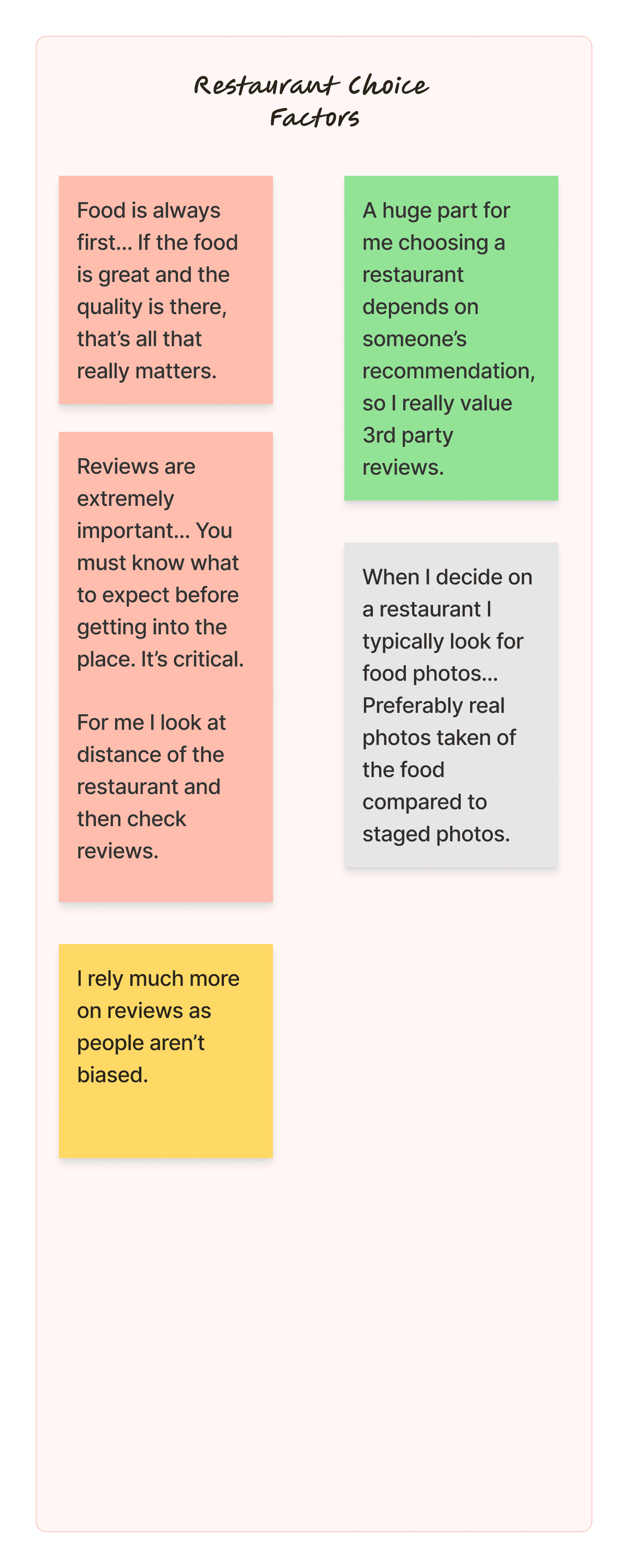
"Reviews are extremely important… You must know what to expect before going there. It's critical."
Quote 2
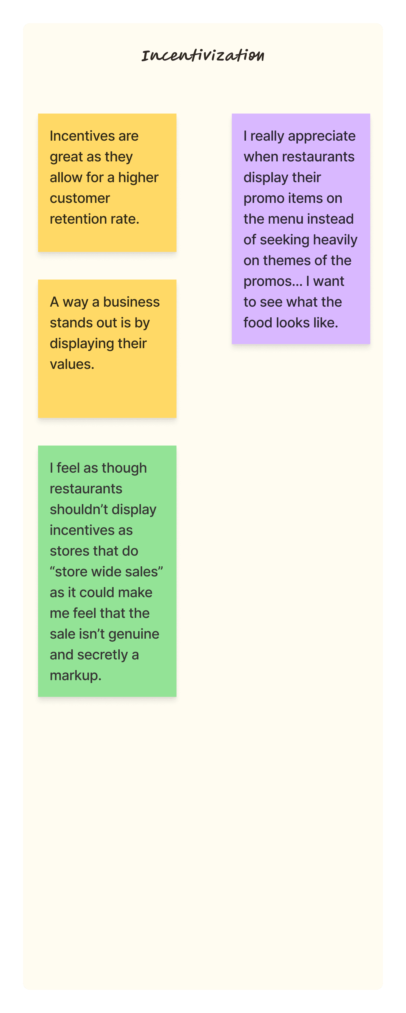
Incentives are great as they allow for a higher customer retention rate."
Quote 3
"To be able to market to the most amount of people , I feel like each restaurant should have their own branding."
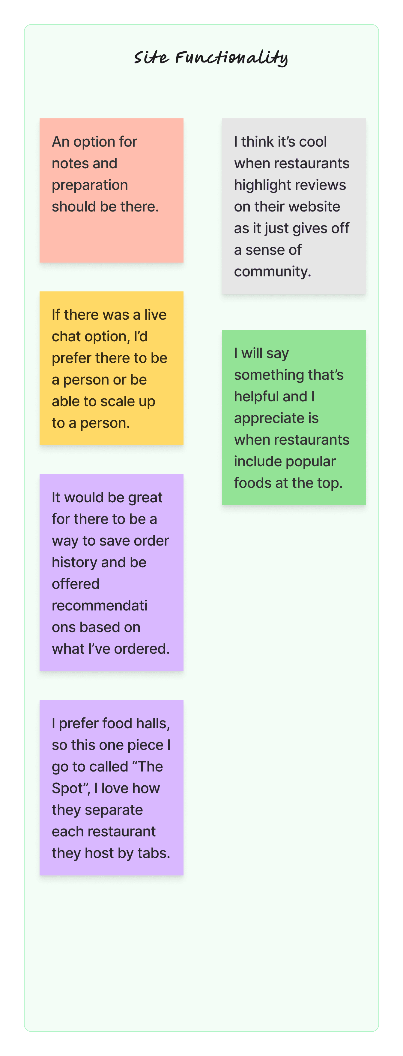
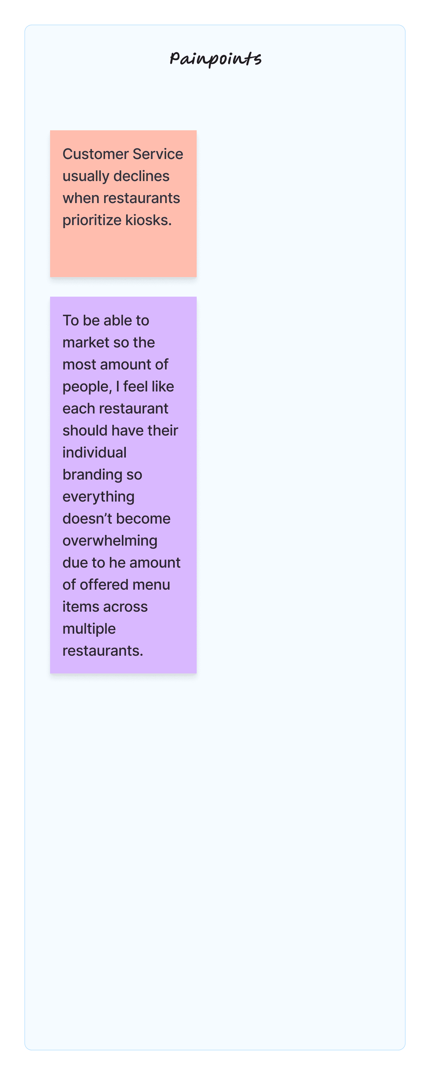
Affinity Mapping
Organizing the data
Post-interviews, I compiled notable points into an affinity map to organize the data for analysis.
Research Key Findings
Reviews are a huge factor in having people try a restaurant.
Restaurant incentives should be easily visible to attract customers and encourage repeat business.
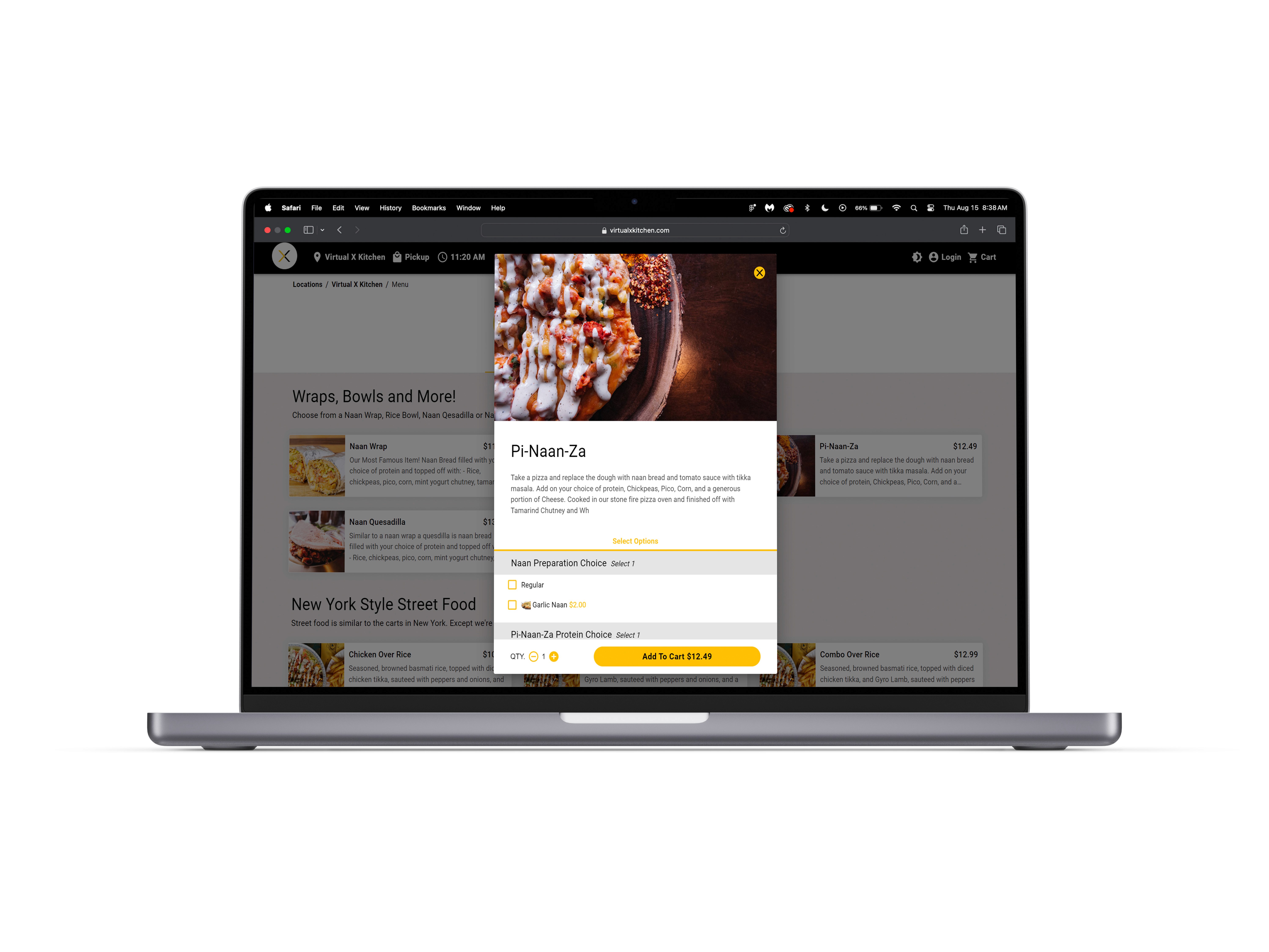
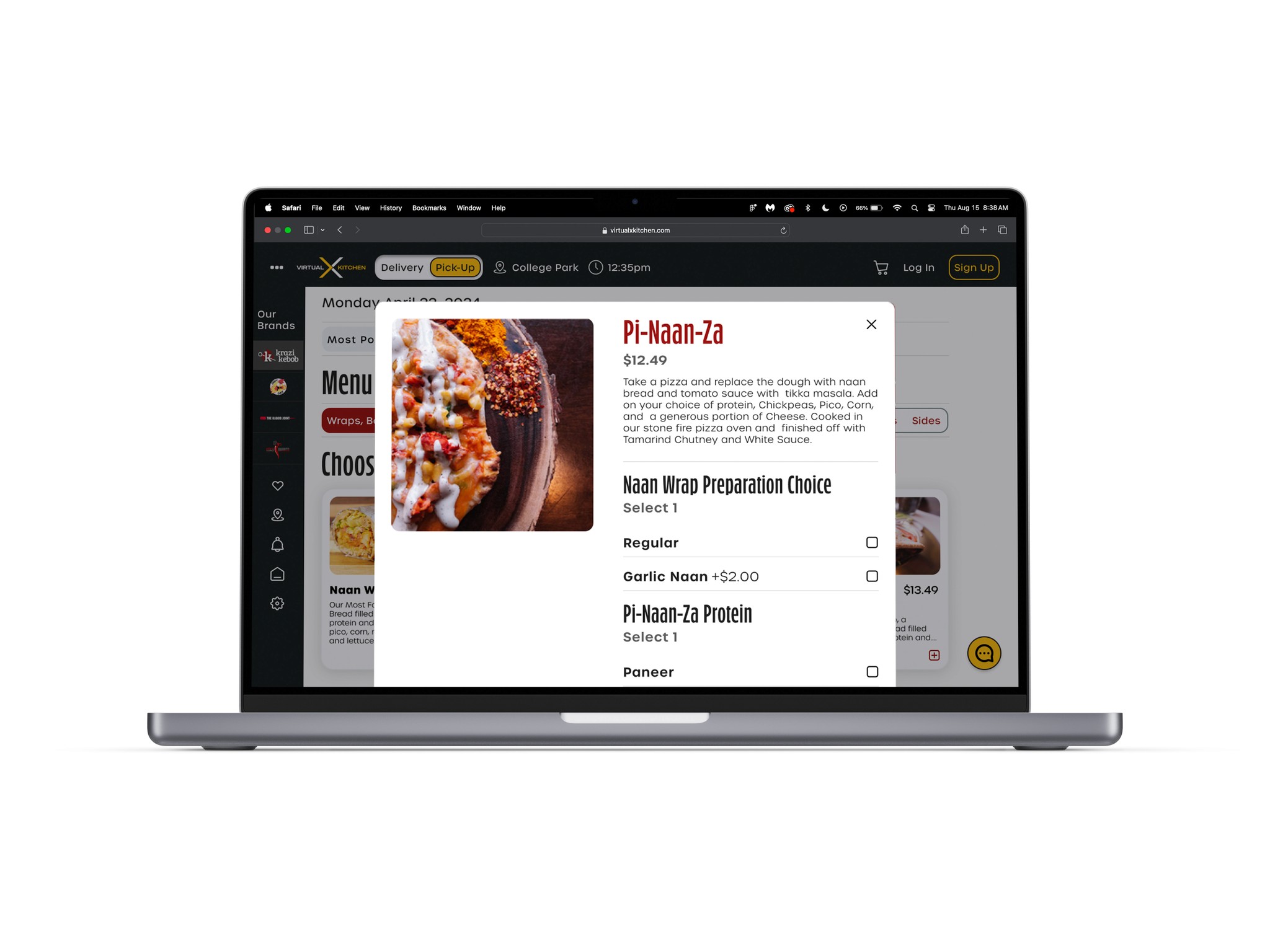
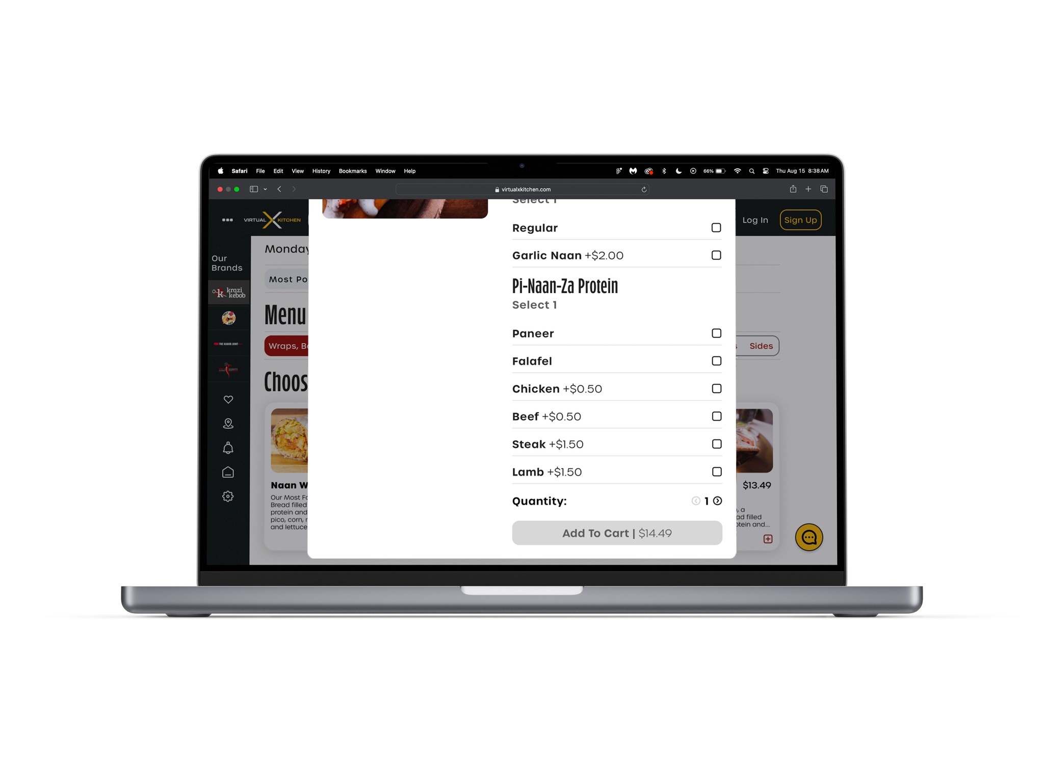
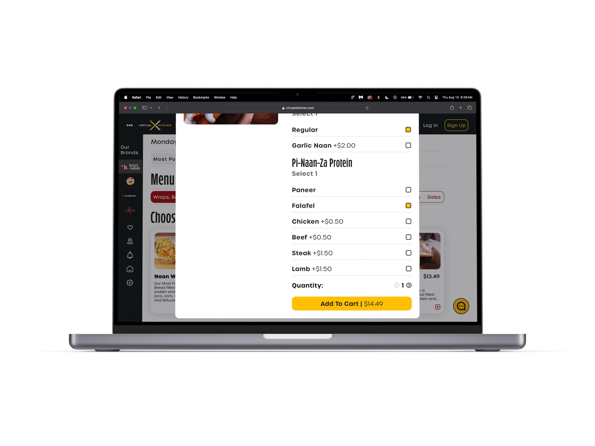
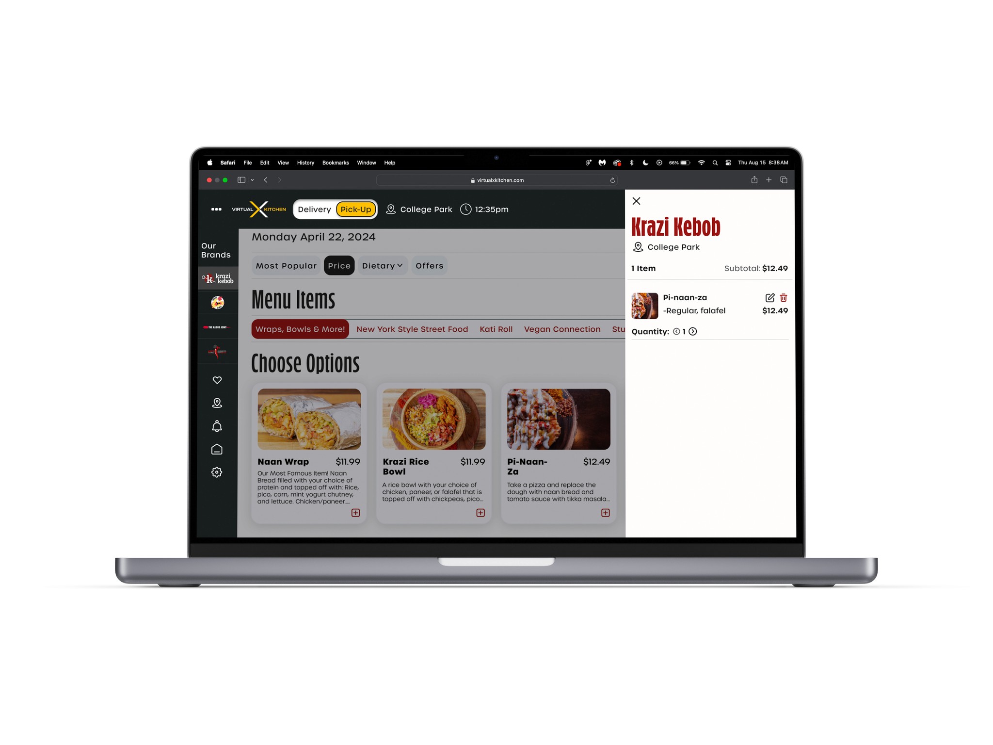
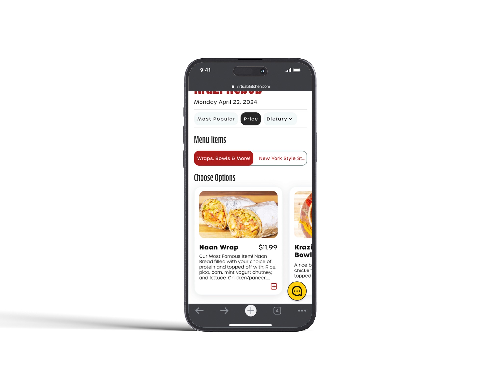
Users find immense value in order customizability.
Users noted that while it’s nice for restaurants to share their mission or values, it doesn’t significantly influence their choice unless it’s a deciding factor between options.
02 - 02
Developing functional features.
Feature Development
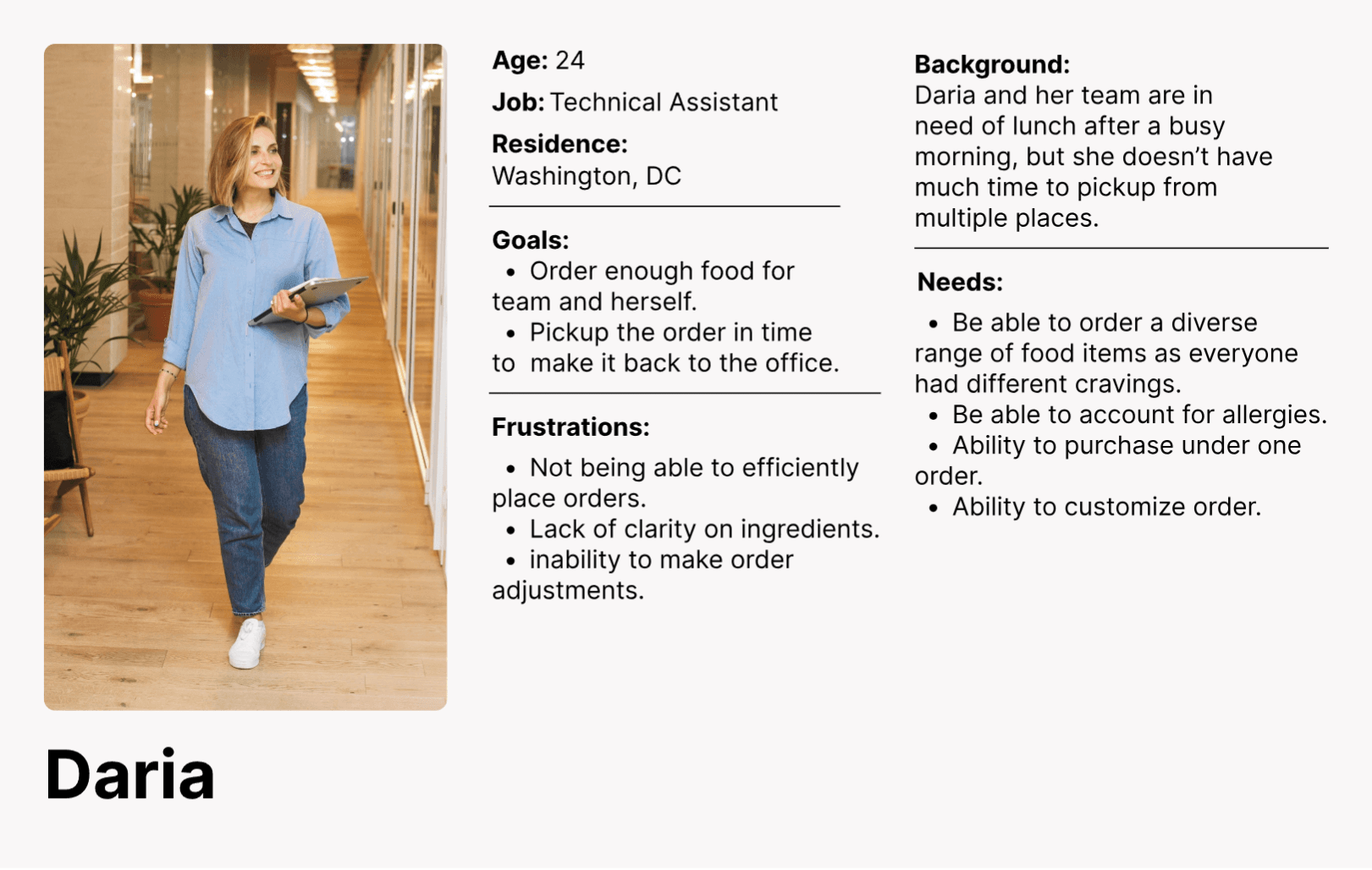
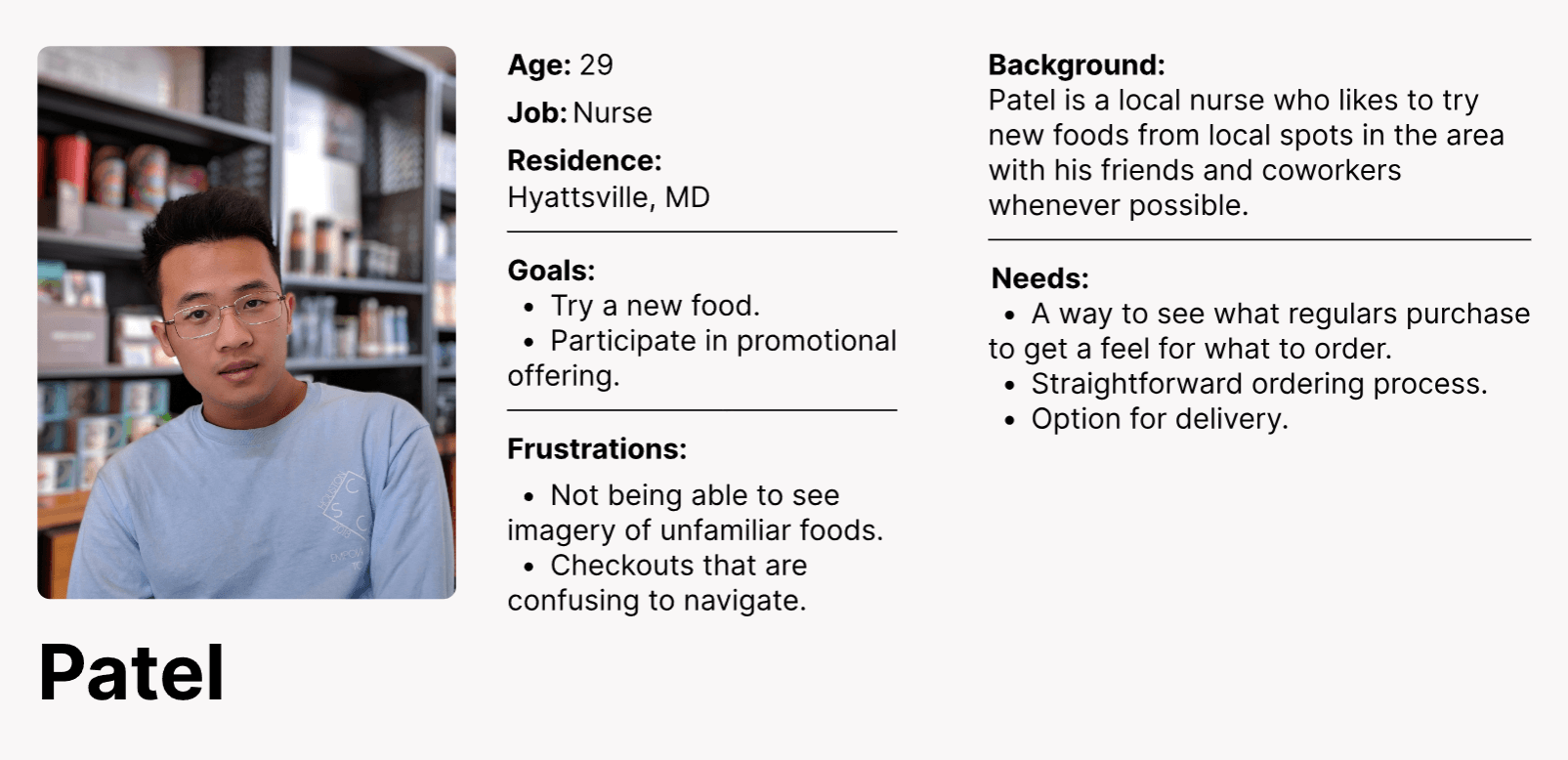
User Personas
Determining who I'm designing for.
Using my user research as a guide, I developed 2 personas that highlight probable use cases of VxK customers.
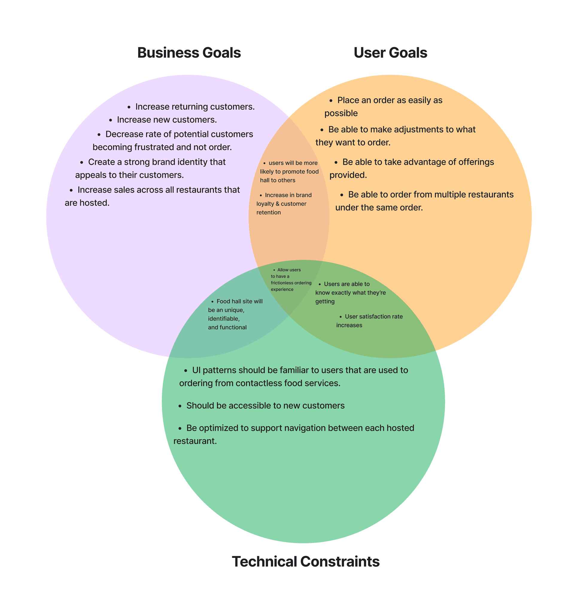
Business goals
Understanding the mutual benefits of achieving each party's goals.
Before finalizing decisions on which features to prioritize for improvement, I like to take a step back and evaluate how these enhancements will mutually benefit the affected groups and align with their goals.
Feature Roadmap & Flows
Determining which features to roll out.
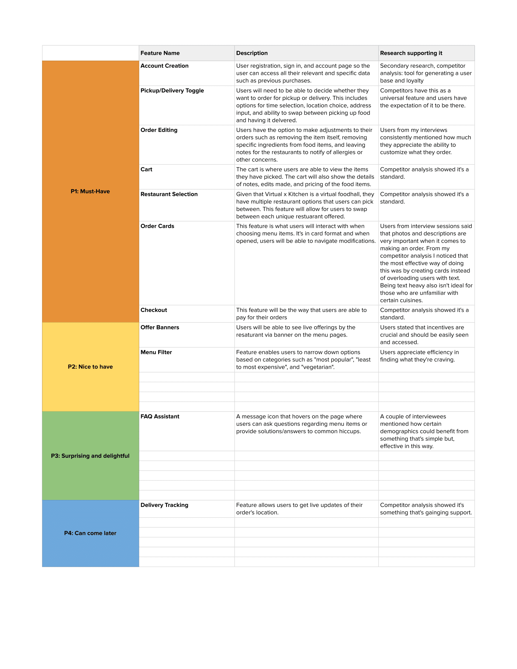
Feature roadmap
Deciding which features to prioritize was challenging due to time constraints, which limited how much I could develop. So, taking a bit of time to create a road map allowed me to look over my user data in order to determine which functionalities would be most beneficial to the end-user right away.
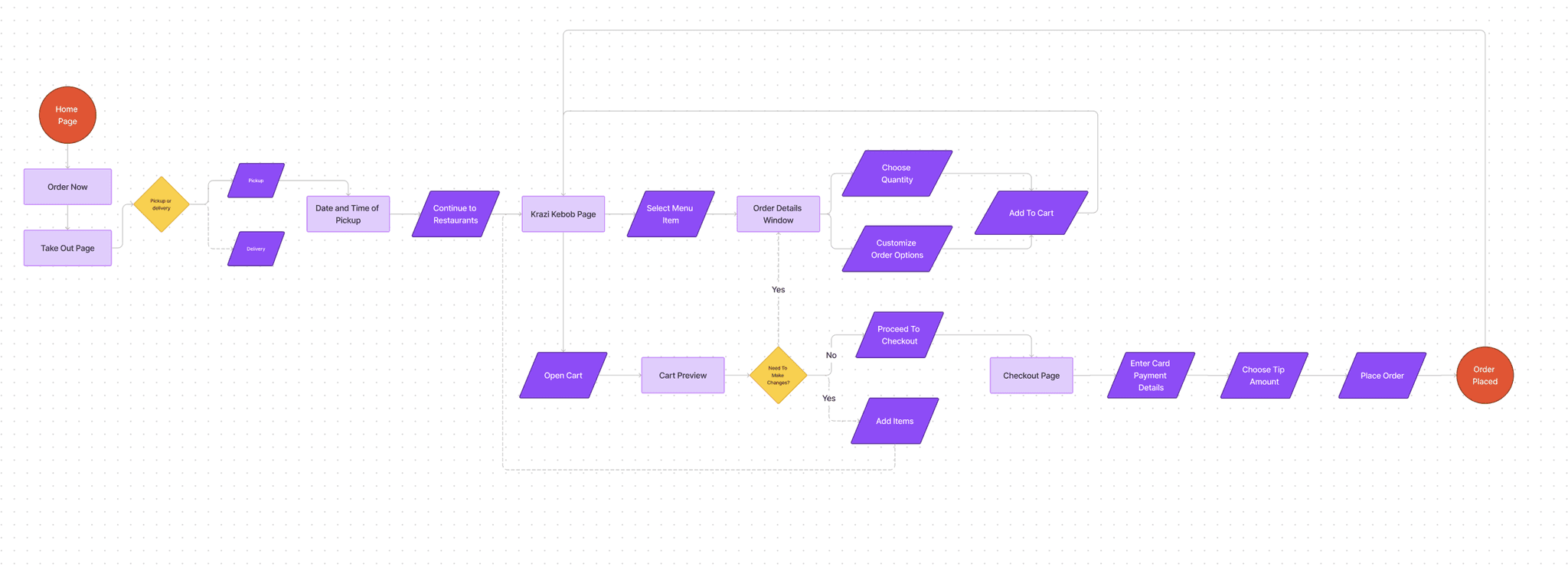
User flow
Developing VirtualxKitchen's user flow was rather simple as it was already established and only need a few tweaks. Another benefit was that online ordering has many points of reference that adopt a flow users are already conditioned to follow.
02 - 03
The Process of Refining VirtualxKitchen
Site Design Overhaul
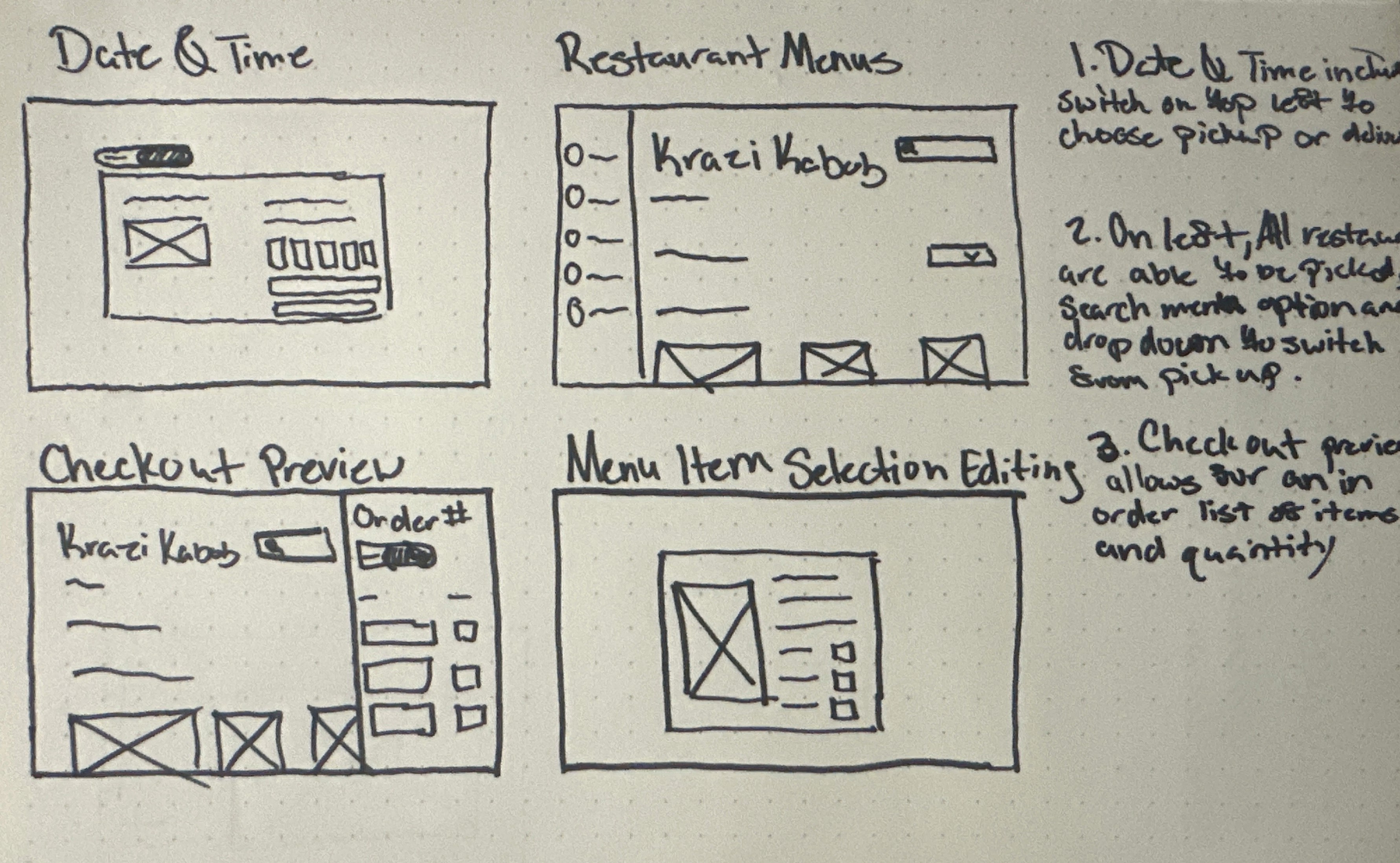
Lo-Fi Wireframes
Baseline Wireframes
With my goals becoming clear, I focused my low-fidelity wireframes on specific UI elements that users engage with most frequently, ensuring they can be seamlessly integrated with updated site navigation and visual design.
Lo-Fi Feedback
After developing Lo-Fi wireframes, I like to get feedback relating to the general flow of my designs. I find that doing so allows me to catch details worth considering that I'd otherwise overlook.
Some highlights are…
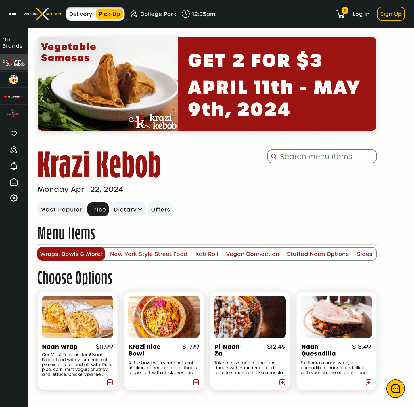
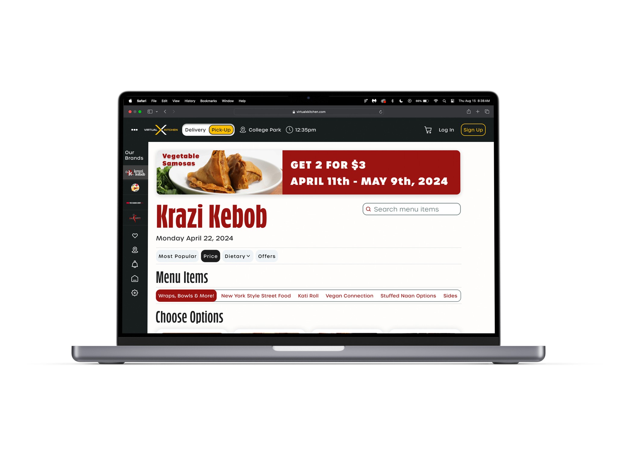
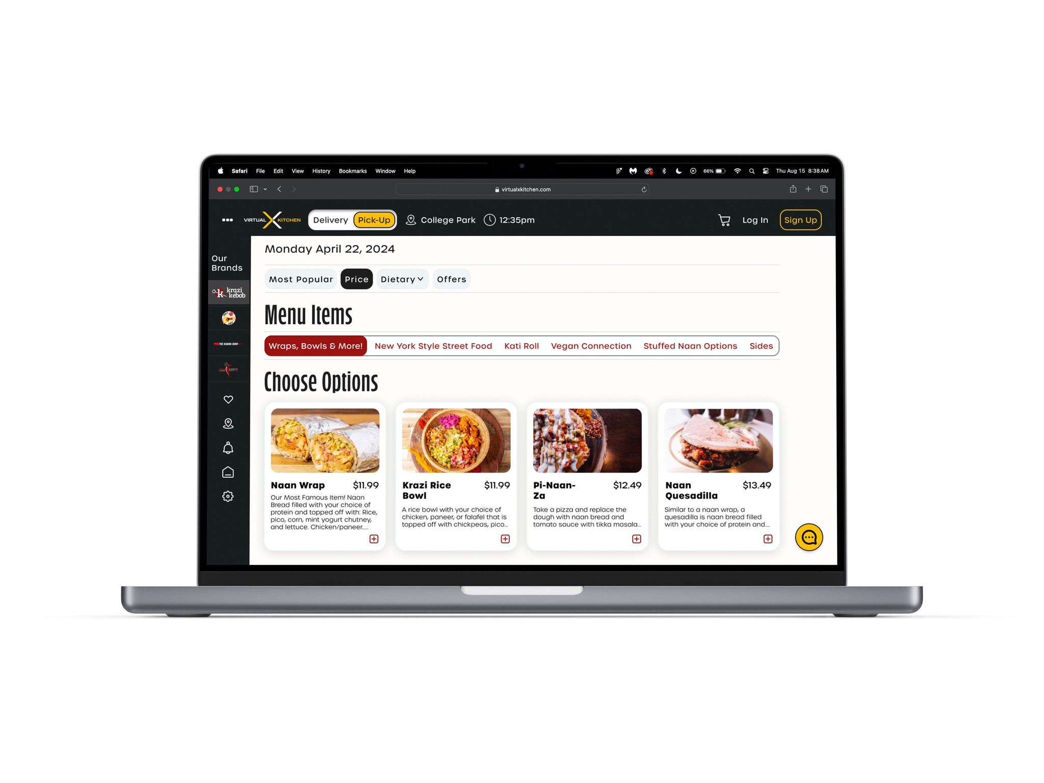
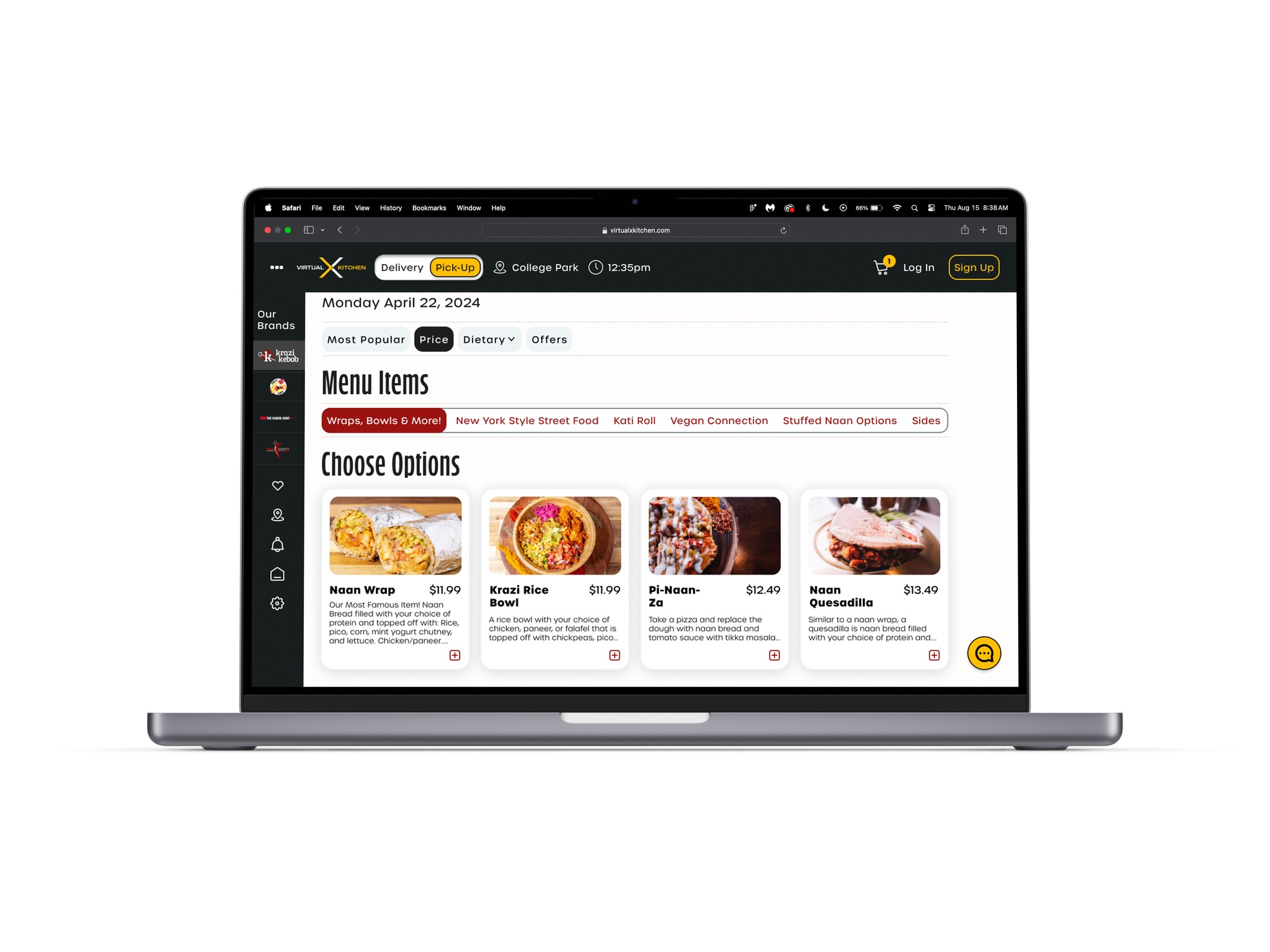
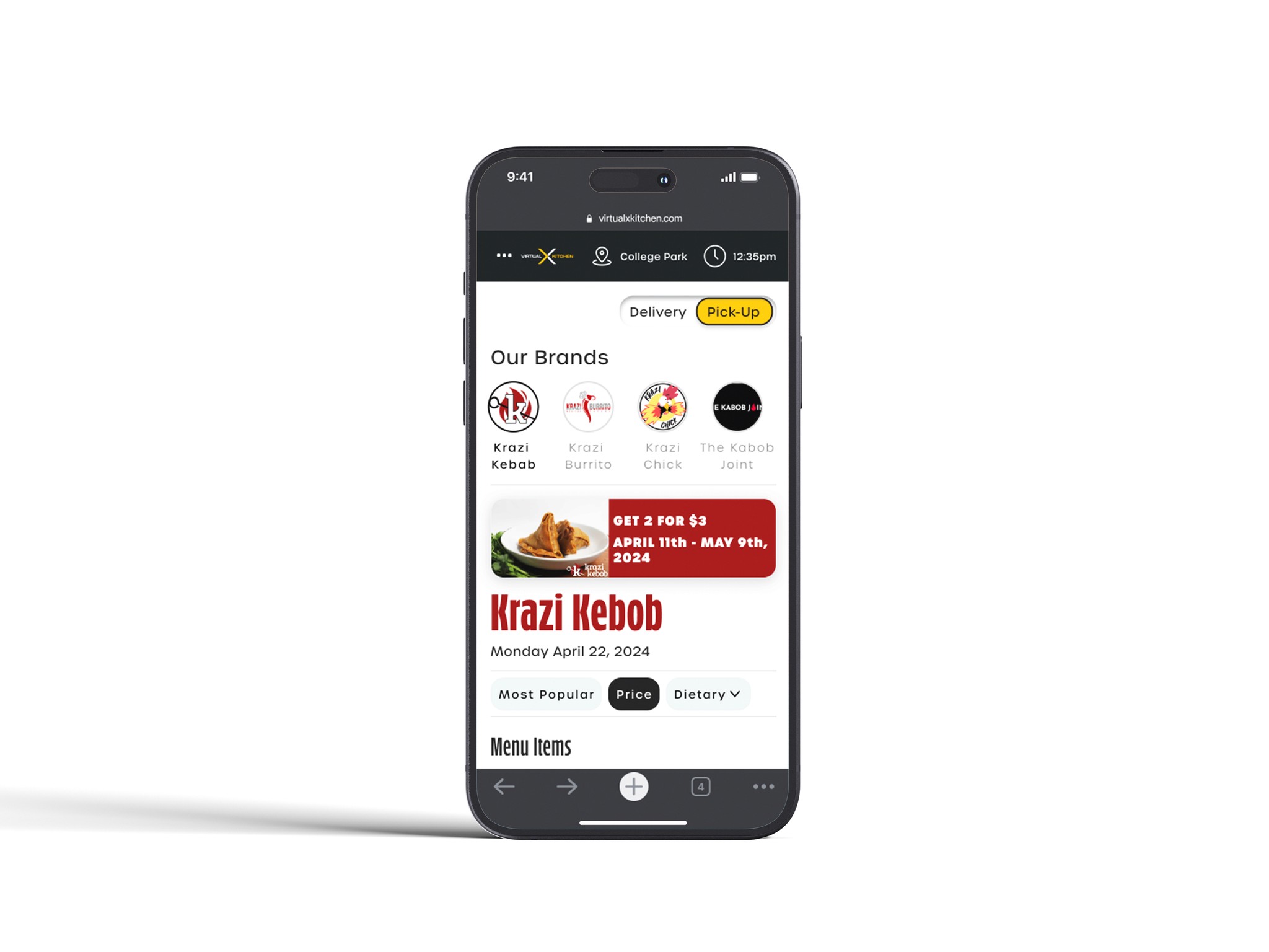
Some users thought that due to the amount of food items, things could become hard to find.
Some users proposed to add item filtering based on categories such as price and popularity.
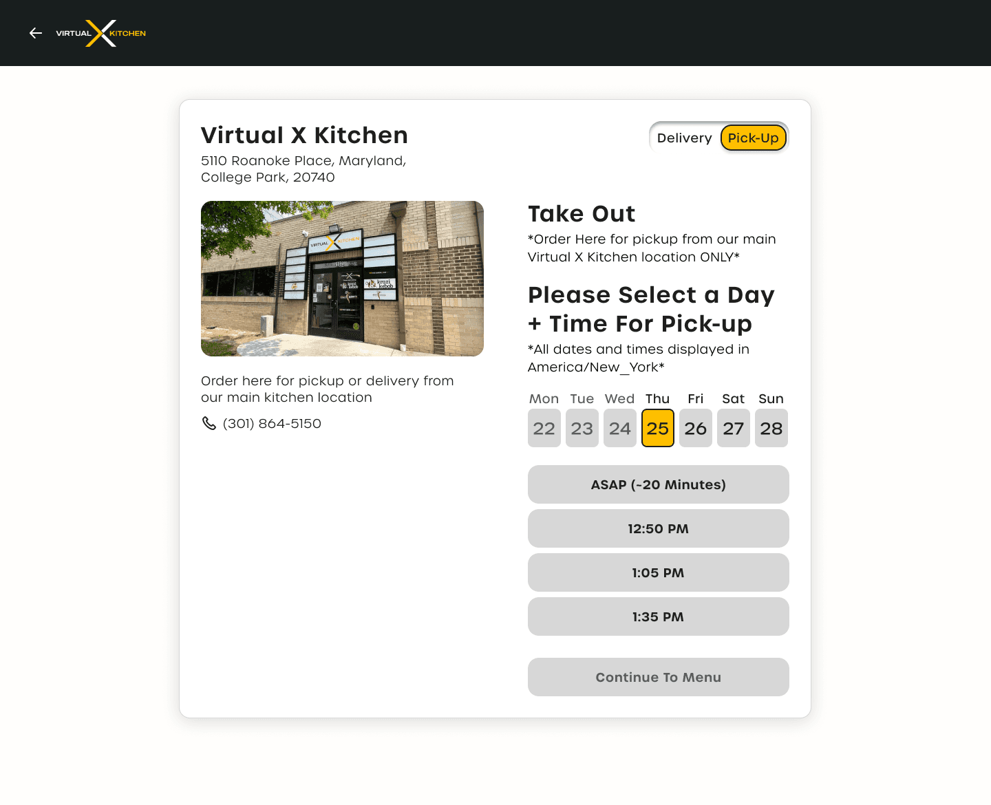
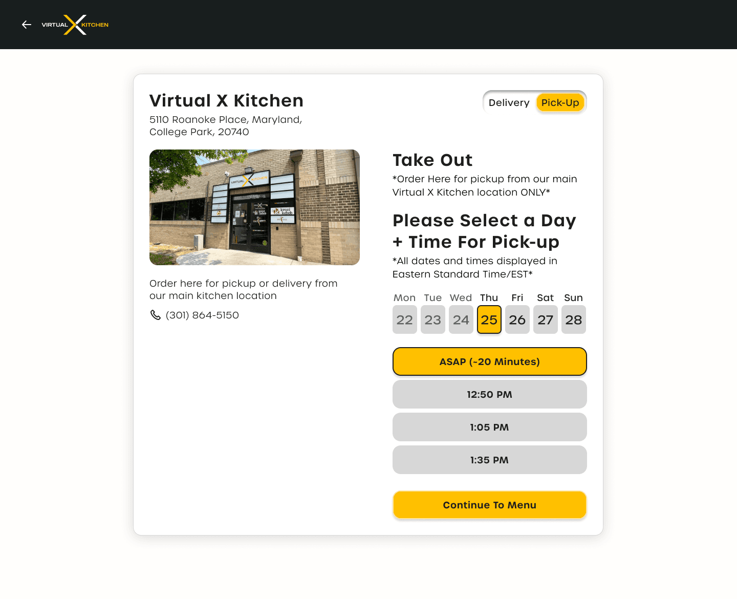
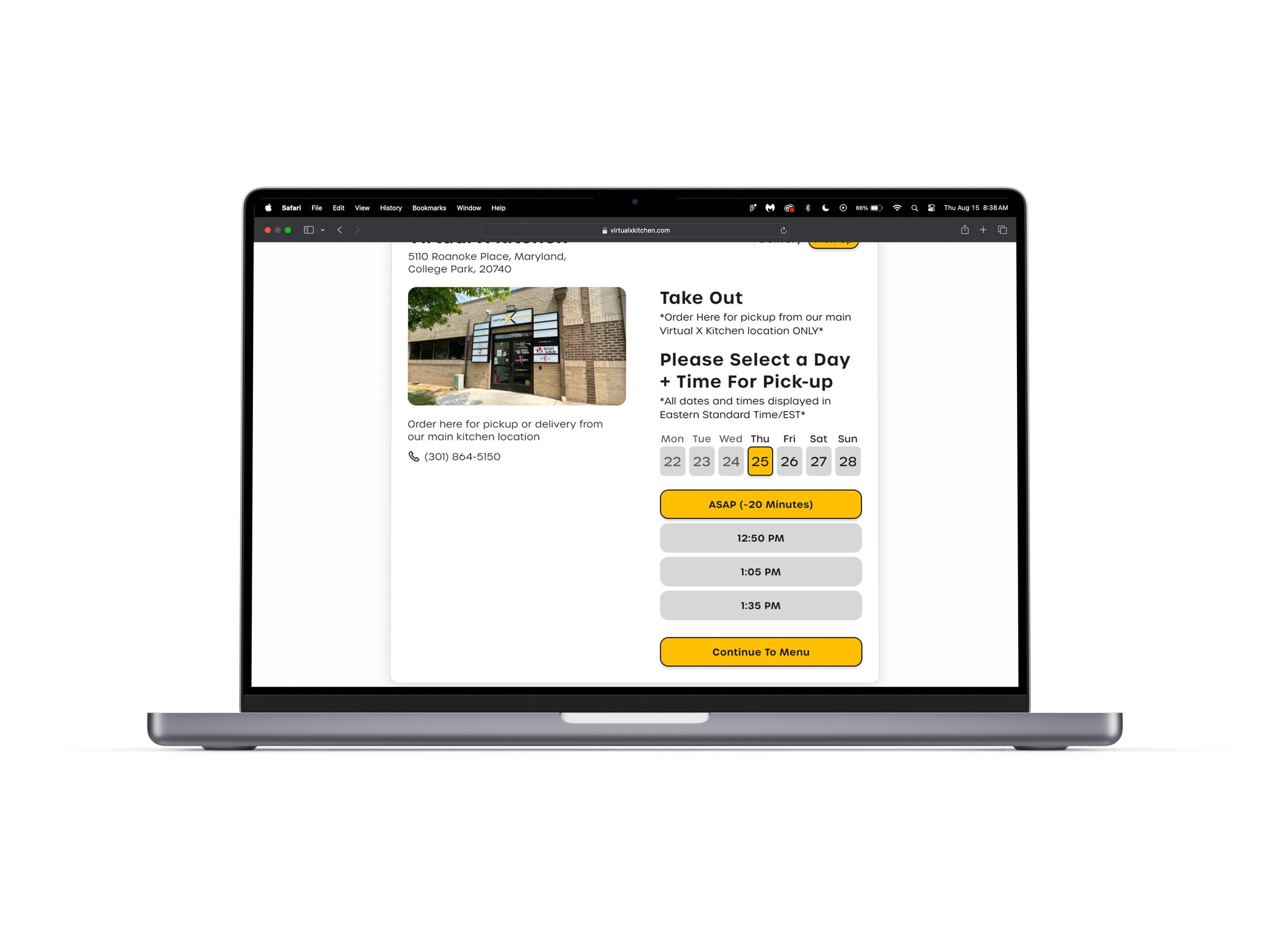
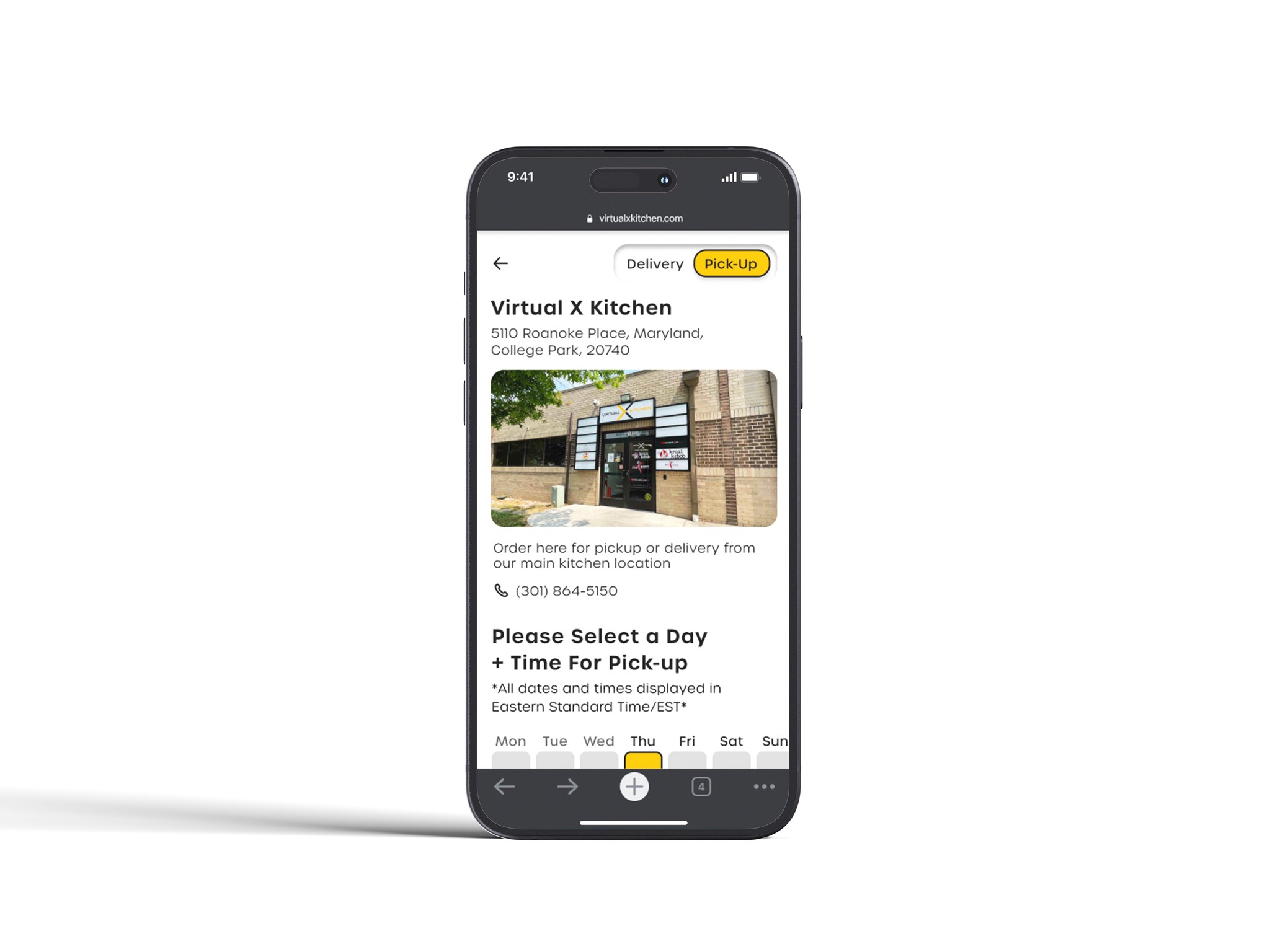
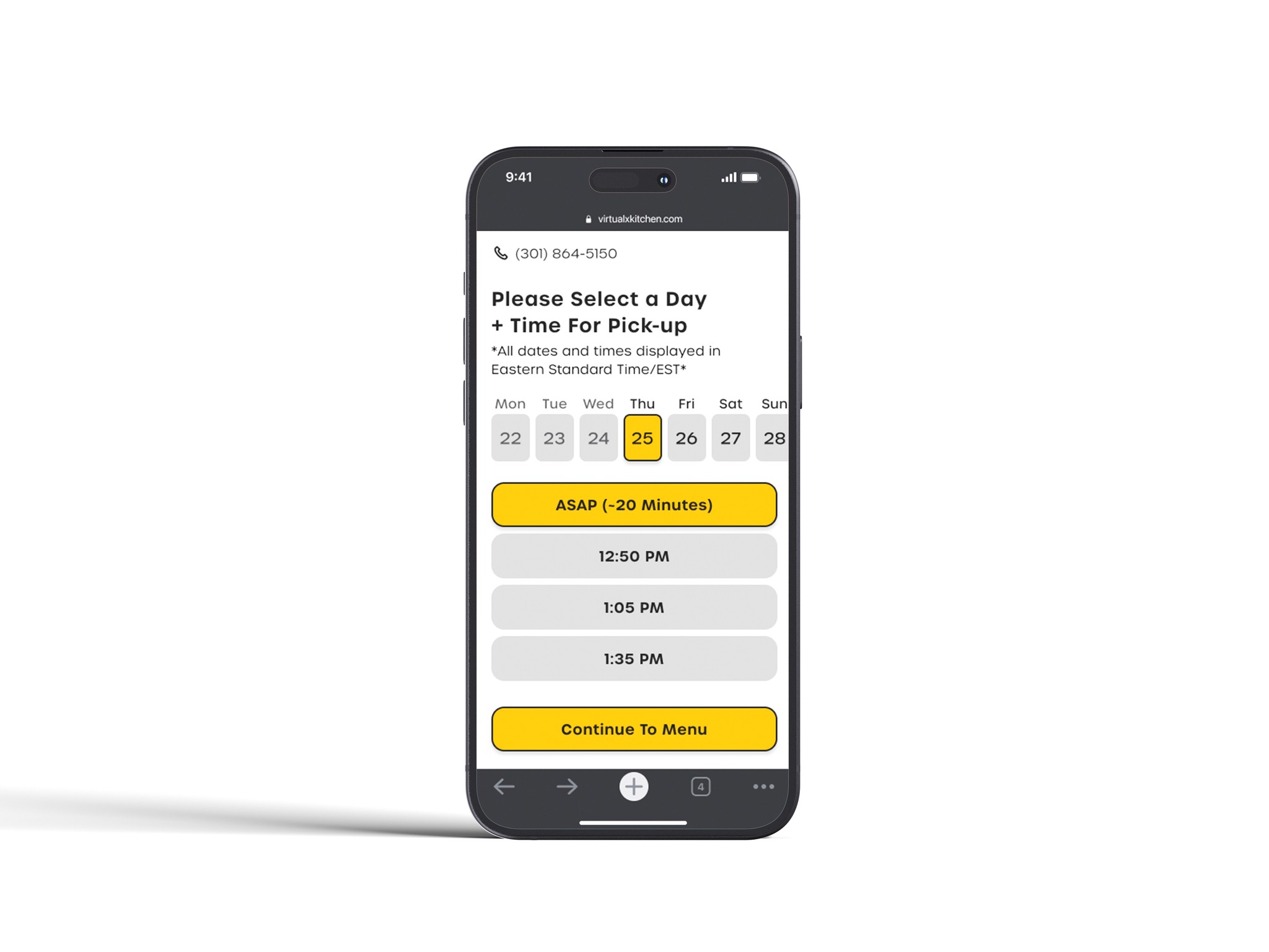
Some users felt the switch on the date and time screen should be grouped with main UI within the frame.
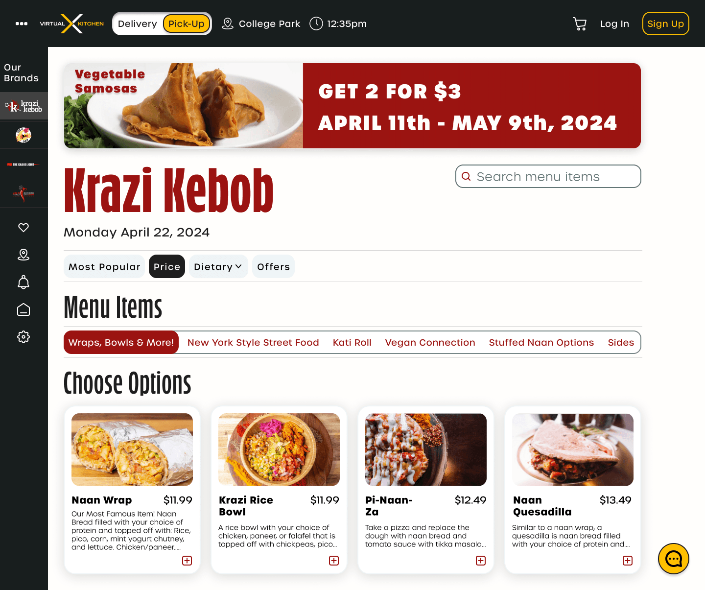
Hi-Fi Screens
Bringing concepts into reality.
After implementing suggestions, I was able to fully flesh out my vision for another round of user testing.
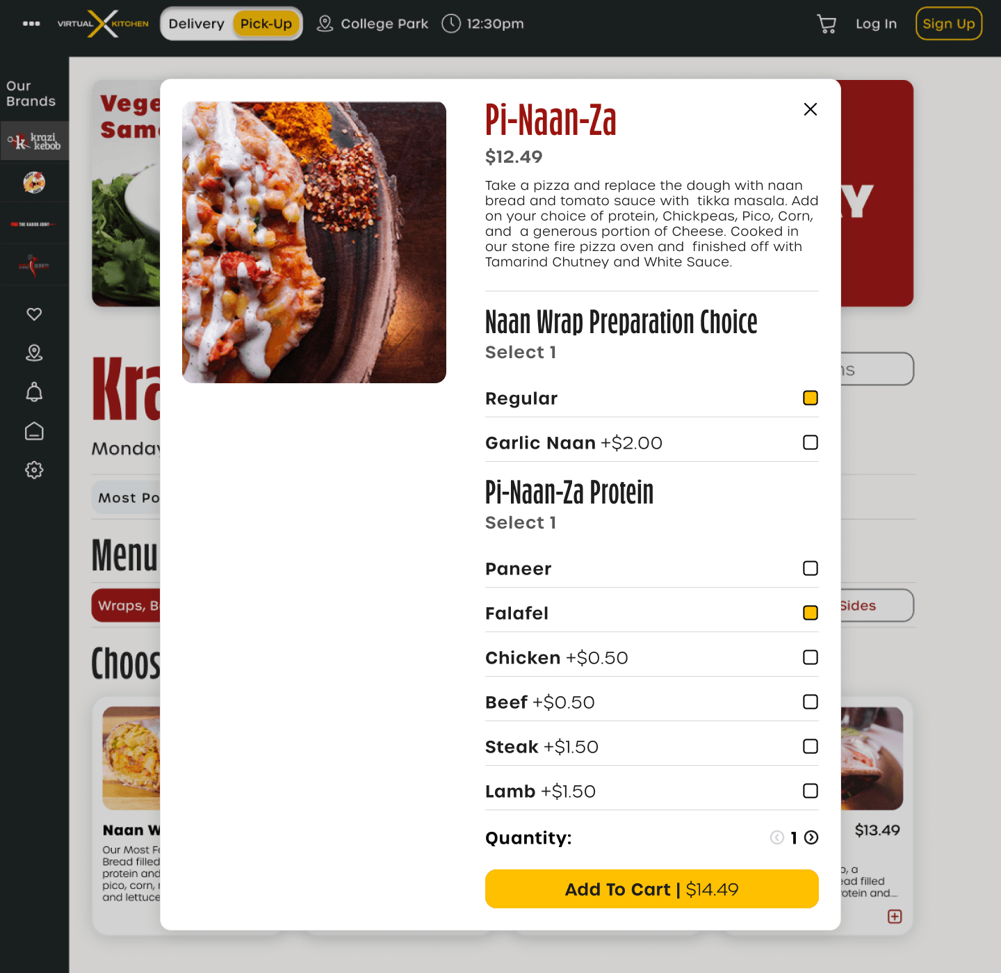

Hi-Fi iterations
After presenting my hi-fidelities for feedback, I was able to gain some solid suggestions for what to tweak. Overall, users were happy with the updated UI as it proved to be a natural and familiar experience.
Here are the updates made…
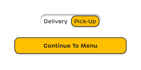
Button Fix
Allowed for higher contrast/readability
Simplified overall styling across website
Banner Fix
Optimized available screen real estate to allow for users to see important information efficiently by decreasing banner size.
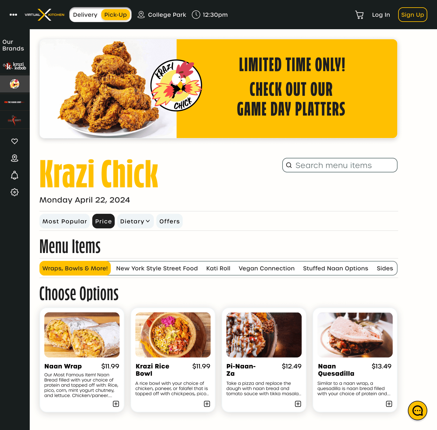
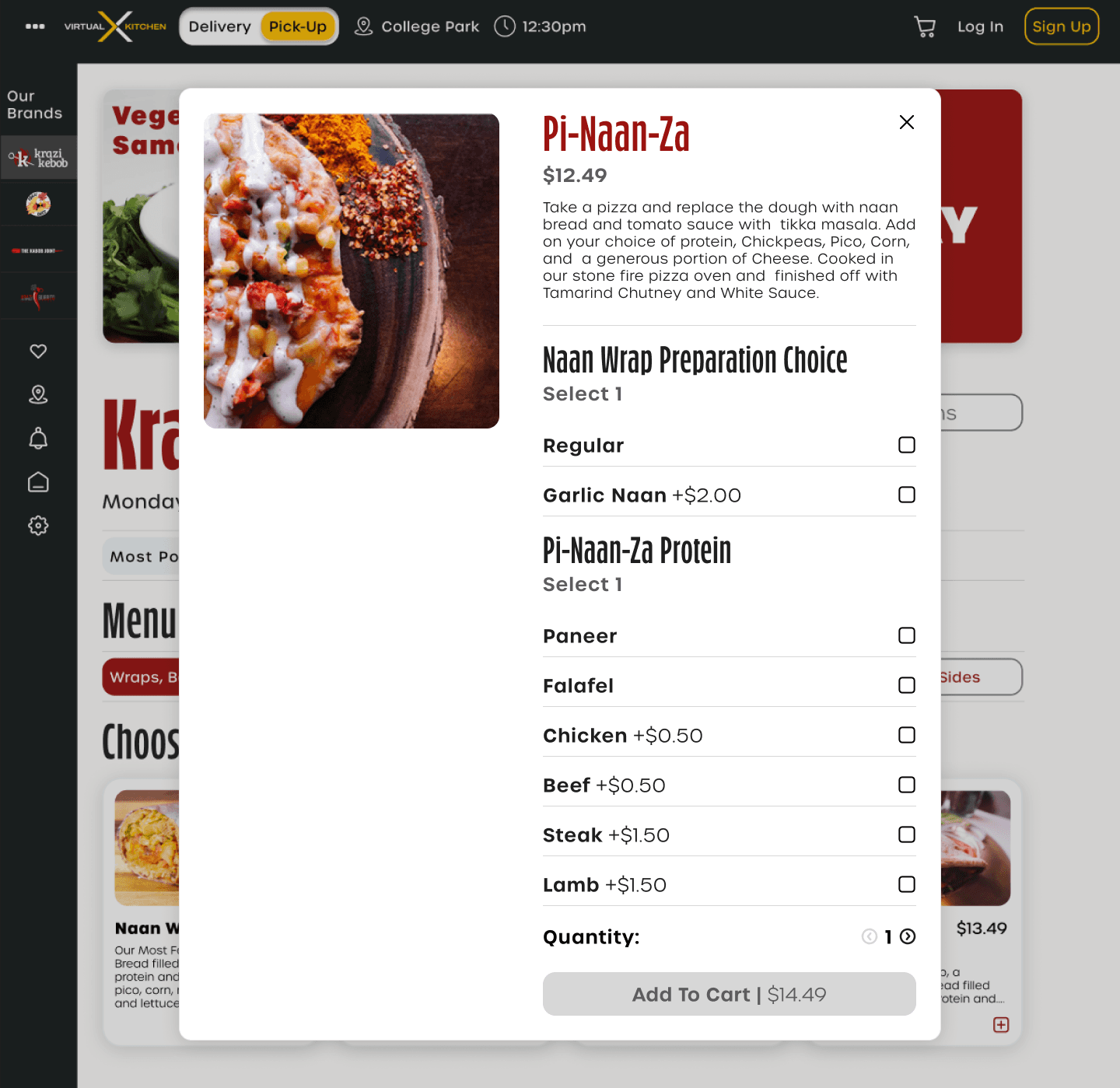
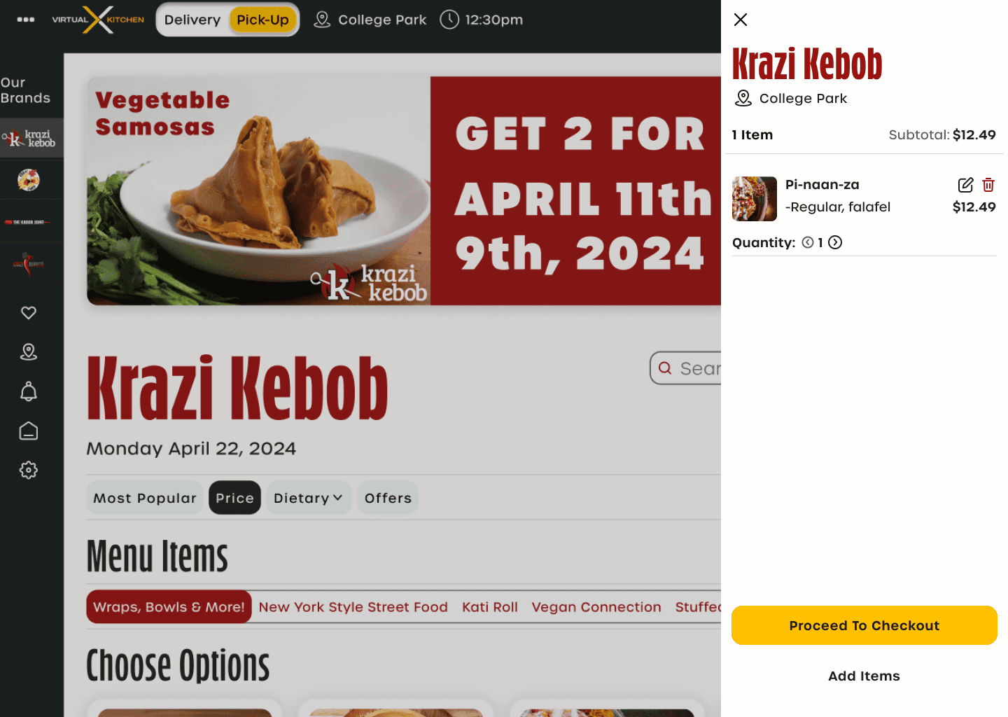
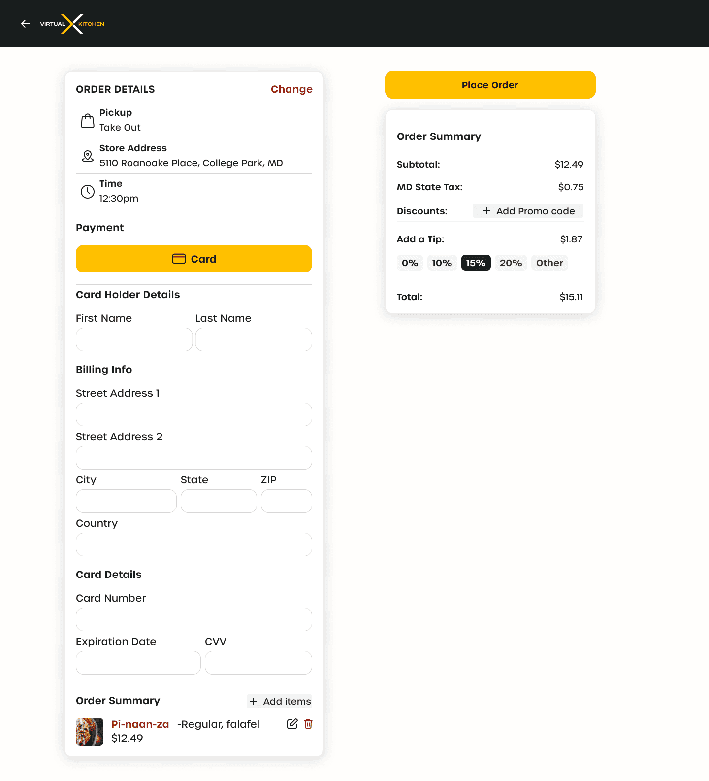
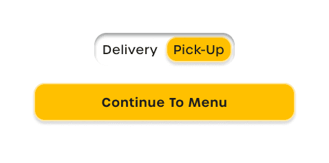
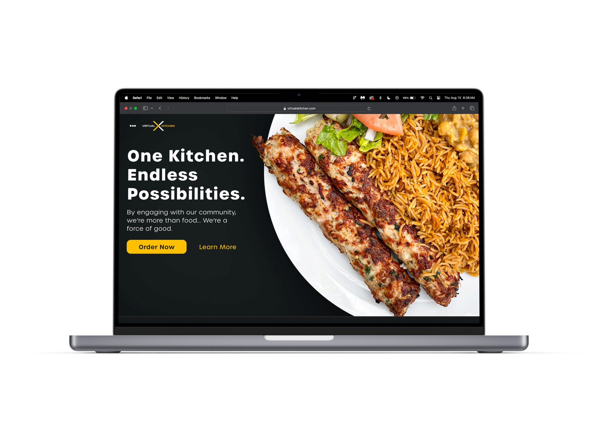
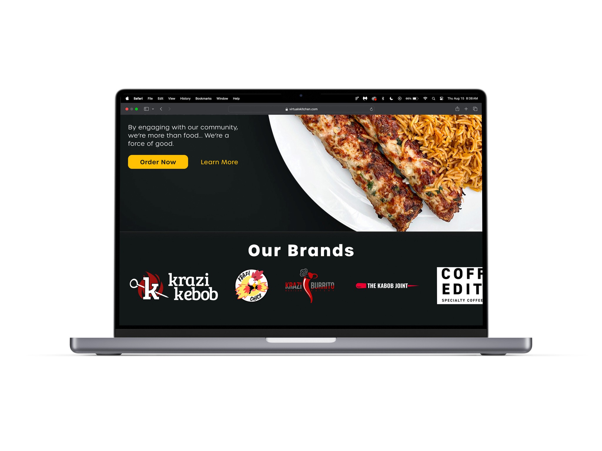
Hi-Fi Prototype
Implementing the final product into a prototype.
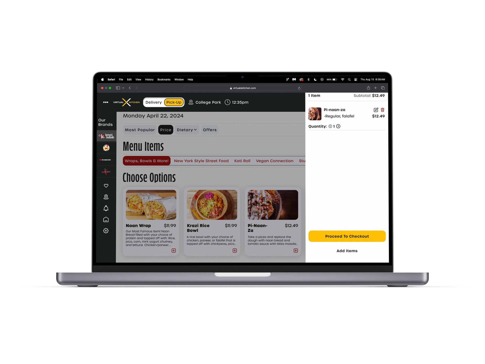
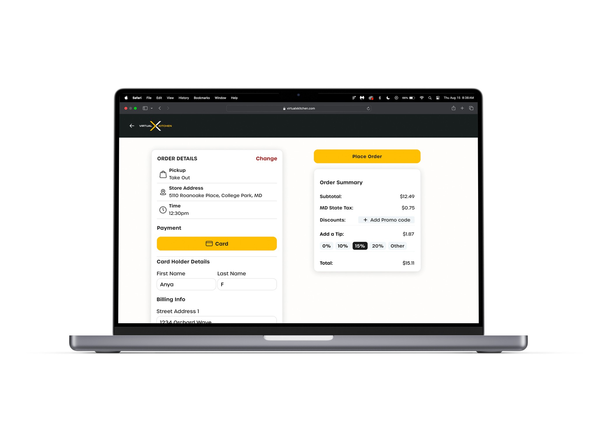
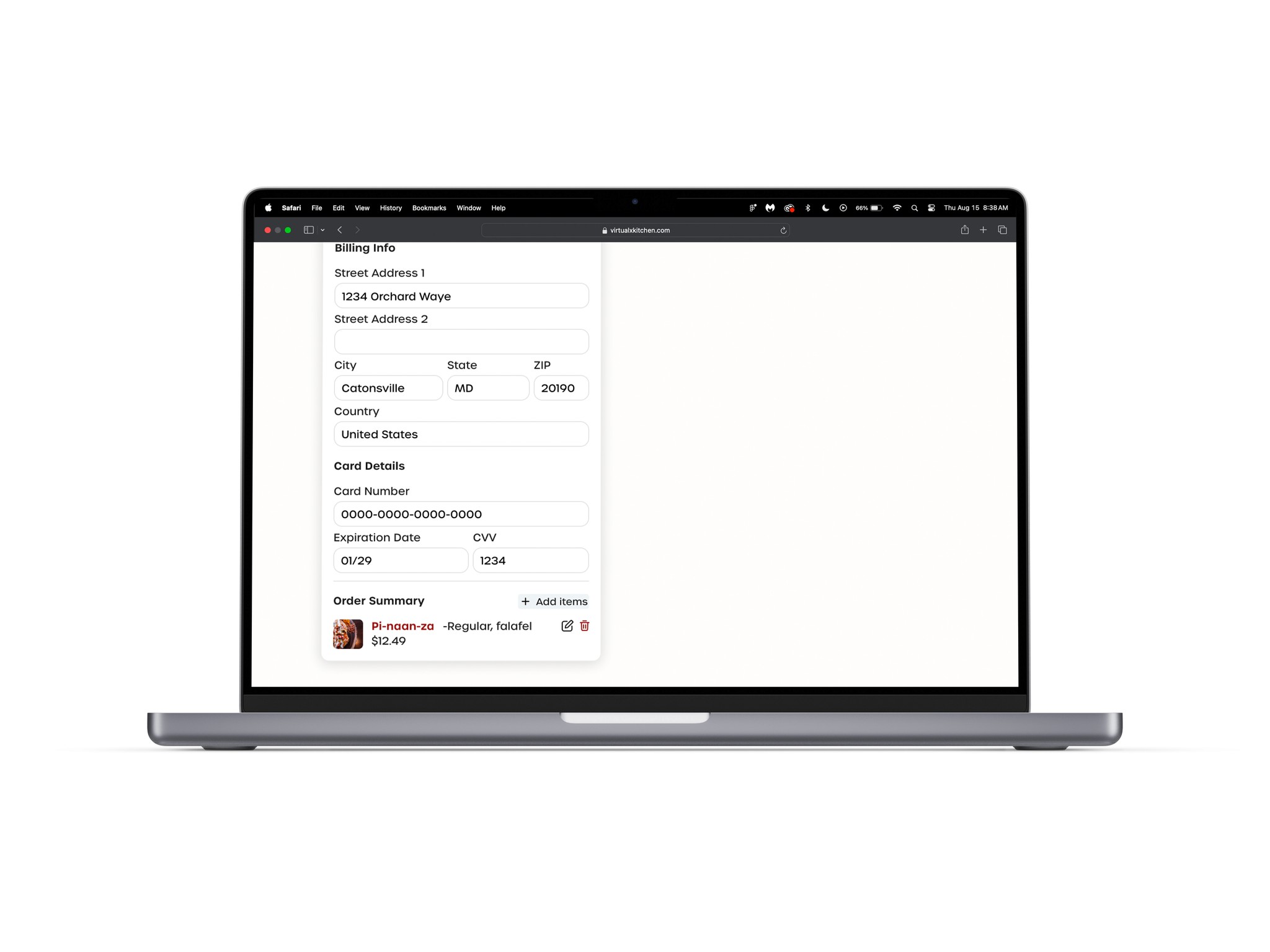
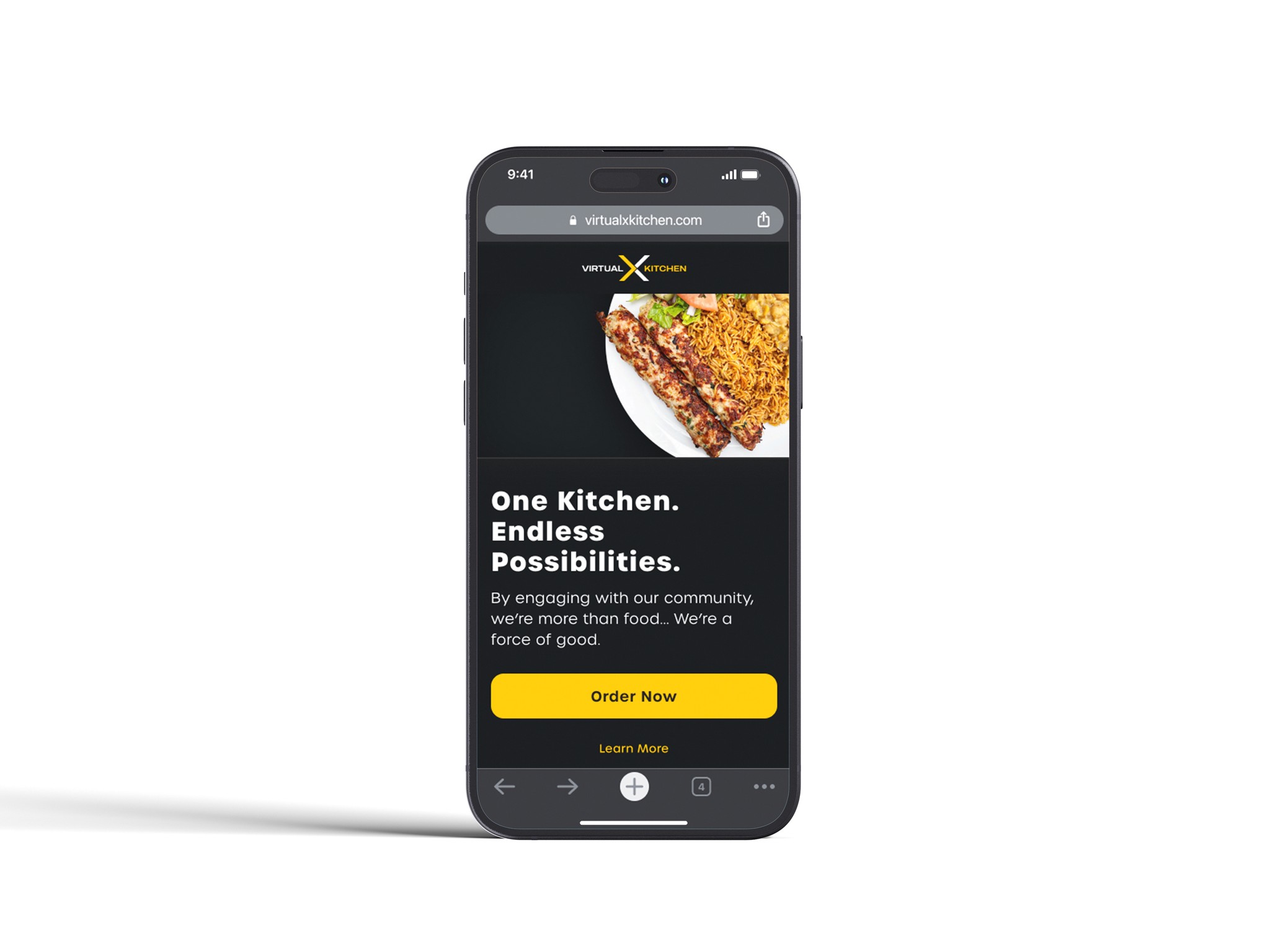
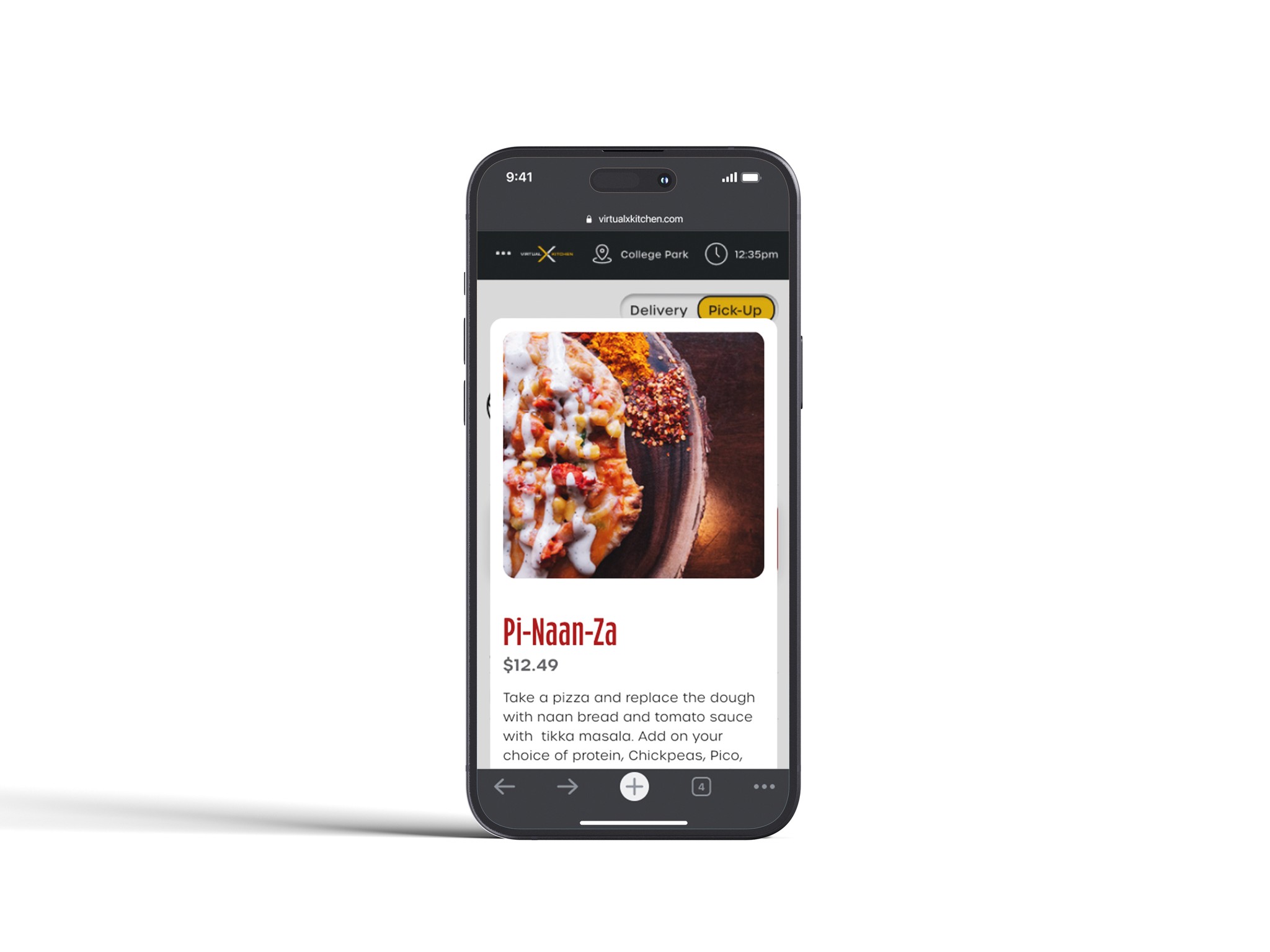
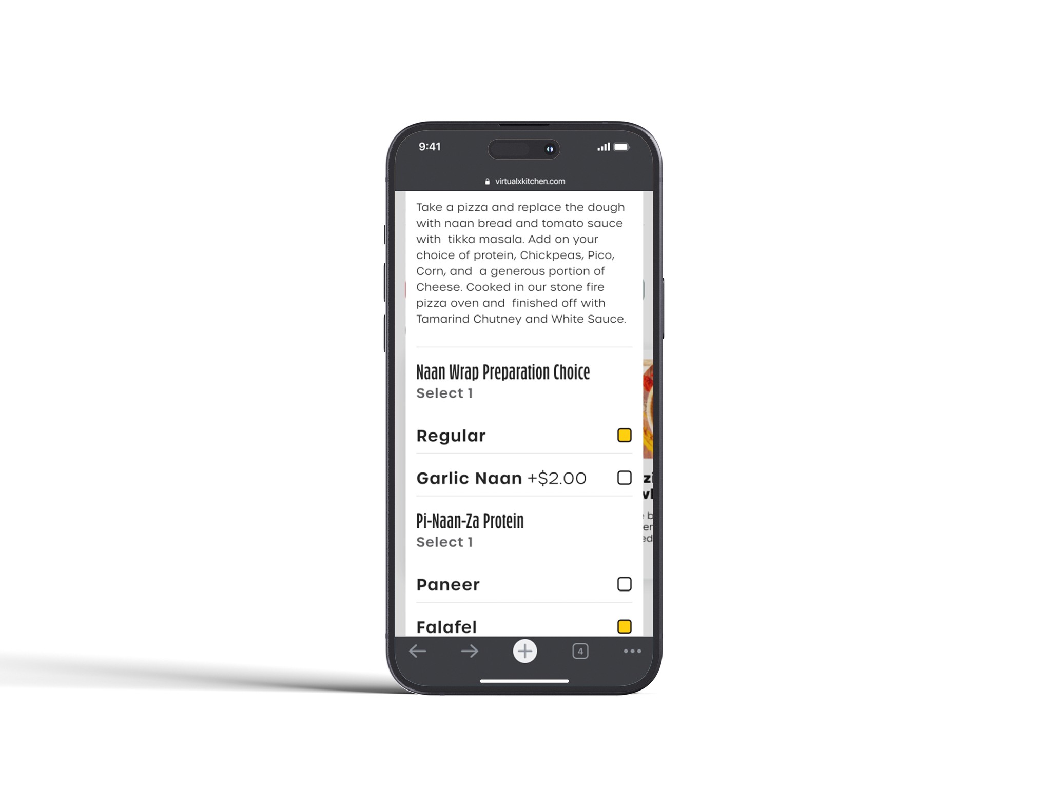
All Finalized Screens
Compiling all screens here.

Project Takeaways
Wrapping up the experience.
The refresh of VirtualxKitchen was a very fun experience for me. With the establishment being a place that I personally support as well as other I know, there was great motivation for me to work the refresh. This project both strengthened and highlighted my skills when it comes to preserving and refining a brand's identity and core values. Not only this, but it allowed me to add a creative twist on how users would interact with online ordering.

CONTACT
Linked In